Case Study
YVR Airport
We helped translate YVR-authored strategies and initiatives into a broader visual expression, from strategic communications to community campaigns and the details people meet every day.
We helped translate YVR-authored strategies and initiatives into a broader visual expression, from strategic communications to community campaigns and the details people meet every day.
Our work with Vancouver International Airport began during the pandemic, when familiar stories about travel met a very different reality. YVR was thinking through its place in the community and communicating substantial organizational change. Those ideas needed a visual expression that people could understand and encounter in useful ways.
The relationship began with Parker embedded in YVR’s team as a contract design lead and continued through Harc’s creative work in the years that followed. We worked close to the people developing the initiatives, translating their direction into communications, applications, and graphic systems.
The organizational strategies belonged to YVR. Our role was to help make them visible.
YVR already had an established identity, with clear expectations about how it should appear. We worked within that framework, exploring how its palette, typography, photography, and supporting elements could carry a wider range of themes.
The community side of the airport offered a productive direction. People at work, local relationships, public life, and the shared experience of keeping a place running could become more prominent in the storytelling. We used the existing visual ingredients to give those subjects their own presence.
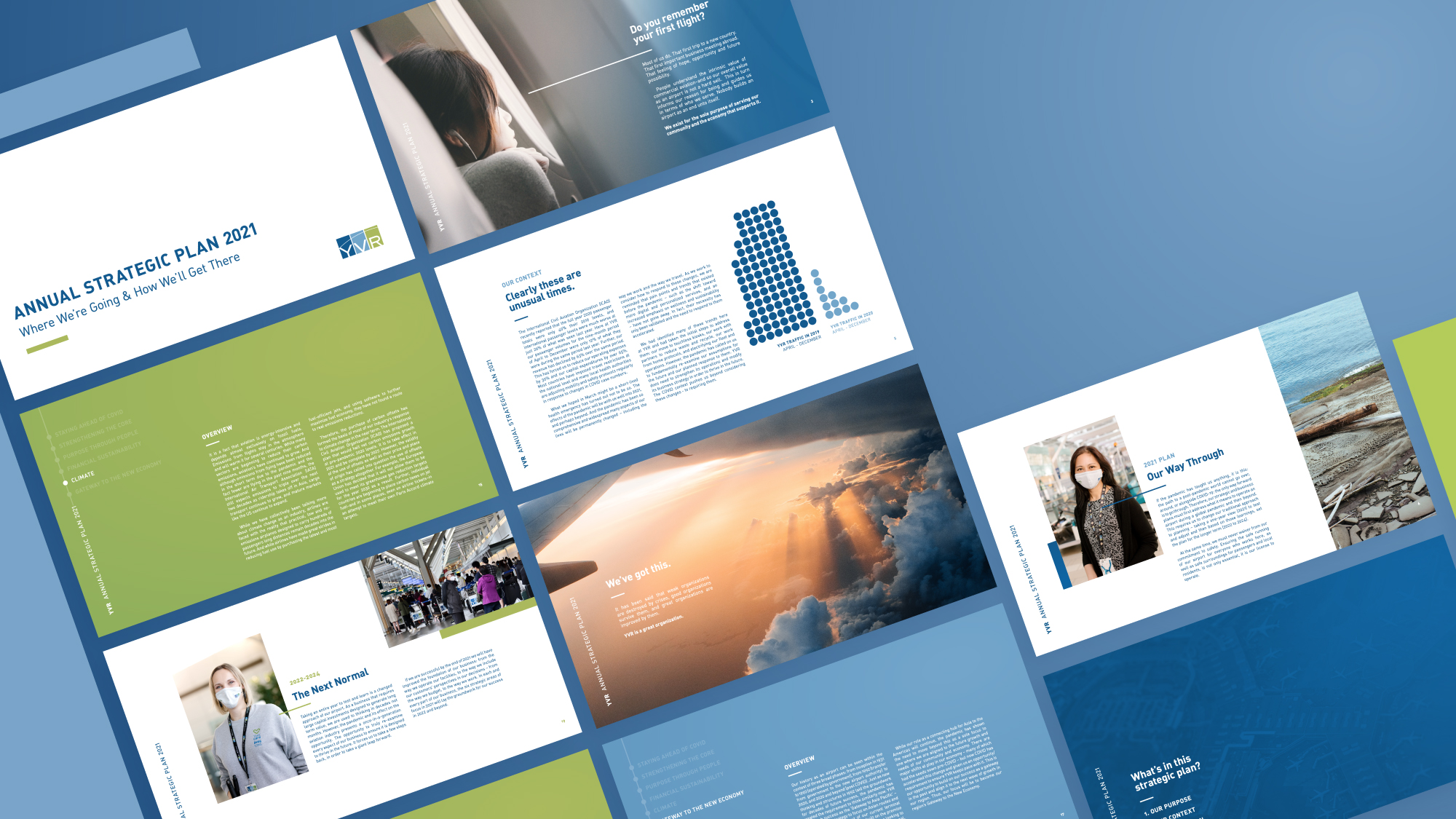
YVR’s strategic direction became a publication people could move through, with a clear hierarchy and room for the people and places behind the plan.
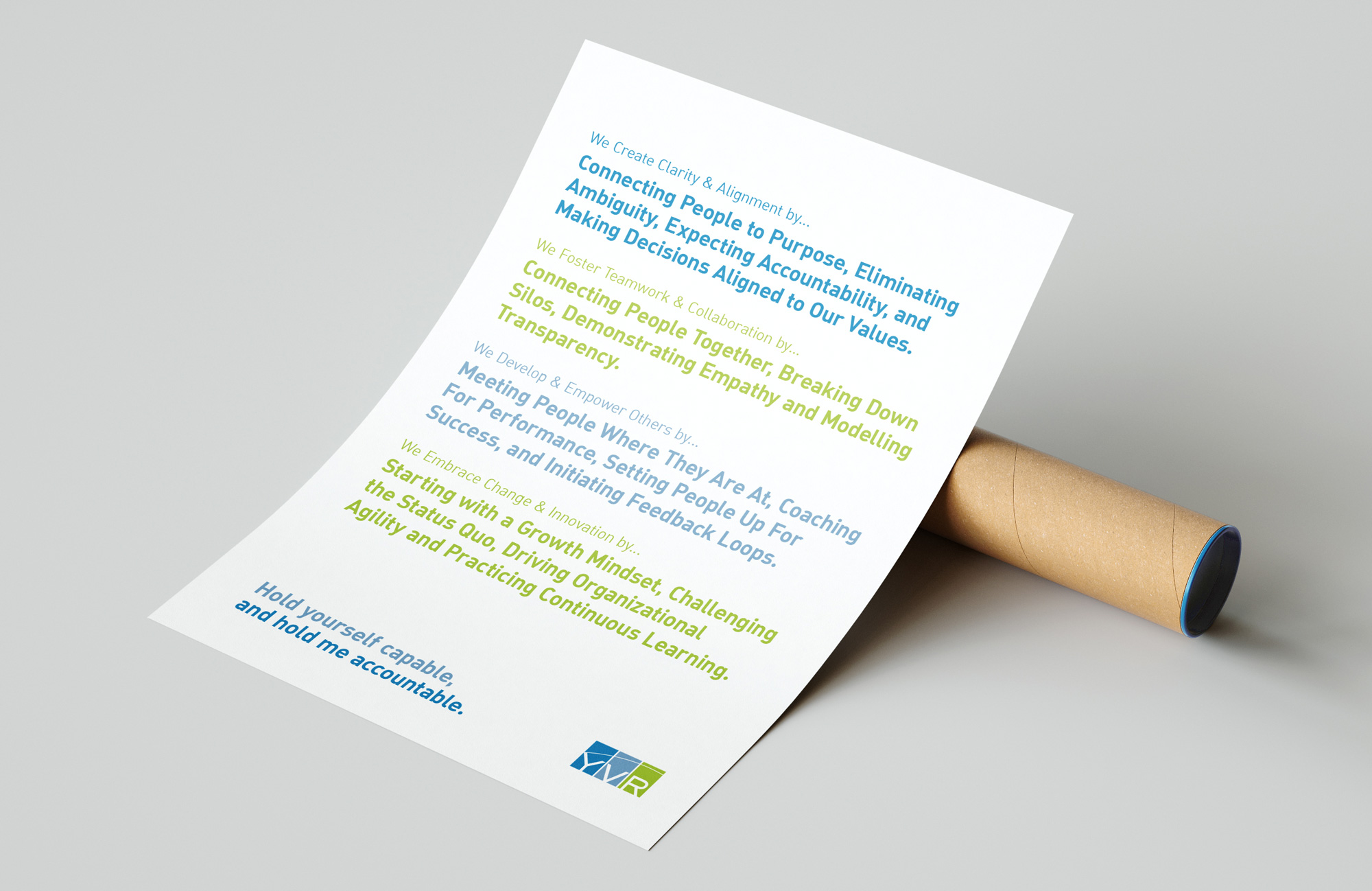
The same design thinking carries organizational language into a smaller, practical format.
Some work needed to be structured and direct. Strategic publications and leadership materials had to make substantial information easier to navigate. Other pieces could be more expressive, helping YVR show its relationships with local organizations and the communities around the airport.
We brought colour, image, and language together differently for each of those jobs. A community partnership could have its own visual emphasis while still feeling connected to YVR. Andy Margolis, Vice President, Operations and Chief Operations Officer, described the translation this way: “Parker took our loosely-defined ideas and produced graphics that captured our vision perfectly.” The ideas belonged to the team. Our work gave them a form people could meet, understand, and spend time with.
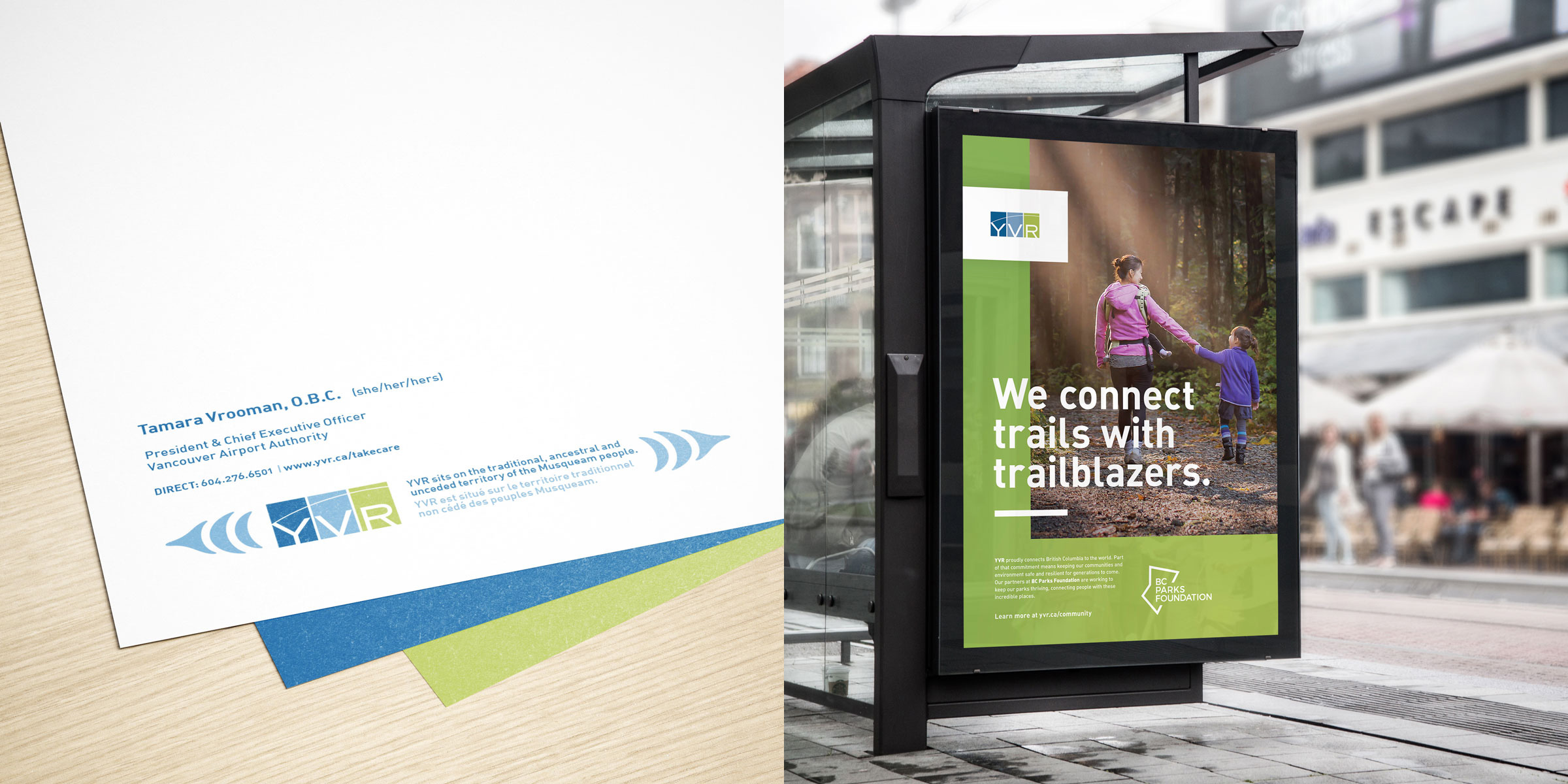
A community-partnership campaign presentation uses the green palette and a local story to give YVR’s existing brand another register.
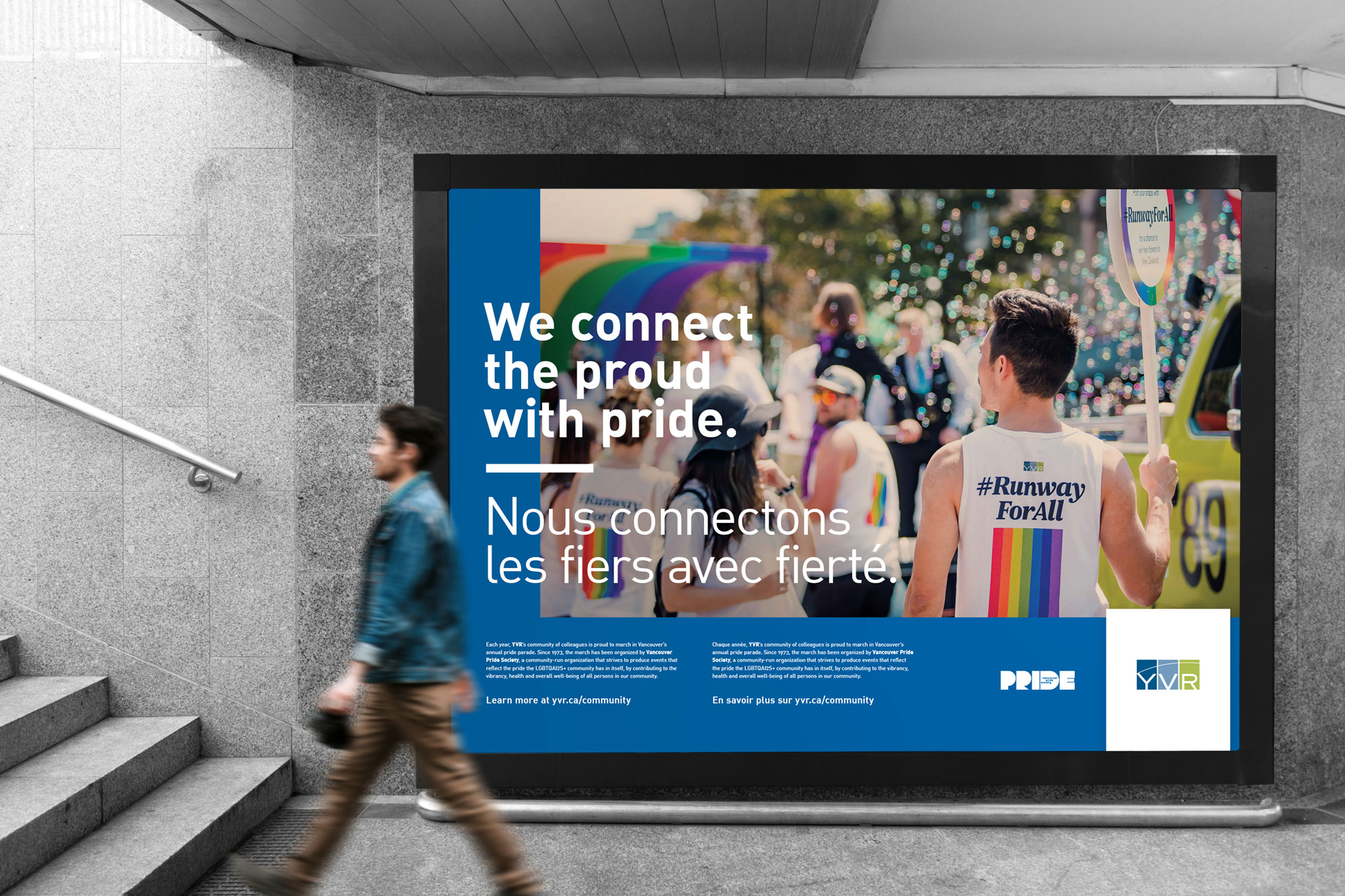
The Pride campaign presentation connects YVR’s public voice with community participation, within the established identity.
Alongside the public-facing work, we developed applications for the places people encounter an organization in the course of a day: a card, a document, an email, a presentation. Those pieces deserve attention because they are often where a brand is used most.
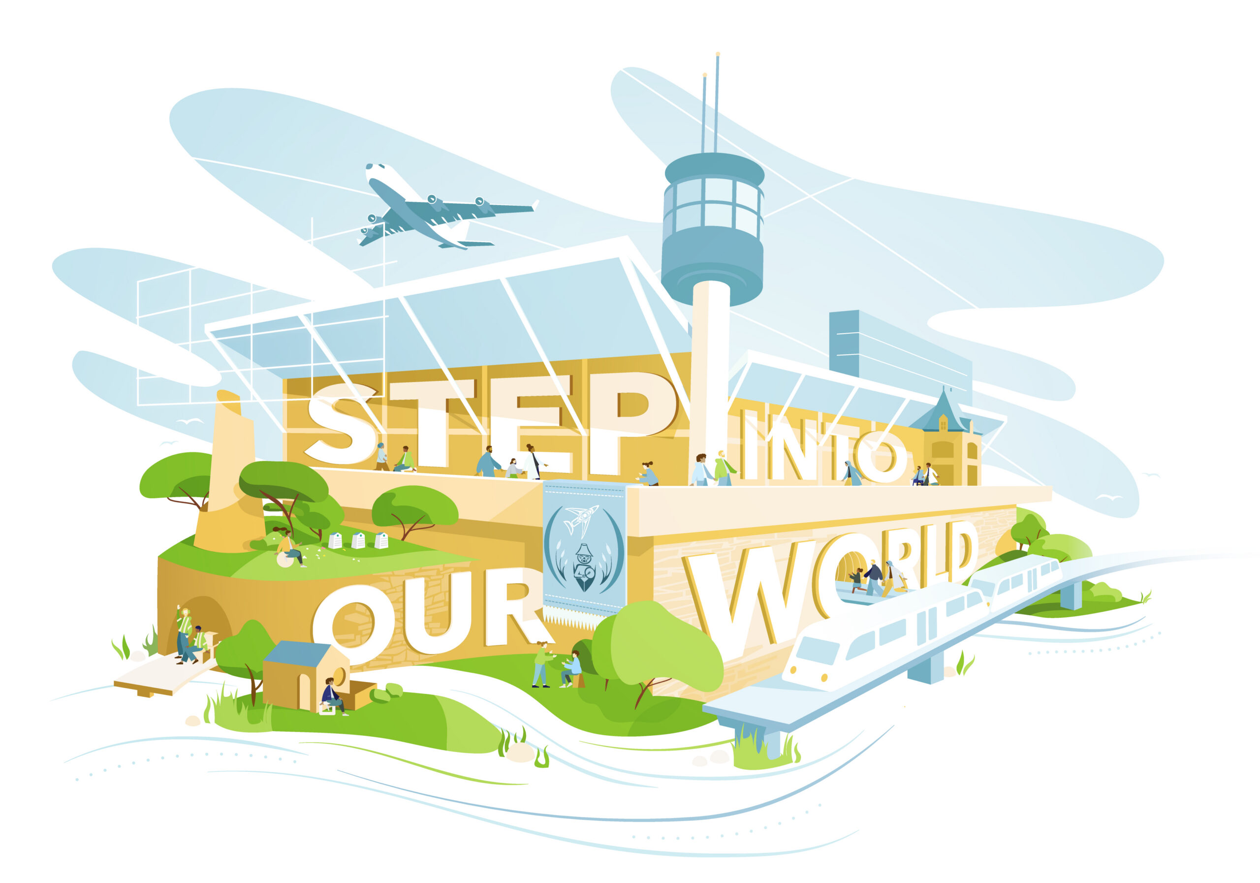
The airport-themed illustration brings a more playful, expansive expression to the existing blue-and-green visual world.
We also carried YVR’s strategic messages into environmental graphics. A wall treatment could put the organization’s direction into a space people moved through, making the relationship between strategy and daily work more tangible.
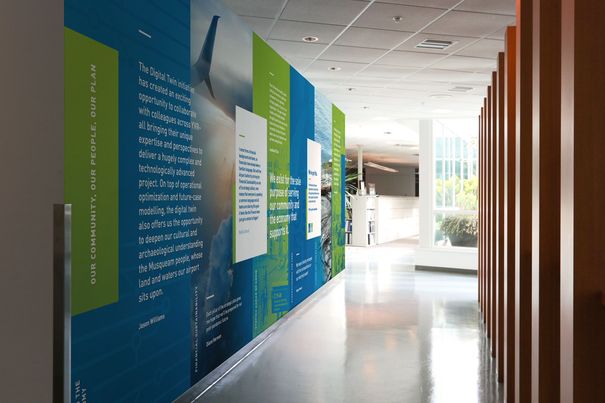
Strategic messages become part of the physical workplace in this panel installation.
Working closely with an established organization asks for a particular kind of creative judgment. You need to understand the rules well enough to use them with imagination, and the people well enough to know what the work needs to express.
We are proud of the range we helped YVR find. The projects moved between serious organizational communication and much more expressive applications, while staying connected to a shared identity. Together, they give more of the airport’s community life a visible place in its story.

Harc didn’t offer a ‘solution in a box’—they helped us focus and come to our own realizations.


Harc will inspire you to think and dream, and the end result will be better than you imagined.


Harc brought forward beautiful, well-researched ideas, resulting in a brand I’m proud to share with the world.


Harc is a great partner for organizations who not only want to be understood, but also to better understand themselves.


The Harc team is intuitive, creative, and strategic while infusing magic and delight into everything they do.


Parker and Jarren became part of our team, showing up in a meaningful way and bringing our story to life through deep understanding.


Working with Harc was like going on a guided journey into understanding and expressing who we are as a company.


Harc’s coaching has helped me see and design my own methods and practices to be successful with a clearer, more confident approach. As a result, I am engaging both my business and my life at a higher level.

A clear brief is welcome. A gloriously untidy first thought is welcome too. Tell us what you’re making, changing or trying to say. We’ll help work out what happens next.