Case Study
Firehall Arts Centre
A musical spark, a historic building, and four decades of community storytelling became the starting points for Firehall Arts Centre’s renewed identity and website.
A musical spark, a historic building, and four decades of community storytelling became the starting points for Firehall Arts Centre’s renewed identity and website.
For roughly forty years, Firehall Arts Centre had been making space for theatre, music, dance, and stories that needed a stage. Its home, a historic Vancouver fire hall, was inseparable from that work. The building had a character of its own. So did the organization inside it.
We came in to help bring that character into a more legible, contemporary identity. There was history to honour and a lively cultural program to make visible. The interesting question was how those things could strengthen each other.
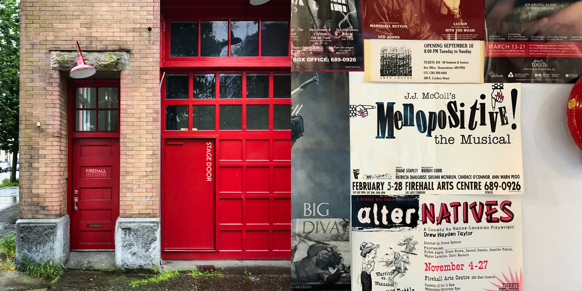
The building and its accumulated show posters gave us two connected starting points: a place with history, and a community continually making something new.
As we listened and worked through the Firehall’s story with its team, an observation from Rosemary Georgeson stayed with us:
“The Firehall is where my family’s stories began to be told again.”
Rosemary Georgeson, Sahtu Dene & Coast Salish Artist, Writer, Storyteller
That specificity mattered. Family stories, finding a place to be told again. It gave us a way to connect the building’s past with the cultural life it holds now. Fire could carry warmth, energy, and the act of gathering around a story.
Music gave us the other half of the idea. With jazz in the courtyard and dance and performance woven through the programming, a musical forte felt right at home. We brought the two together in a forte symbol on fire. A small mark with a fair bit going on.
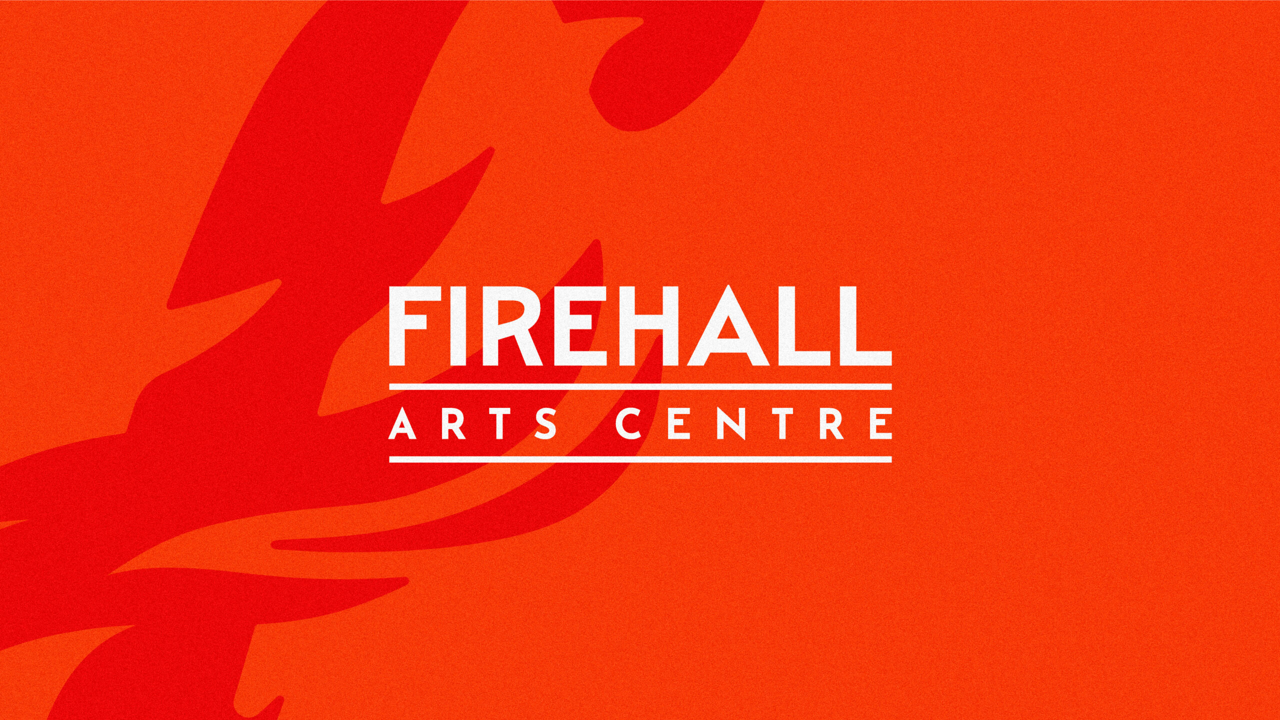
Fire and a musical forte meet in the identity, alongside a logotype that keeps a connection to the Firehall’s history.
A logo can be wonderfully pleased with itself. A performing arts brand has other responsibilities. It needs to make room for artists, faces, titles, and very different kinds of shows. We developed the flame into an accent and framing device that could travel across the identity without taking over every conversation.
The historically inflected lettering brought a sense of permanence. The flame brought movement and an immediate flash of recognition. Together, they gave us a graphic language that could hold an intimate portrait, a bold production title, or a season’s worth of programming.
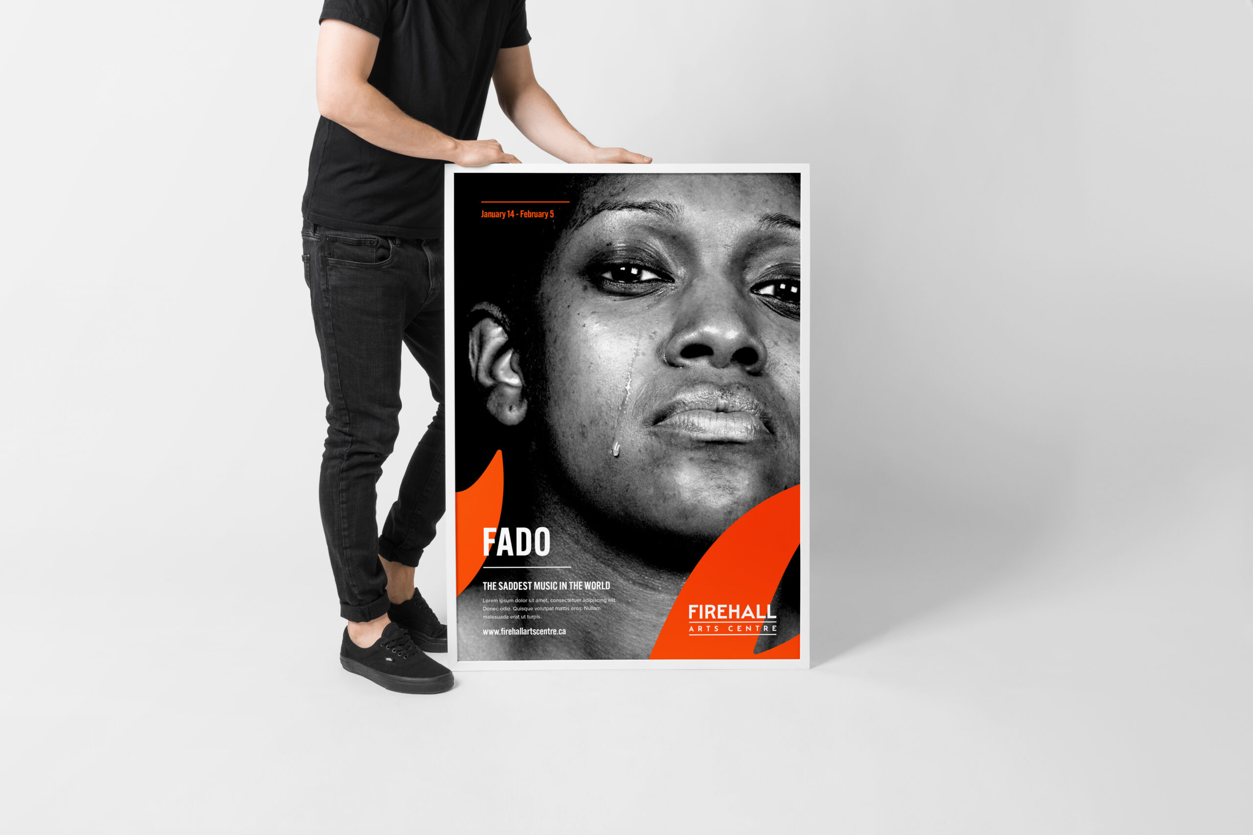
In the poster design, the flame frames the performance photography and gives the show its own space within a recognizable Firehall identity.
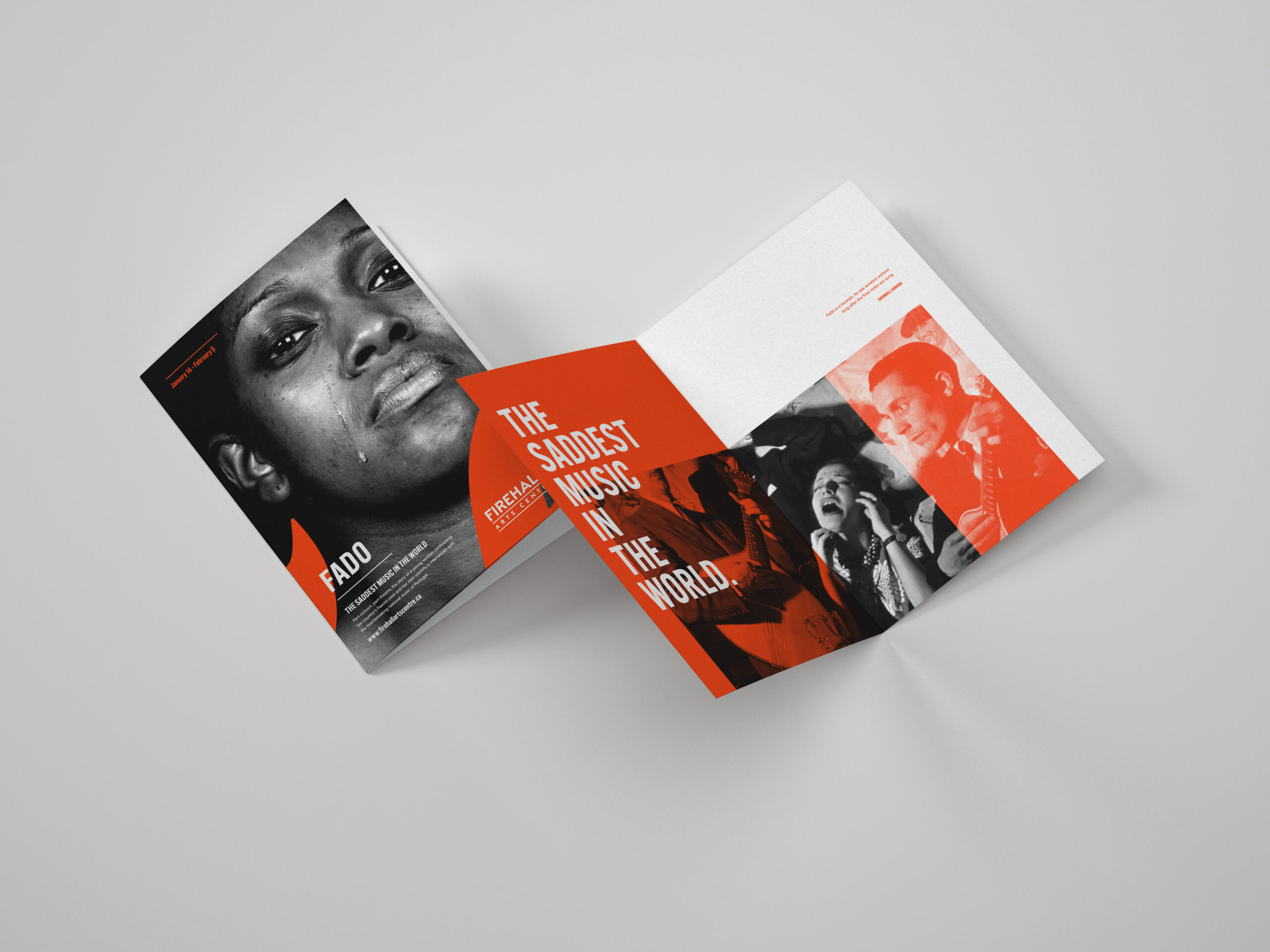
The same language carries through a program, connecting individual performances to the place that brings them together.
We carried that thinking into business cards, social graphics, and the website. Each application had a different job. The website needed to help people explore what was on; a social post needed to announce something clearly; a program needed to hold a little more detail. The identity gave those pieces a shared character while leaving them useful.
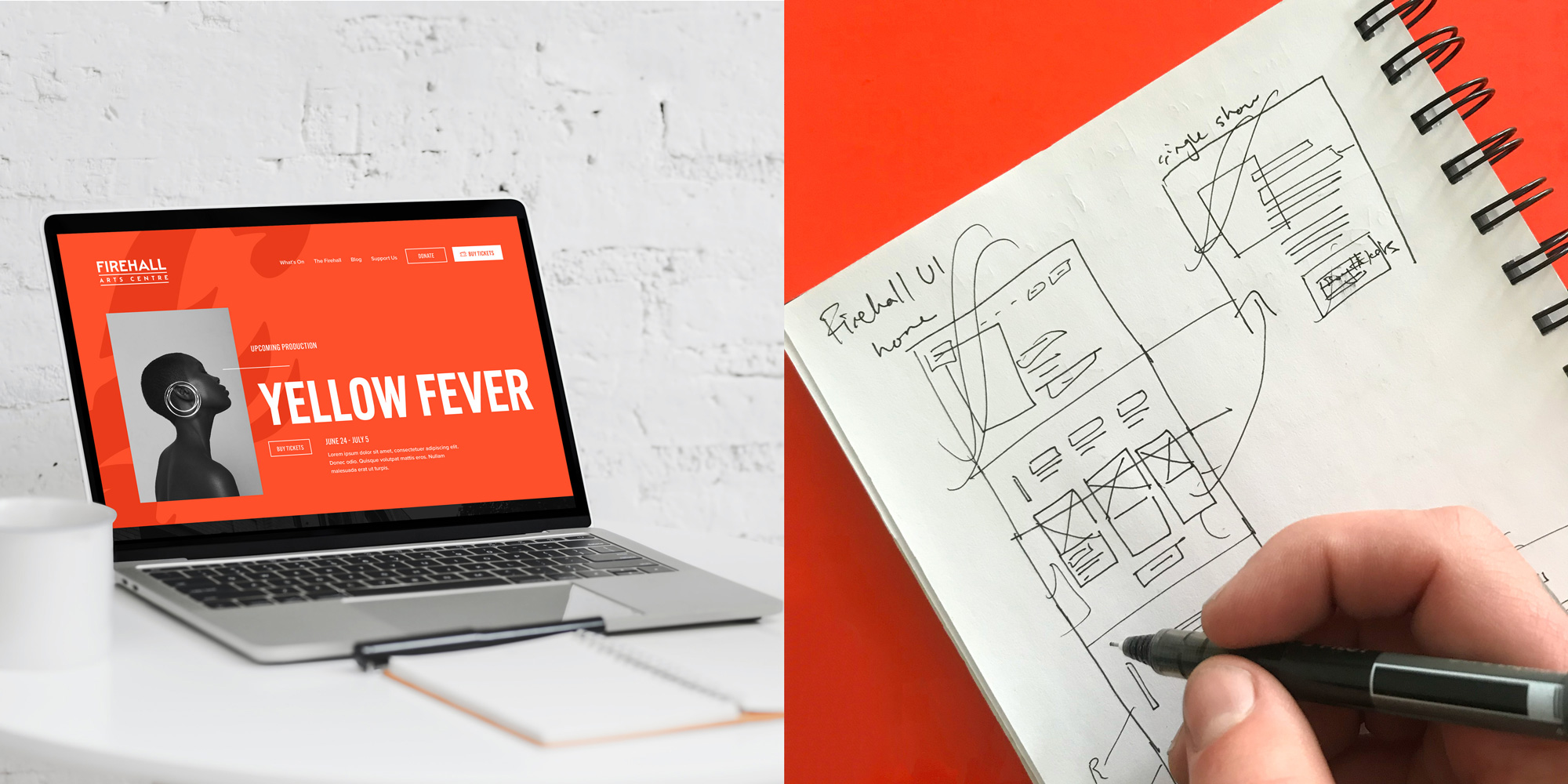
The website presentation connects the finished interface with its layout development, carrying the brand into a practical home for the program.
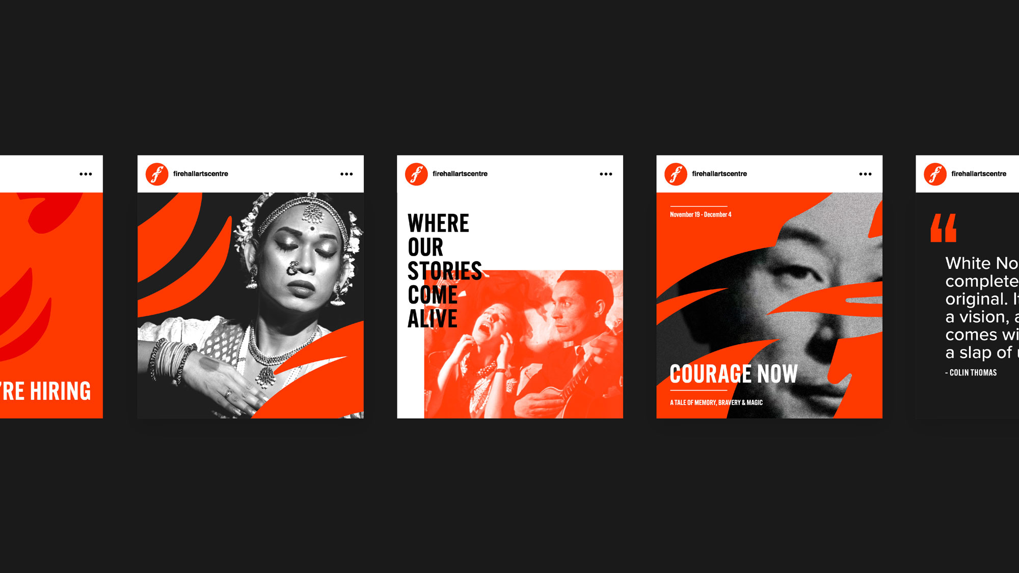
Across social graphics, the orange palette and flame language make room for different artists and different kinds of announcements.
We still see the Firehall identity around Vancouver. That is one of the pleasures of doing this work close to home: a project leaves the studio and becomes part of the city we move through. You meet it again on the way somewhere else.
For us, the strongest part of this identity is how naturally it belongs to the Firehall. The building, the music, and the stories were there when we arrived. We helped give them a shared visual expression, with enough character to be noticed and enough room for the next story.
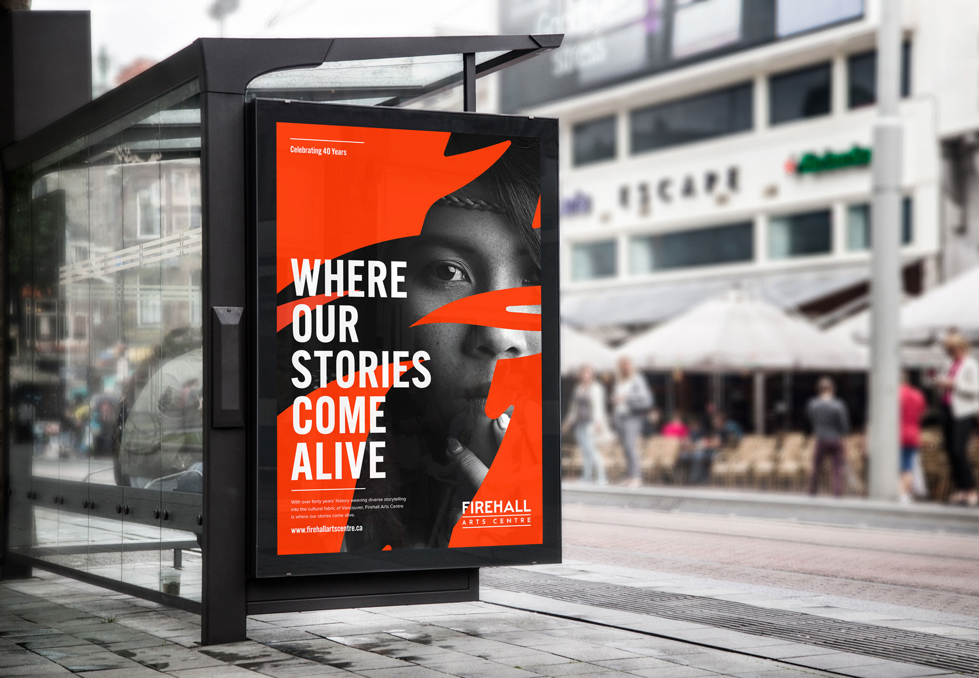
A transit-ad presentation shows the identity at city scale, bringing the Firehall’s invitation into public view.

The flame can also carry the identity on its own, as this tote application shows.

Harc didn’t offer a ‘solution in a box’—they helped us focus and come to our own realizations.


Harc will inspire you to think and dream, and the end result will be better than you imagined.


Harc brought forward beautiful, well-researched ideas, resulting in a brand I’m proud to share with the world.


Harc is a great partner for organizations who not only want to be understood, but also to better understand themselves.


The Harc team is intuitive, creative, and strategic while infusing magic and delight into everything they do.


Parker and Jarren became part of our team, showing up in a meaningful way and bringing our story to life through deep understanding.


Working with Harc was like going on a guided journey into understanding and expressing who we are as a company.


Harc’s coaching has helped me see and design my own methods and practices to be successful with a clearer, more confident approach. As a result, I am engaging both my business and my life at a higher level.

A clear brief is welcome. A gloriously untidy first thought is welcome too. Tell us what you’re making, changing or trying to say. We’ll help work out what happens next.