Case Study
Stanley Park Ecology
We helped Stanley Park Ecology simplify its name and develop a more expressive identity, bringing its work into a visual world people could recognize, share, and wear.
We helped Stanley Park Ecology simplify its name and develop a more expressive identity, bringing its work into a visual world people could recognize, share, and wear.
Stanley Park Ecology Society had a name that described an organization. Removing “Society” brought the focus more directly onto the place and the work. Stanley Park Ecology was simpler to say, easier to carry into a design, and open to a broader expression of what the organization could be.
That small change gave us a useful opening. We were working with people who cared deeply about the park: staff, volunteers, and a wider community connected to its ecology. We wanted the brand to make more of that interest and energy visible.
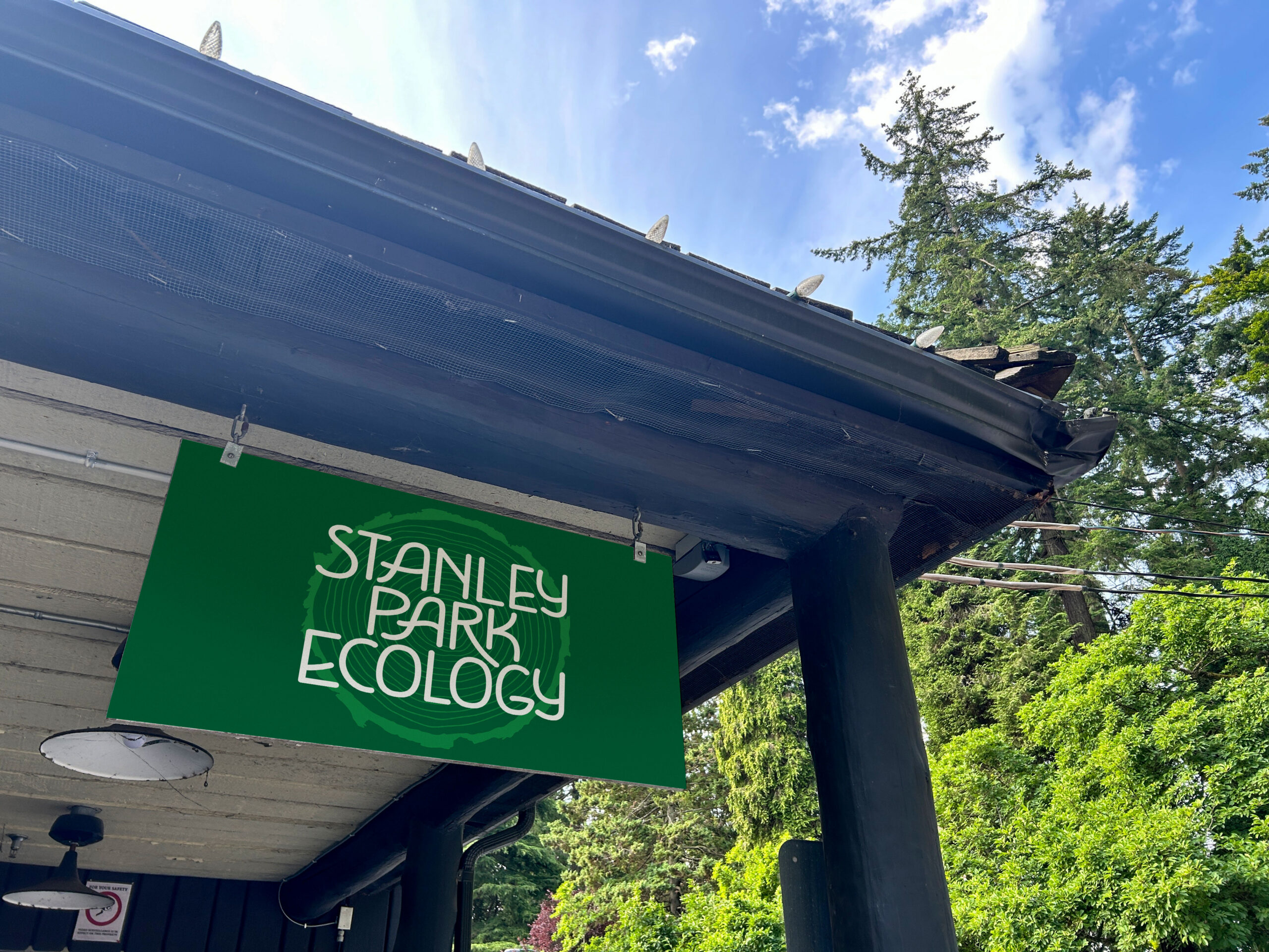
The shorter name appears on the organization’s installed sign, surrounded by the park it belongs to.
The visual direction moved away from a primarily academic feeling toward something more expressive and artful. We developed distinctive lettering and a graphic world that could feel at home on a shirt or tote as readily as on an organizational communication. The name itself could become something people enjoyed looking at.
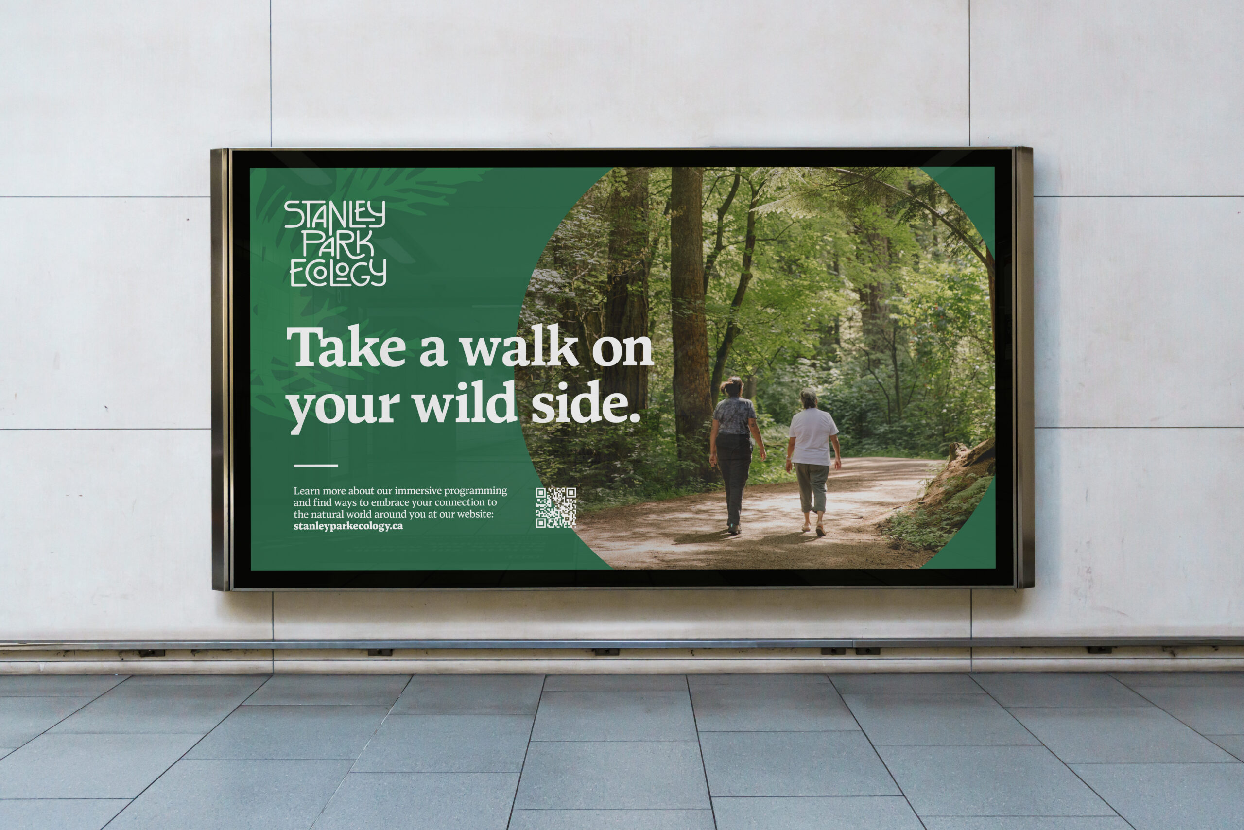
The refined identity welcomes viewers to journey closer to their roots.
That gave the work a different kind of presence. It could carry knowledge and invite curiosity, while making room for the pleasure of being interested in the natural world. There is plenty of seriousness in ecology. There is also an excellent case for a good tote bag.
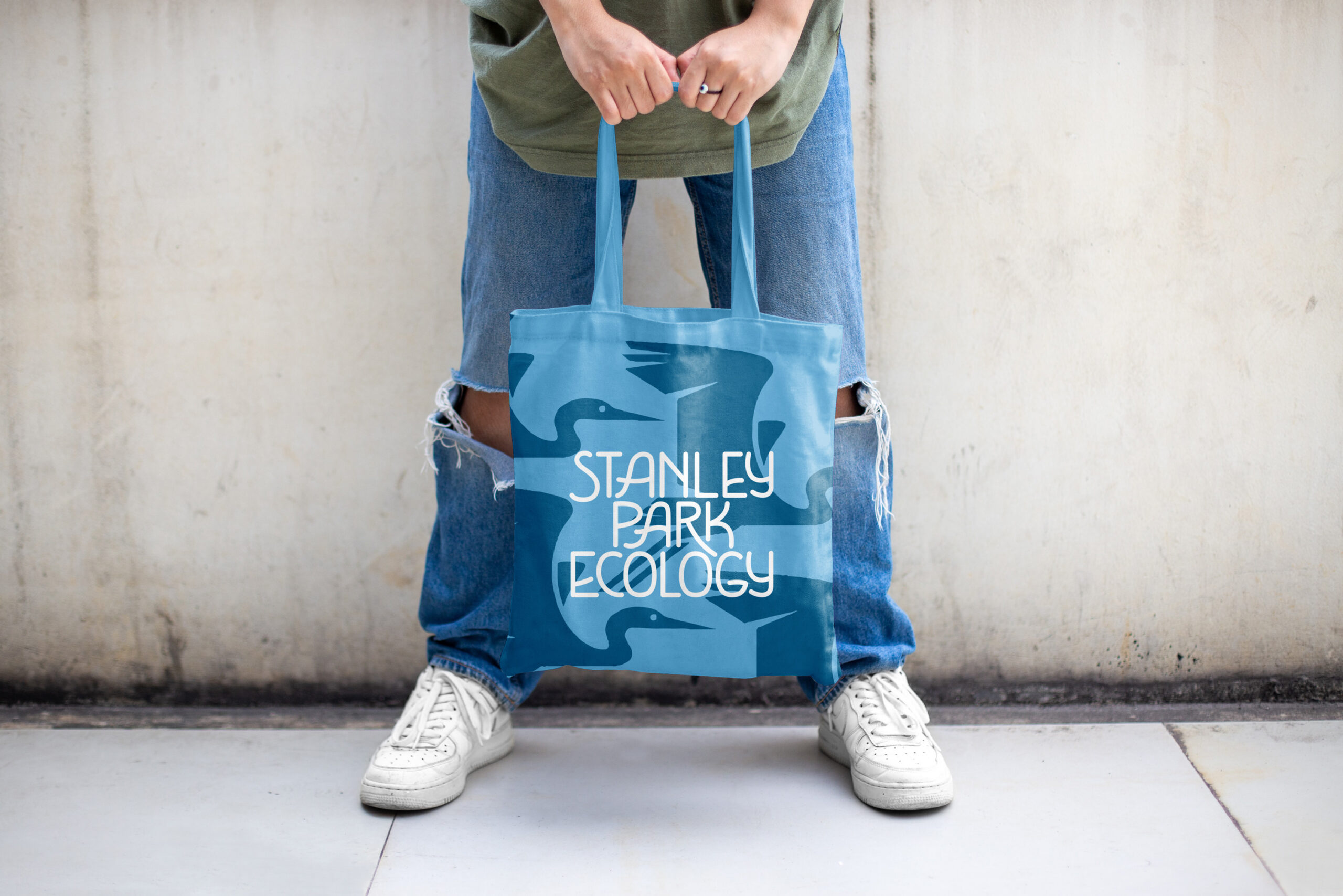
Distinctive lettering and a flowing blue graphic treatment give the identity an everyday life beyond formal communications.
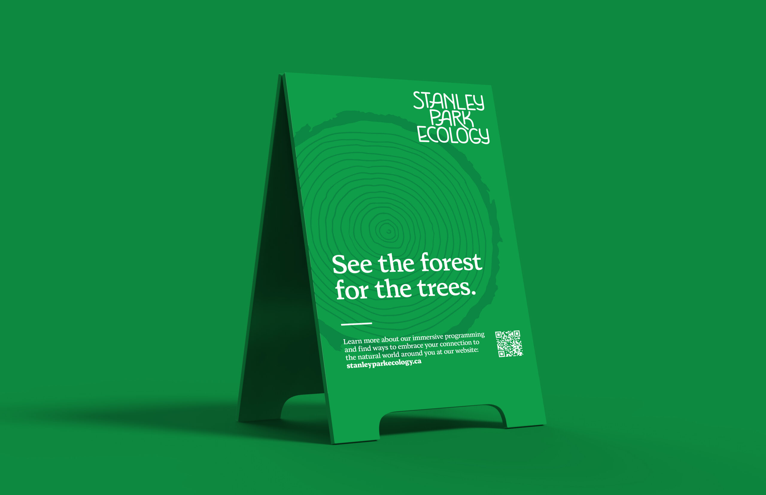
We carried the identity into signage and digital applications, developing a range that could hold photographs, messages, and invitations into the organization’s work. The palette and graphic treatments could create variety while the lettering kept a recognizable thread running through it.
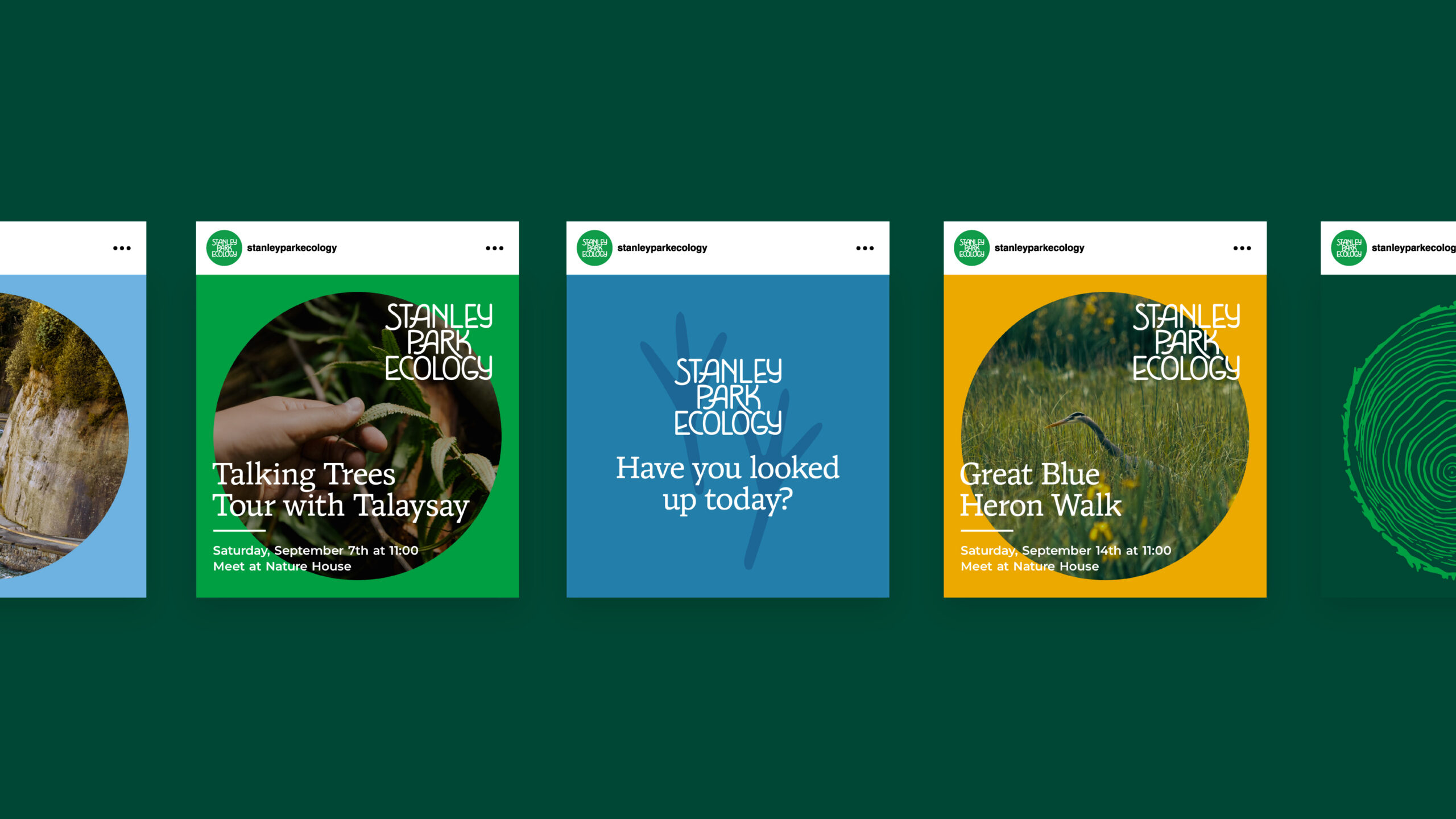
Photography, graphic pattern, and colour bring different invitations into a recognizable social sequence.
The identity can take a quieter, more typographic form when the message needs room.
The team at Stanley Park Ecology described a practical difference in the finished work: “the brand is clearly differentiated from Vancouver Park Board and unique to Stanley Park.” The organization had a more distinct presence in the place it knew so well. We like how directly that recognition connects to the design: a clearer name, lettering with character, and new ways to meet someone on a sign, a screen, or a very useful bag.

Harc didn’t offer a ‘solution in a box’—they helped us focus and come to our own realizations.


Harc will inspire you to think and dream, and the end result will be better than you imagined.


Harc brought forward beautiful, well-researched ideas, resulting in a brand I’m proud to share with the world.


Harc is a great partner for organizations who not only want to be understood, but also to better understand themselves.


The Harc team is intuitive, creative, and strategic while infusing magic and delight into everything they do.


Parker and Jarren became part of our team, showing up in a meaningful way and bringing our story to life through deep understanding.


Working with Harc was like going on a guided journey into understanding and expressing who we are as a company.


Harc’s coaching has helped me see and design my own methods and practices to be successful with a clearer, more confident approach. As a result, I am engaging both my business and my life at a higher level.

A clear brief is welcome. A gloriously untidy first thought is welcome too. Tell us what you’re making, changing or trying to say. We’ll help work out what happens next.