Case Study
Pilgrimme
For this legacy restaurant project, an existing carved sign, Jesse’s cooking, and the particular character of Galiano became a connected identity for Pilgrimme.
For this legacy restaurant project, an existing carved sign, Jesse’s cooking, and the particular character of Galiano became a connected identity for Pilgrimme.
Getting to Pilgrimme meant getting to Galiano. The shoreline, the forest, and the journey to the island were part of the experience before anyone sat down to eat. Inside, Jesse’s cooking brought the same attention to place into the meal.
When we began working together in 2015, there was already a carved wooden sign and a restaurant with a distinct point of view. Our job was to understand what belonged to it, then shape an identity that could carry that character into print, a website, and the small details around a meal.
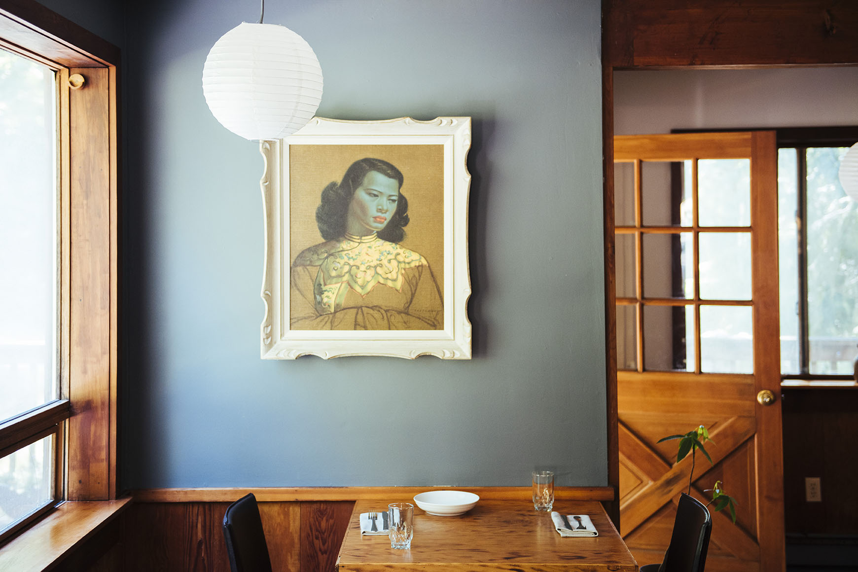
The restaurant’s scale, materials, and atmosphere gave us a close point of reference for the identity.
The carved sign became a starting point for the logotype. We wanted to respect that existing authorship and the restaurant’s lineage, while giving the lettering a form that could work across other uses.
Jesse’s culinary background, including his time at Noma, was part of the story. Galiano gave it its particular setting. We developed the positioning “coast, forest, and farm-to-table” to bring those relationships into language. It could name the experience simply and give the design a clear sense of where it belonged.
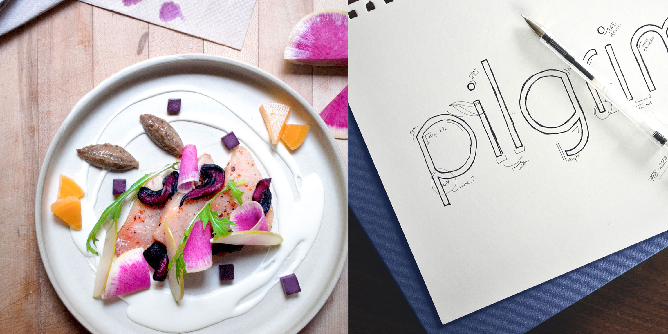
The relationship between the food and the lettering shaped the visual direction. This presentation pairs a plated dish with logotype development.
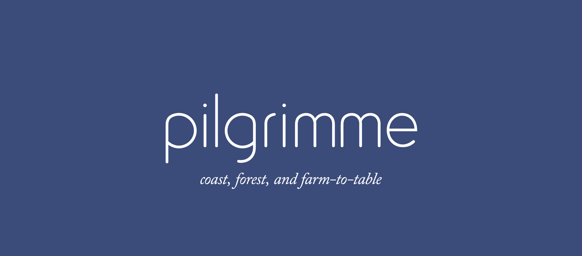
The logotype and positioning keep the introduction quiet, with the particular character of the place carried in the details.
A kelp dish offered another connection between the food and the identity. We developed the P into a bull-kelp form, giving the brand an illustration that could stand on its own and still lead back to Pilgrimme.
Muted blues, fine linework, natural textures, and photography created a visual world with room to breathe. The cooking had its own precision and restraint. We wanted the brand to carry some of that same attention, with enough character to be recognizable in a very small detail.
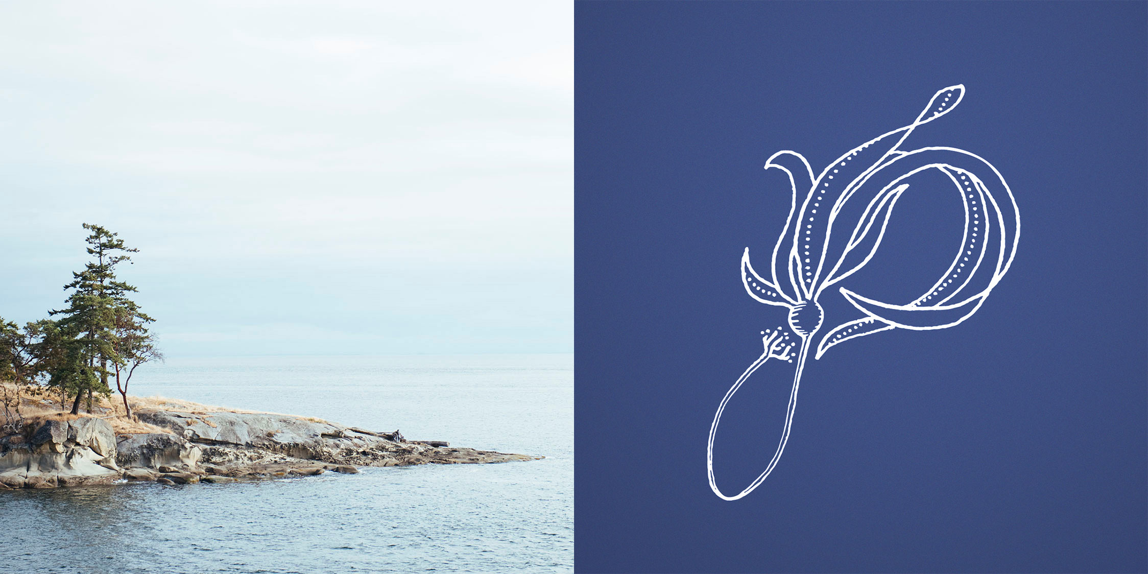
A bull-kelp P connects the identity with the coastal place and ingredients that shaped the restaurant.

The menu brings the identity to the table, keeping the typography and materials close to the experience of the meal.
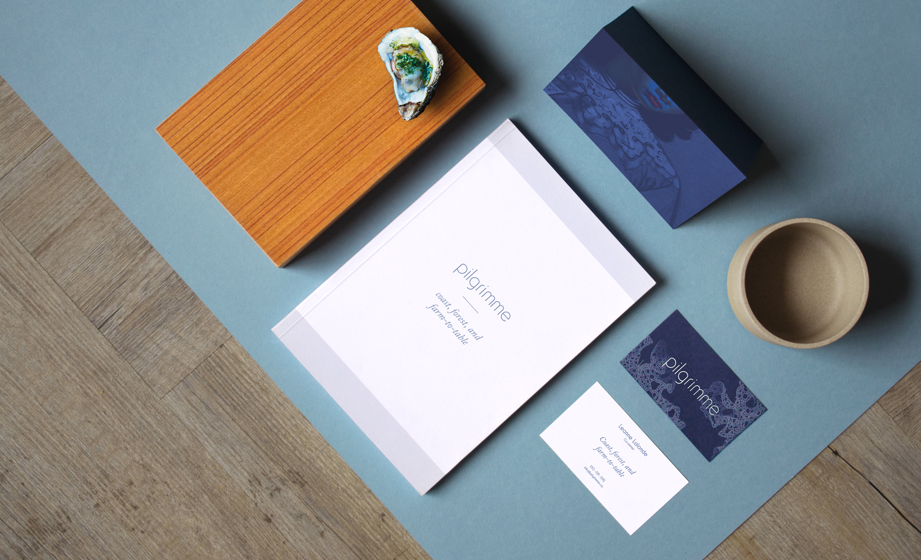
The identity extends across a small suite of printed pieces, with illustration and texture connecting the different formats.
For an island restaurant, the website has a substantial role in helping people imagine the visit. We designed and built a digital home that could carry the setting, the food, and the restaurant’s character before the trip began.
The same visual language continued into collateral and small applications, with room for local craft and the pleasures of an object made with care. Over the years, we saw the work evolve alongside Jesse and Mel as they built their life and family. The brand could stay connected to its source while the restaurant kept changing.
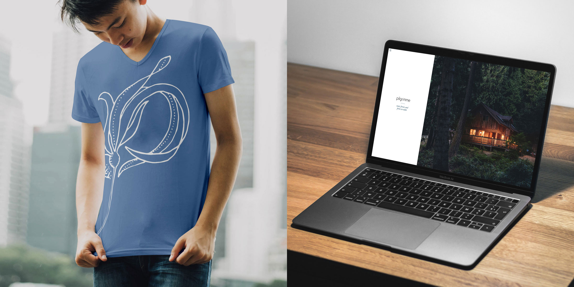
The website and shirt applications carry the same quiet identity into very different encounters with the restaurant.
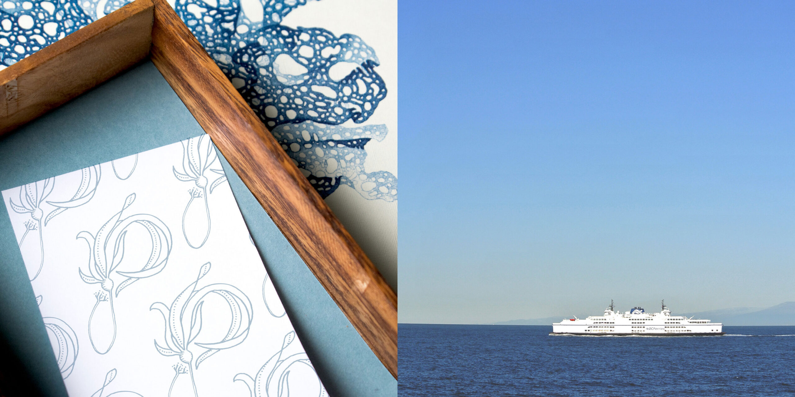
Small printed details could keep a connection to the island, shown here alongside the ferry journey that was part of a visit.
Pilgrimme has since closed. We hold this as a legacy project, with a great deal of affection for the people and place behind it. The restaurant was particular, and the creative work had the pleasure of becoming particular alongside it.
We are still proud of how the identity found its shape through what was already there: a carved sign, a chef’s history, a coastal ingredient, and an island. It is work we return to when we think about the care involved in helping a place express itself.

Harc didn’t offer a ‘solution in a box’—they helped us focus and come to our own realizations.


Harc will inspire you to think and dream, and the end result will be better than you imagined.


Harc brought forward beautiful, well-researched ideas, resulting in a brand I’m proud to share with the world.


Harc is a great partner for organizations who not only want to be understood, but also to better understand themselves.


The Harc team is intuitive, creative, and strategic while infusing magic and delight into everything they do.


Parker and Jarren became part of our team, showing up in a meaningful way and bringing our story to life through deep understanding.


Working with Harc was like going on a guided journey into understanding and expressing who we are as a company.


Harc’s coaching has helped me see and design my own methods and practices to be successful with a clearer, more confident approach. As a result, I am engaging both my business and my life at a higher level.

A clear brief is welcome. A gloriously untidy first thought is welcome too. Tell us what you’re making, changing or trying to say. We’ll help work out what happens next.