Case Study
Metlakatla CEM
We helped Metlakatla CEM turn complex research into a vibrant, navigable website, with the Nation’s relationships, voices, and priorities shaping the experience.
We helped Metlakatla CEM turn complex research into a vibrant, navigable website, with the Nation’s relationships, voices, and priorities shaping the experience.
Metlakatla’s Cumulative Effects Management program brings together knowledge about the lands, waters, and lives of the Nation. There is a great deal of research behind that work. The website needed to make it understandable and meaningful to the community whose future it concerns.
We began by listening to Nation Members and the CEM team. People spoke with pride about stewardship carried across generations, and about the connections between natural resources, language, culture, and community. Those conversations gave us a clear creative direction: bring those relationships into the experience of the website.
Communications Manager Jane Banning described what changed when community voices could shape the direction: “This approach allowed for more authentic collaboration, where voices from the community were integral to shaping the project’s direction. As a result, the project outcomes were not only more meaningful but also aligned with the community’s needs and values.” Those contributions gave the website a responsibility to the

The coastal setting places the program’s work within the lands and waters it concerns.
We worked with the team to move the presentation beyond an academic reading of the program. Community photographs, more direct language, and a clearer structure could help someone recognize what the work meant before encountering its full technical depth. The research would still be there, with a more welcoming way into it.
We translated that direction into a vivid green visual world, with broad organic forms, strong typography, and photographs carrying a sense of place. The resulting design had character. It could look and feel like a living part of the program, with people and their relationships visible alongside the science.
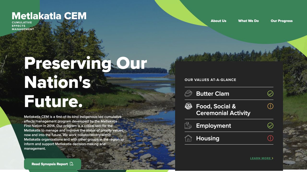
The homepage puts the landscape and the program’s priorities into the same view, with an at-a-glance panel providing a route into the detail.
We reorganized the site around simpler routes into the program, its work, and its progress. That meant working with the team to picture how someone might arrive, what would help them get their bearings, and where the deeper information should live.
Katerina described how the picture took shape: “At many points throughout the project, they also helped us visualize what we wanted in a new website by asking thoughtful questions, by taking the time to get to know our team, and by sharing their expertise and perspectives. It truly felt like a collaborative project.”
We gave overviews, indicators, status information, and deeper explanations consistent places to live. A visitor could understand why something mattered, then choose how far to go. The team’s knowledge of the program and our work on the structure could meet in an interface people could actually use.
That balance let us keep the depth of the work in view without asking everyone to begin with a technical report. The visual design and information structure supported one another: recognizable patterns, useful summaries, and room for the detail that gives the program its substance.
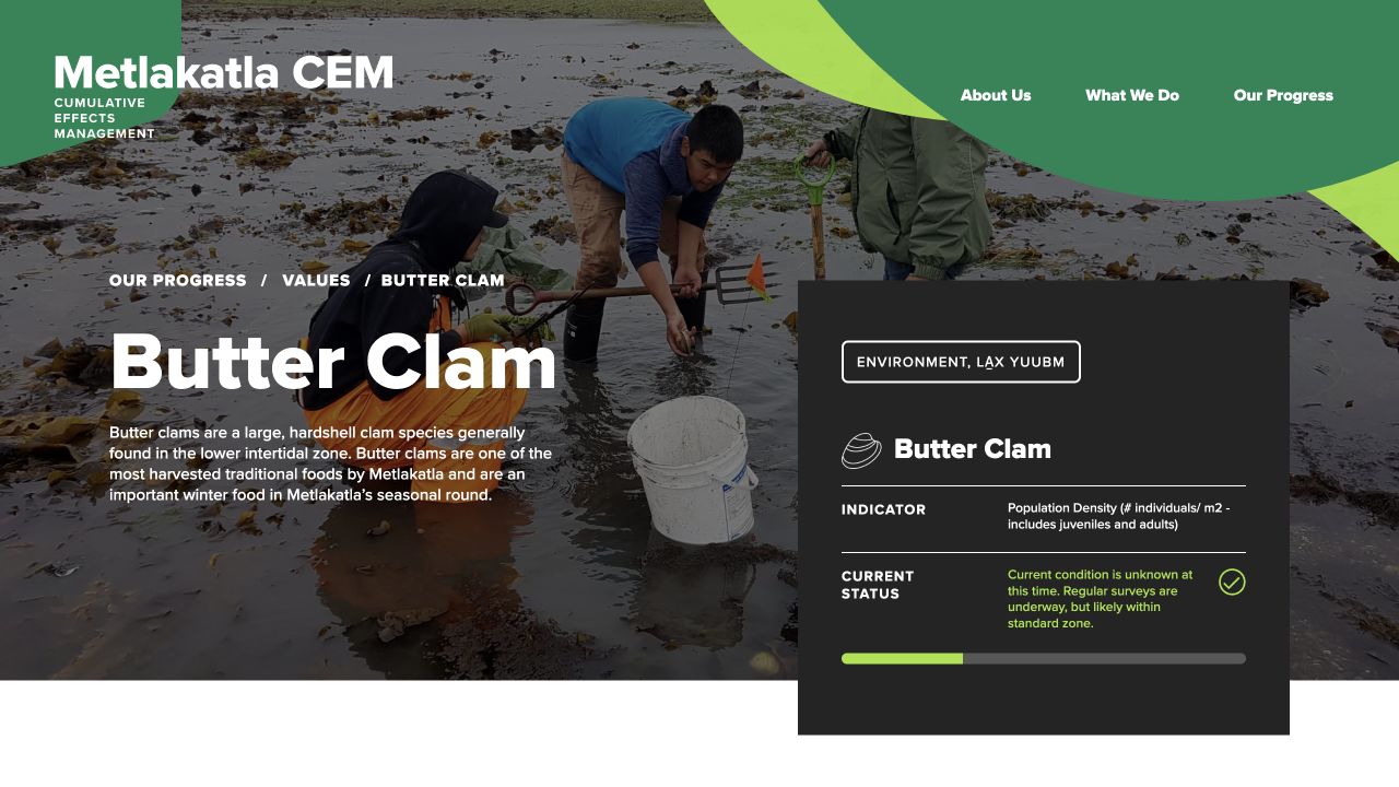
A value detail page connects an everyday relationship with the land to the program’s indicators and status information.
We carried the direction through design and development, then spent time helping the team navigate and maintain what we had built. Jean Nelson’s feedback followed that thread all the way through: “They really took the time to listen to our ideas and once the project was done, they made sure we were comfortable in navigating our project.” The people whose knowledge had shaped the website could feel more at home using it.
Katerina named the public-facing payoff, too: “We feel so grateful to have worked with Parker and Jarren on this project and are so excited to have a website that we are proud to share with our community.” That pride matters in a site whose subject is the community’s own future.
We are proud of how much more of the team’s character could come through in the final experience. The site holds serious information, and it has life in it. It gave the team a more welcoming way to share its work, with the depth still there for people who wanted to look closer.

Harc didn’t offer a ‘solution in a box’—they helped us focus and come to our own realizations.


Harc will inspire you to think and dream, and the end result will be better than you imagined.


Harc brought forward beautiful, well-researched ideas, resulting in a brand I’m proud to share with the world.


Harc is a great partner for organizations who not only want to be understood, but also to better understand themselves.


The Harc team is intuitive, creative, and strategic while infusing magic and delight into everything they do.


Parker and Jarren became part of our team, showing up in a meaningful way and bringing our story to life through deep understanding.


Working with Harc was like going on a guided journey into understanding and expressing who we are as a company.


Harc’s coaching has helped me see and design my own methods and practices to be successful with a clearer, more confident approach. As a result, I am engaging both my business and my life at a higher level.

A clear brief is welcome. A gloriously untidy first thought is welcome too. Tell us what you’re making, changing or trying to say. We’ll help work out what happens next.