Case Study
Rainbow Railroad
Over several years on retainer, we helped Rainbow Railroad expand an existing identity across publications, presentations, campaigns, and everyday communications.
Over several years on retainer, we helped Rainbow Railroad expand an existing identity across publications, presentations, campaigns, and everyday communications.
Rainbow Railroad’s work asks a great deal of its communications. The organization supports LGBTQI+ people facing persecution, and it needs to speak across research, advocacy, fundraising, public events, and the practical business of keeping people informed.
We worked with its team on retainer over several years, making publications, keynote and presentation materials, social graphics, invitations, and campaign pieces. It was a relationship built through the work itself, as each new brief showed us something about what the team needed next.
Rainbow Railroad had an existing brand foundation. As we applied it across different formats, we could see where it needed more flexibility. A system that works in one context can become restrictive when it has to carry a detailed report, an event invitation, and a presentation in quick succession.
We developed the brand from within. Small adjustments to the logo and logotype, the palette, and the way the parts worked together gave the team a wider range of expression while preserving the identity people knew. Dane Bland, then Head of Development, valued that attention to “how we can use our collective efforts to build our brand on an ongoing basis.” Each brief became a chance to make the system more useful for the ones that would follow.
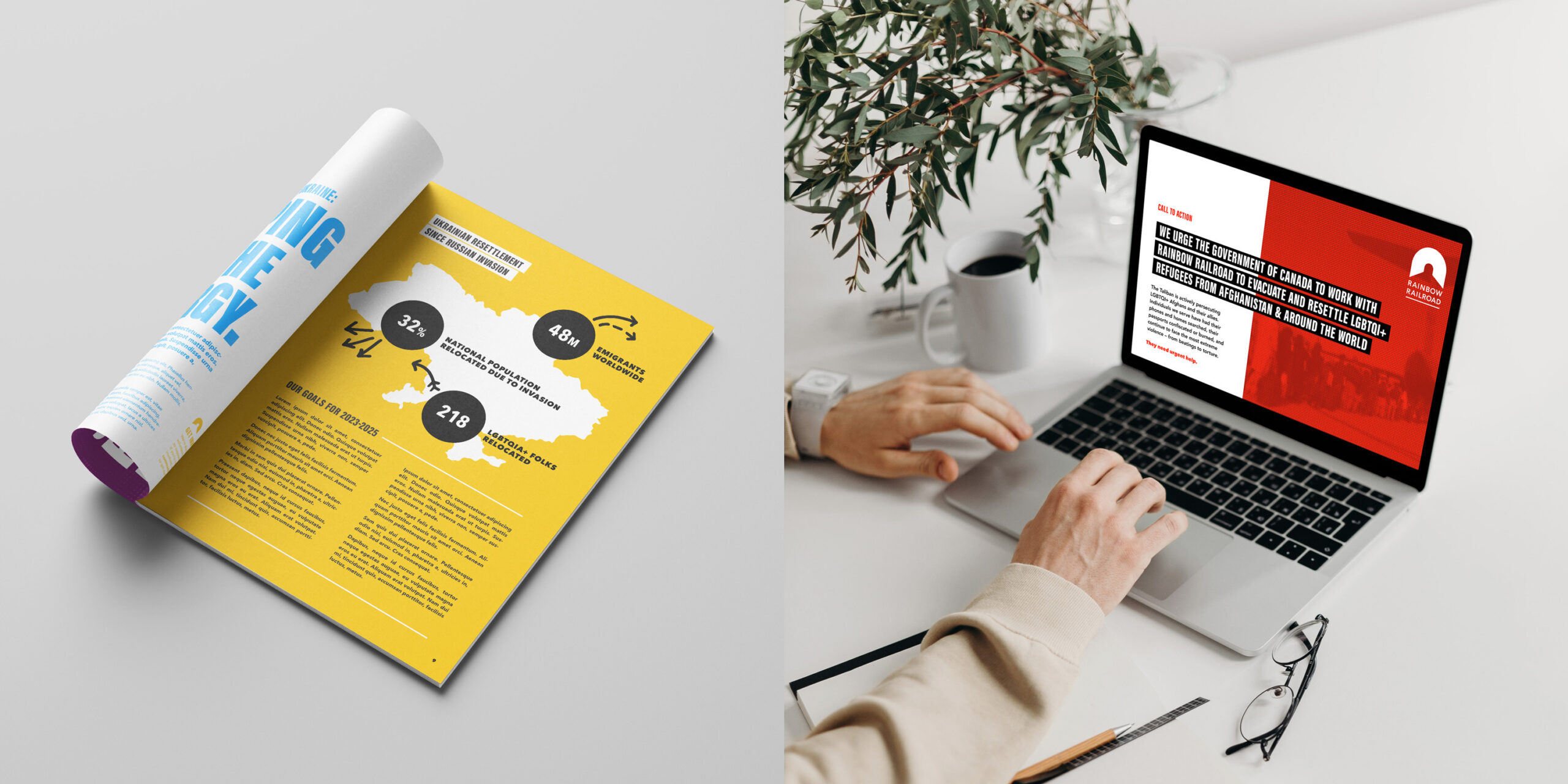
Publications and presentations gave us recurring opportunities to make the existing brand clearer, more flexible, and easier to use.
A publication about persecution and displacement needs care in how it handles information and images. An event can make more room for celebration and public solidarity. We worked with the communications team to give those different purposes their own expression within a connected visual system.
That meant paying attention to structure as well as style: how a report guides someone through the material, how a presentation supports a speaker, and how a campaign can be recognized across different places. The design needed to help people stay with the organization’s message.
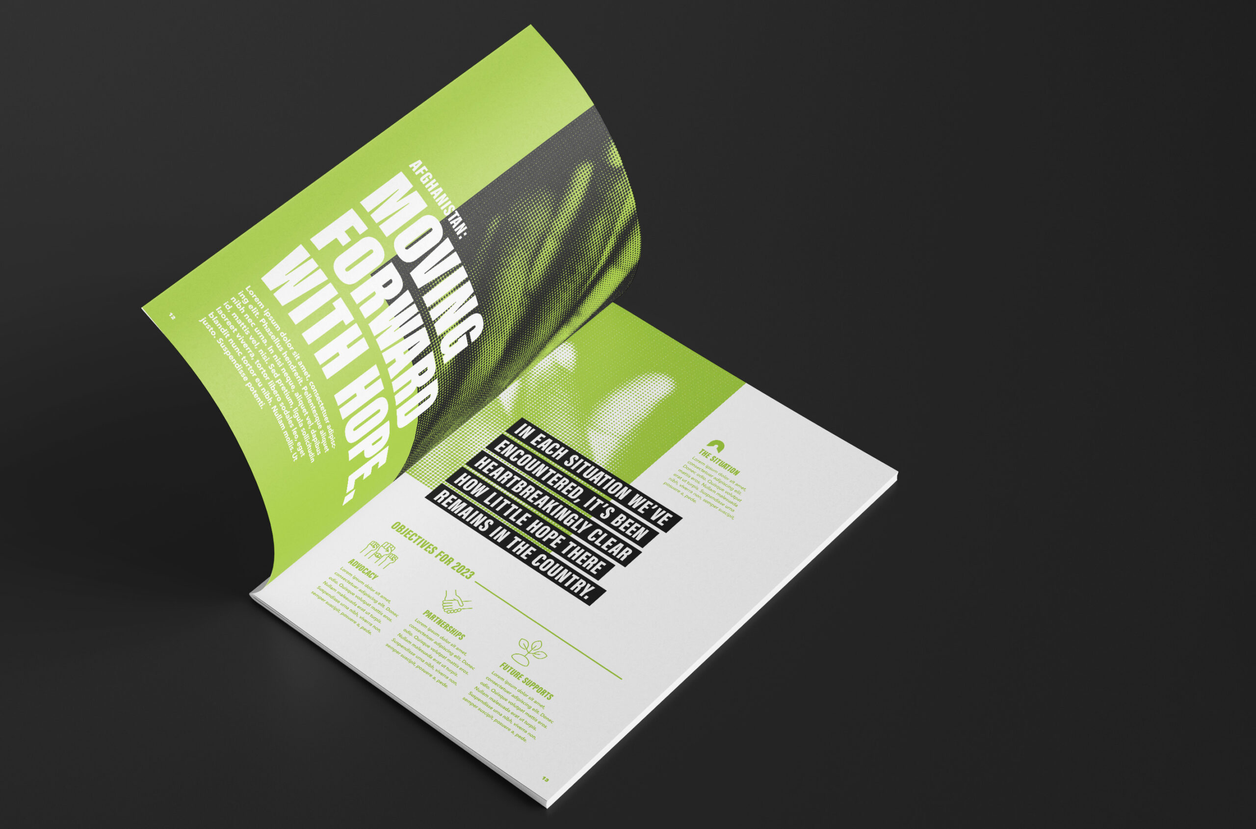
The publication design gives substantial information a clear visual structure within the evolving brand system.
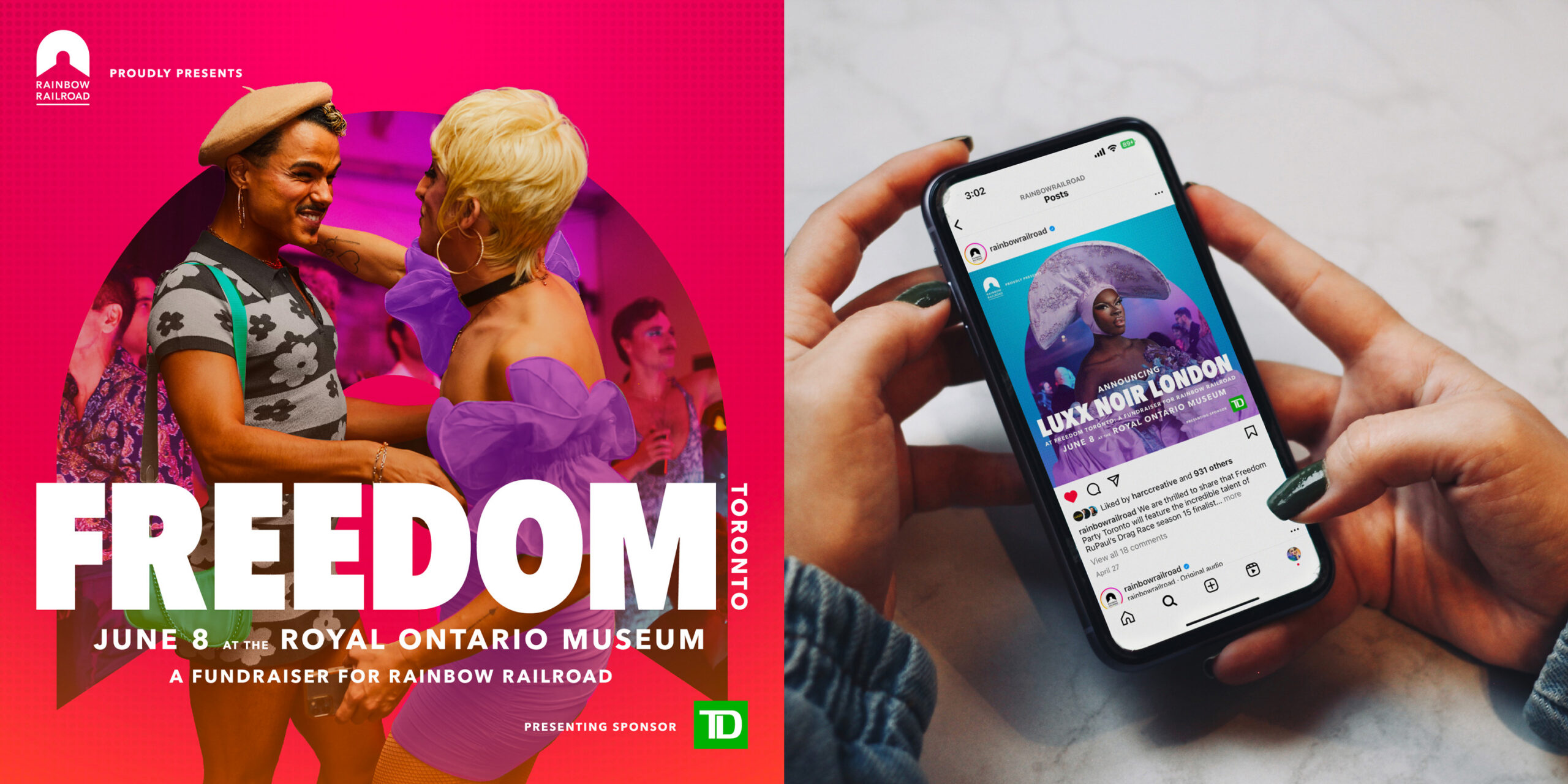
The Freedom event presentation connects a campaign’s printed expression with the same invitation on social media.
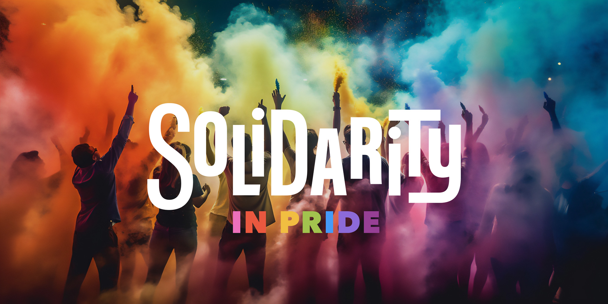
The Solidarity in Pride artwork gives the event communications a more expressive register.
We worked alongside Rainbow Railroad’s designers and communications team, bringing creative direction and hands-on production into the same relationship. When a project needed specialist support, we brought in and guided collaborators in areas such as motion, print, and video.
That continuity let knowledge build. We could understand where a new piece sat in the larger body of work, carry useful decisions forward, and keep refining the system as it met different demands. The next brief arrived with some shared ground already beneath it.
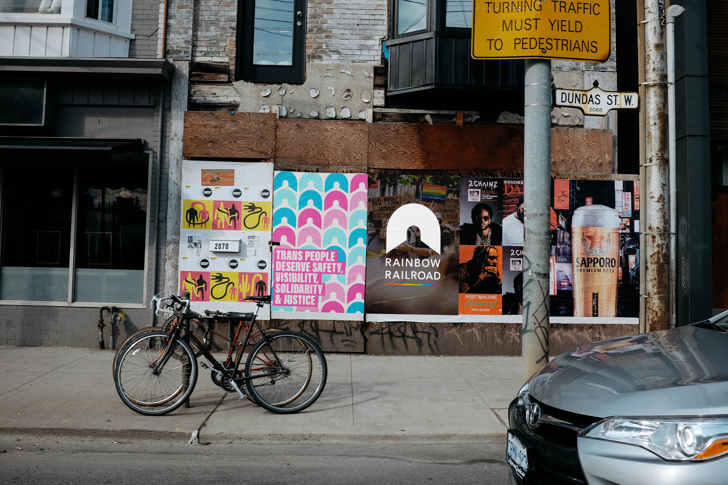
A public-poster presentation shows another scale for the evolving identity and its campaign language.
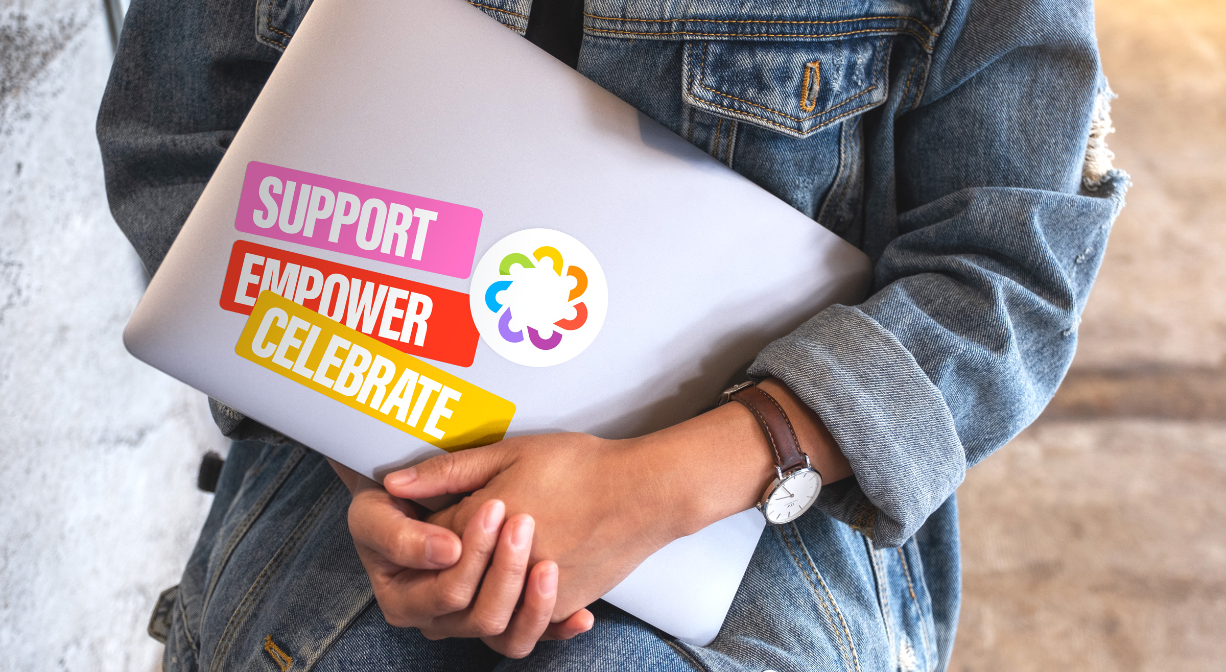
The brand can also work in a small, direct expression of support, as this sticker application shows.
Dane also noticed what happened in the smaller decisions: “Harc sweats the details; they do absolutely everything to ensure that every little thing is thought of.” A report’s hierarchy, a presentation’s pacing, an invitation’s tone: those choices accumulate. Over several years, we could keep connecting them, with a growing understanding of the people making the work and the people it needed to reach.
For Rainbow Railroad, we helped an existing identity grow into more of the work the organization was doing. We are proud of the publications and campaigns, and of the ongoing care in the details that connected them.

Harc didn’t offer a ‘solution in a box’—they helped us focus and come to our own realizations.


Harc will inspire you to think and dream, and the end result will be better than you imagined.


Harc brought forward beautiful, well-researched ideas, resulting in a brand I’m proud to share with the world.


Harc is a great partner for organizations who not only want to be understood, but also to better understand themselves.


The Harc team is intuitive, creative, and strategic while infusing magic and delight into everything they do.


Parker and Jarren became part of our team, showing up in a meaningful way and bringing our story to life through deep understanding.


Working with Harc was like going on a guided journey into understanding and expressing who we are as a company.


Harc’s coaching has helped me see and design my own methods and practices to be successful with a clearer, more confident approach. As a result, I am engaging both my business and my life at a higher level.

A clear brief is welcome. A gloriously untidy first thought is welcome too. Tell us what you’re making, changing or trying to say. We’ll help work out what happens next.