Case Study
Queer Aging BC
A community-led naming conversation became Queer Aging BC, with a vivid visual identity that makes space for the life, history, and possibility in those words.
A community-led naming conversation became Queer Aging BC, with a vivid visual identity that makes space for the life, history, and possibility in those words.
The community now known as Queer Aging BC was already doing work that its previous name struggled to hold. Explaining the organization too often began with explaining what the name did and did not mean. That is a lot of preliminary conversation before getting to the thing people actually came for.
We began by asking whether a new name was needed at all. Through interviews, focus groups, and conversations about identity and belonging, we explored what people understood the work to be and what kind of language could carry it more fully.
The word came up unprompted, again and again. People were already using it to describe the community, its work, and the wider movement around queer aging. There was recognition in that language. There was also history.
For some people, queer carries the memory of an insult. For others, it has become a word of connection and pride. Often those experiences live in the same person. As we developed the naming direction, we needed to stay with that complexity and make room for people to say what the word brought up.
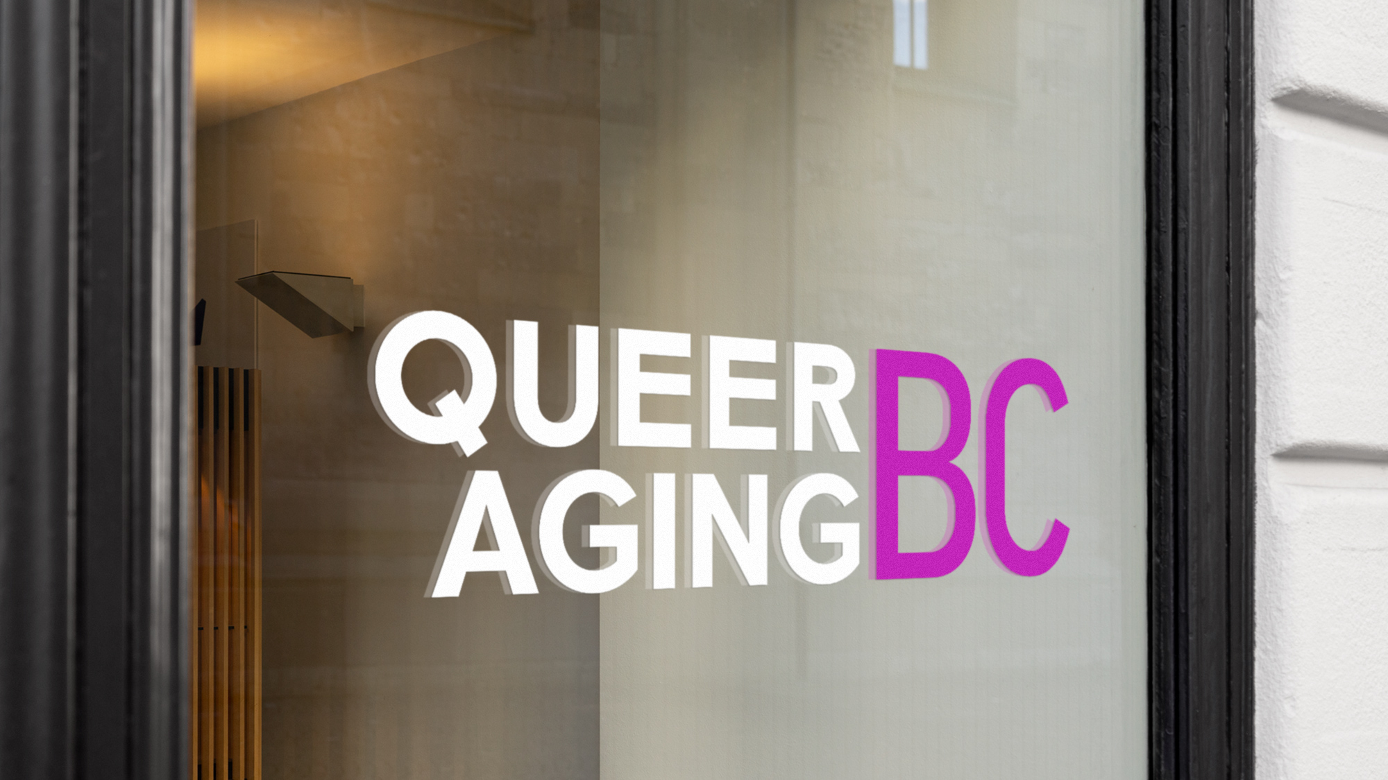
The proposed name, shown here in a window application, gives the organization a direct way to say who the work is for and where it is rooted.
We brought the direction back through further focus groups and presented it at the organization’s AGM, where we helped hold the conversation that followed. Indira, at Queer Aging BC, described what that made possible: “Your ability to listen has allowed us to walk through a sticky situation related to the name change.” The name needed to be considered in the company of the people it would represent. Its emotional charge was part of that consideration.
Queer Aging BC gave the organization a clear structure. Queer connects it with language already alive in its community. Aging describes a lived process, with room for people at different points in their lives. BC makes the provincial reach explicit. Together, the words could hold more of the work without requiring a paragraph of explanation.
Once the naming direction was in place, we developed a visual identity with colour, presence, and a willingness to take up space. The portrait compositions bring people into the centre of the brand. Arches and circles give those portraits a shared visual rhythm, while vivid colour against black makes the whole system feel energetic and immediate.
We wanted an expression that could hold the seriousness of dignity and belonging alongside the pleasure of being visible. You can care deeply about aging and still have a magnificent colour palette. The work had room for both.
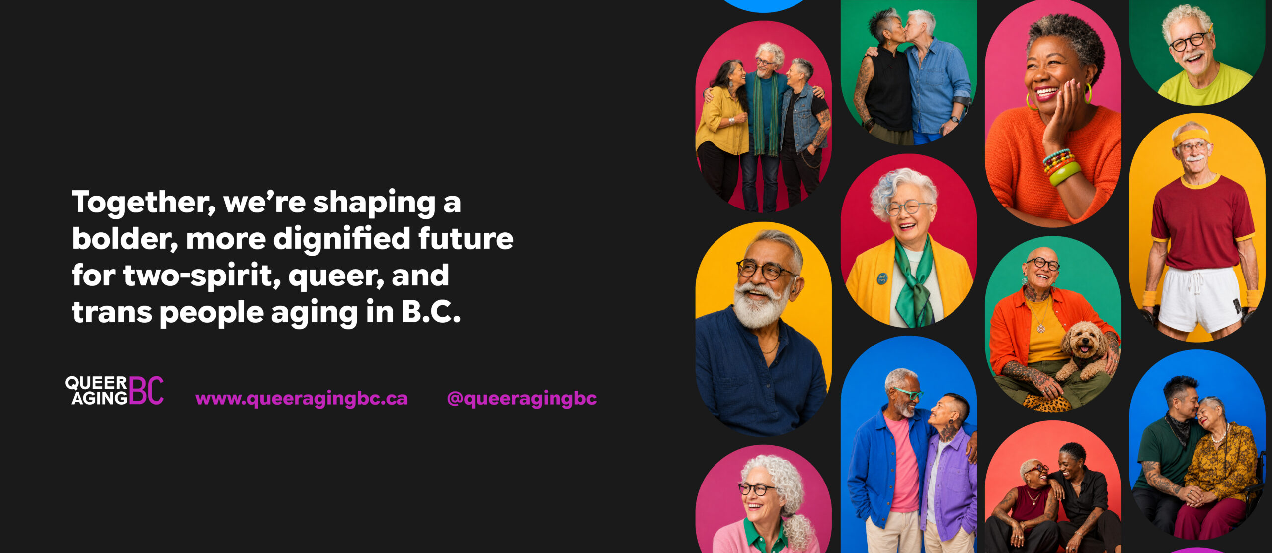
The identity brings the name, a collective statement, and vivid portrait compositions into one shared visual world.
The wordmark stays direct in a small, everyday application, with colour giving it a distinctive presence.
We carried the identity into social templates and brand applications, giving the team a practical set of pieces for introducing the organization’s next chapter. The social system can hold an announcement, a community invitation, a quotation, or a face, and still feel like part of the same conversation.

The social system gives community invitations, quotations, and announcements a consistent home without making every post identical.

A transit-ad mockup shows how the brand can meet a wider audience with a clear name and an unmistakably lively presence.
What we value in this project is how closely the result is tied to the conversations that shaped it. The community brought language with meaning and history. We helped examine it, make the decision understandable, and give it a visual expression the organization could use. There is warmth in that work, and there is some courage. We are glad to have been part of it.

Harc didn’t offer a ‘solution in a box’—they helped us focus and come to our own realizations.


Harc will inspire you to think and dream, and the end result will be better than you imagined.


Harc brought forward beautiful, well-researched ideas, resulting in a brand I’m proud to share with the world.


Harc is a great partner for organizations who not only want to be understood, but also to better understand themselves.


The Harc team is intuitive, creative, and strategic while infusing magic and delight into everything they do.


Parker and Jarren became part of our team, showing up in a meaningful way and bringing our story to life through deep understanding.


Working with Harc was like going on a guided journey into understanding and expressing who we are as a company.


Harc’s coaching has helped me see and design my own methods and practices to be successful with a clearer, more confident approach. As a result, I am engaging both my business and my life at a higher level.

A clear brief is welcome. A gloriously untidy first thought is welcome too. Tell us what you’re making, changing or trying to say. We’ll help work out what happens next.