Case Study
Wavefront Centre
A move into a new home became a naming, identity, and digital project shaped by Deaf, DeafBlind, and hard-of-hearing community perspectives.
A move into a new home became a naming, identity, and digital project shaped by Deaf, DeafBlind, and hard-of-hearing community perspectives.
When the organization then known as the Western Institute for the Deaf and Hard of Hearing prepared to move into a new home, there was an opportunity to reconsider how it introduced itself. The facility would expand what was possible. Its name and identity needed room to grow with that change.
There was also a long history of connection to respect. People had relationships with the organization, its services, and its familiar acronym. We wanted to understand what the change could make possible and what people needed to recognize in it.
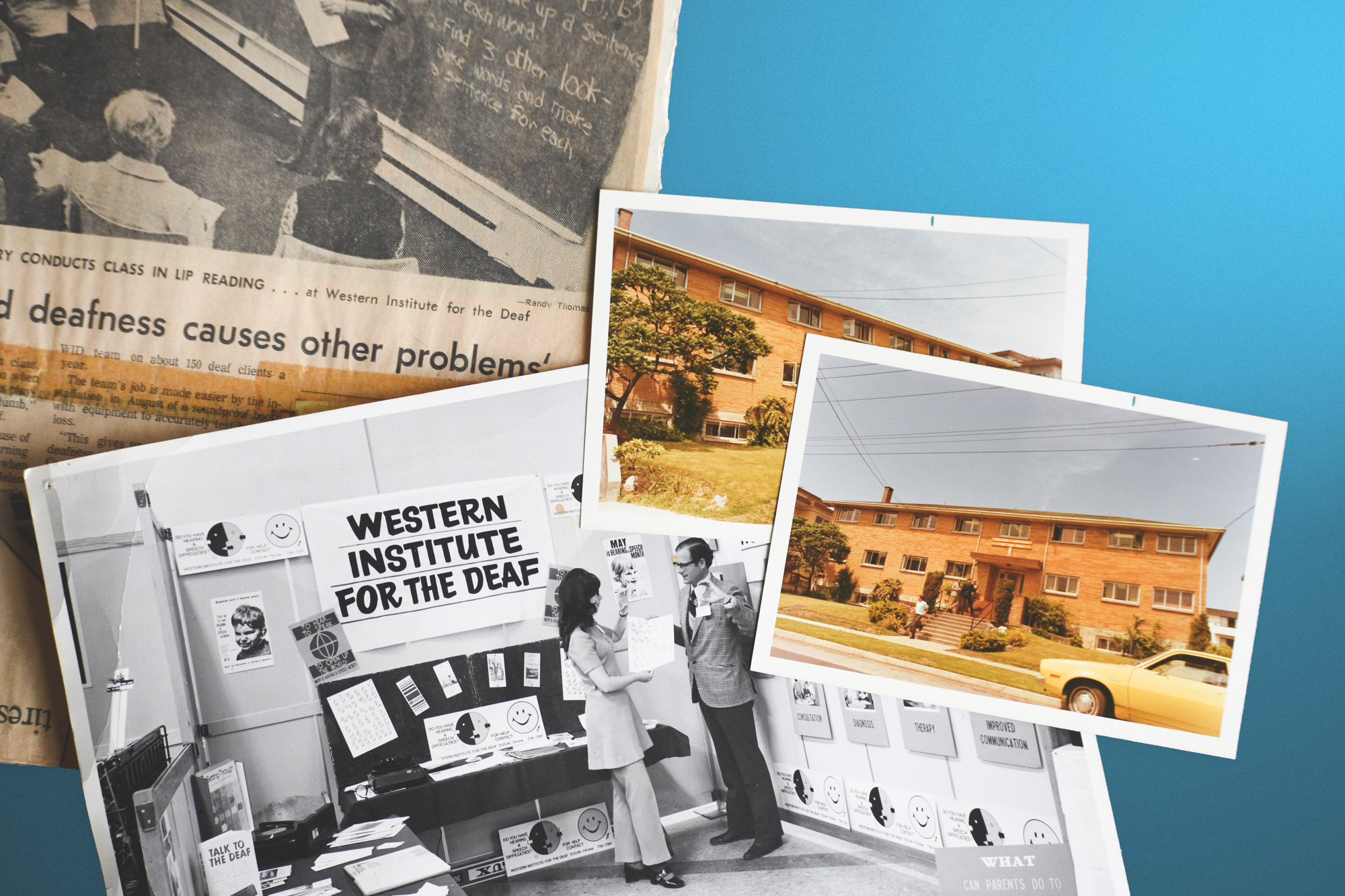
The organization’s archives helped us understand the history and continuity people would carry into a new name and a new home.
We worked with the team to build a community-engagement process around the naming and creative work. Focus groups, questionnaires, interviews, and conversations with clients, staff, family members, and related organizations gave us different ways into the question. We also spent time in the archives.
The emerging direction moved toward communication accessibility as a shared ambition. Wavefront gave that ambition a name with motion and possibility in it. We worked with two Deaf ASL interpreters on a sign for the new name, making the naming work broader than its written English form.
We began the identity around a W form, keeping a connection with the familiar initial of the previous acronym. An early direction drew on a sound wave and the visual language of an audiogram. It made sense to us as designers. Community feedback gave us a more complicated picture.
For some Deaf participants, the audiogram carried difficult associations with clinical experiences. That feedback changed the design. Working further with community members, we reshaped the W into something less clinical and more suggestive of a mountain, with a connection to the geography around Vancouver.
Those conversations materially improved the work. We could bring a direction, hear how it landed, and keep making. The resulting identity was reviewed and approved through community town halls, with the people who would use the name involved in how it took shape.
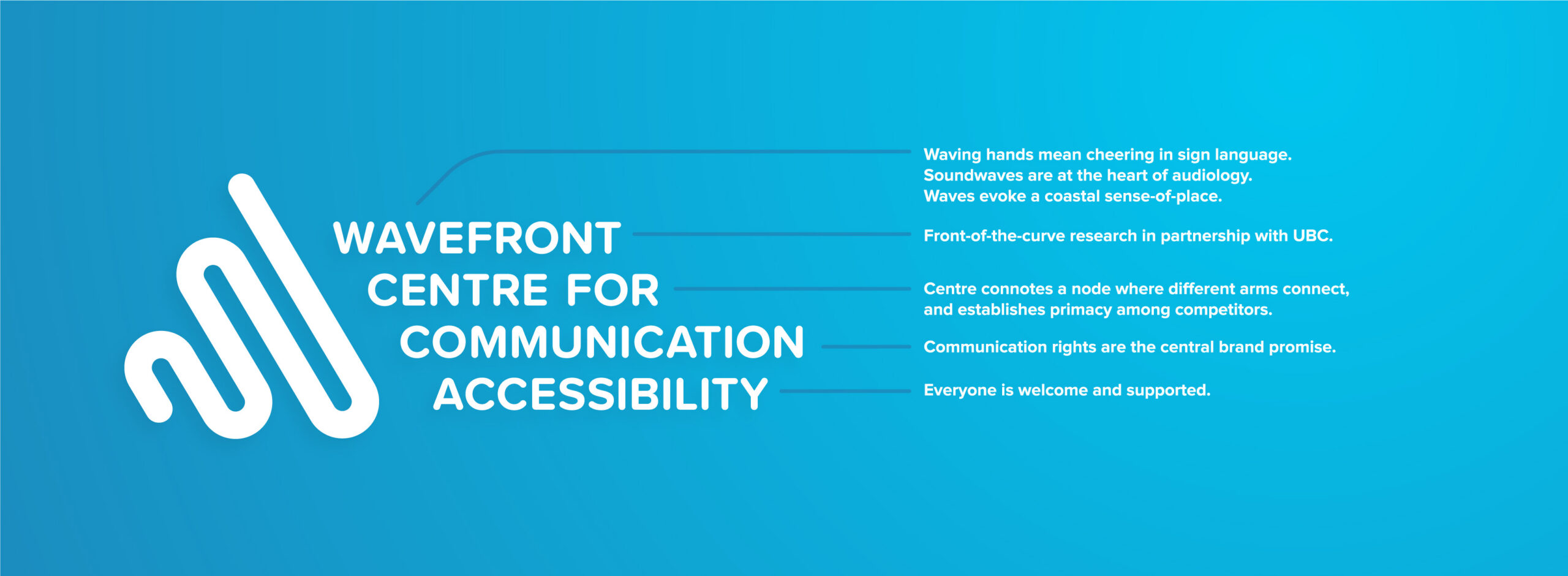
The final W mark keeps movement and a connection to place in a form shaped through community review.
Once the name and visual direction were in place, we carried them through the places people would encounter the organization. A concise palette, approachable typography, photography, and geometric elements gave the system a clear family resemblance across print and digital materials.
We designed signage, wayfinding, printed information, and the website. The work had to connect an announcement about the organization with practical details inside it: recognizing the name, finding a floor, understanding a service, or knowing where to go next.
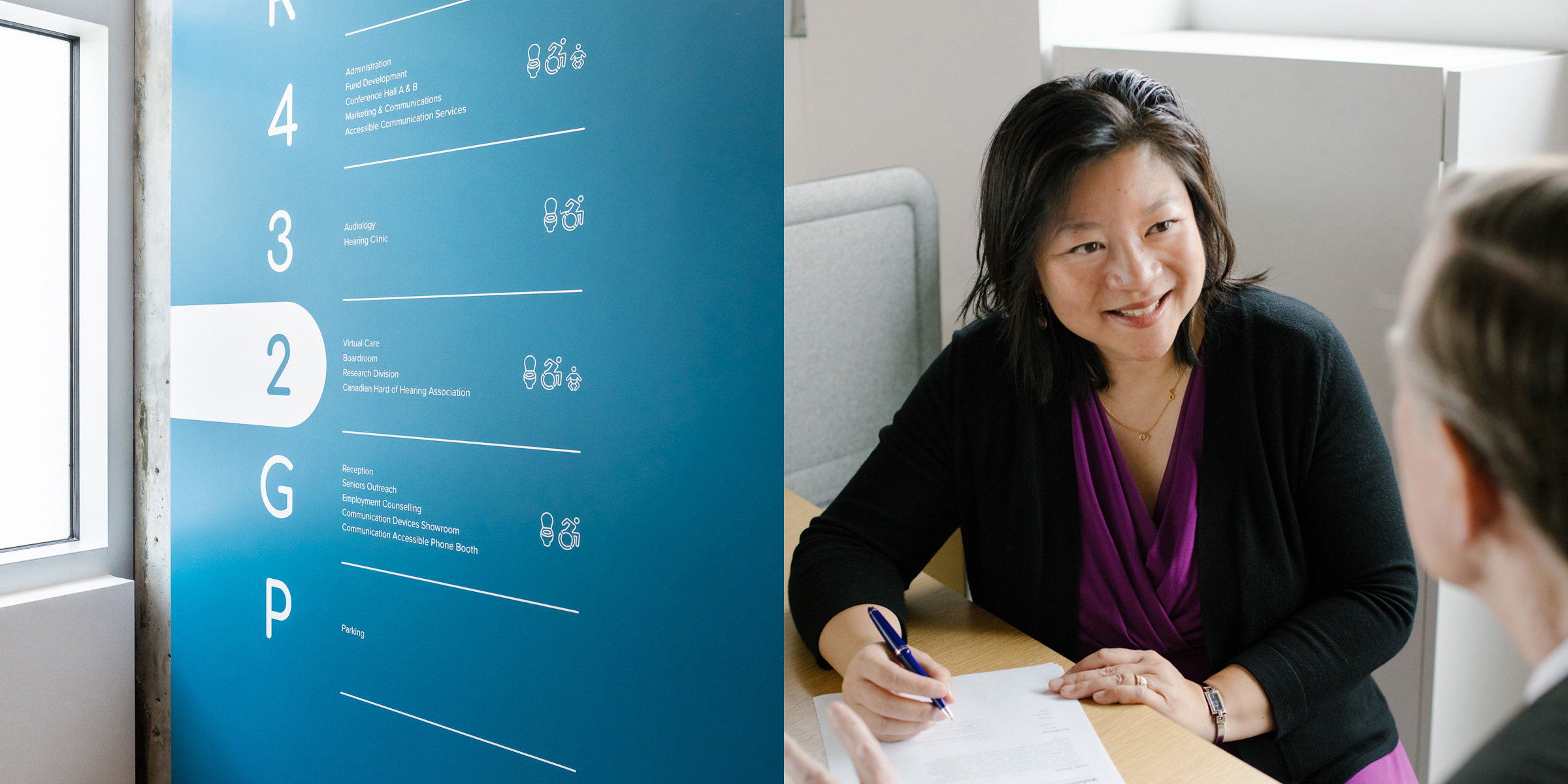
The identity becomes part of navigating the building and meeting the people within it.
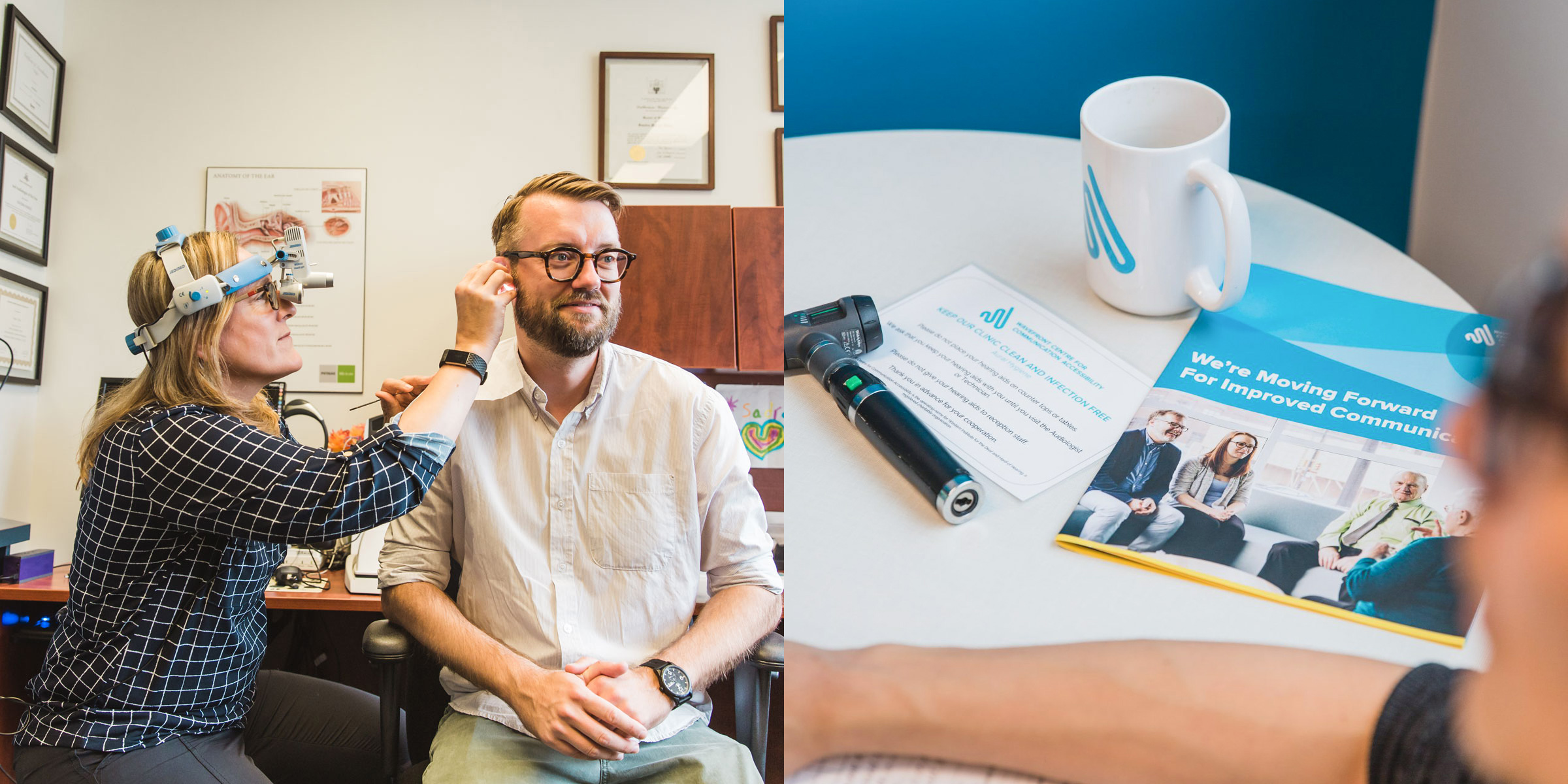
The brand connects clinical services with the information people take into and out of those appointments.
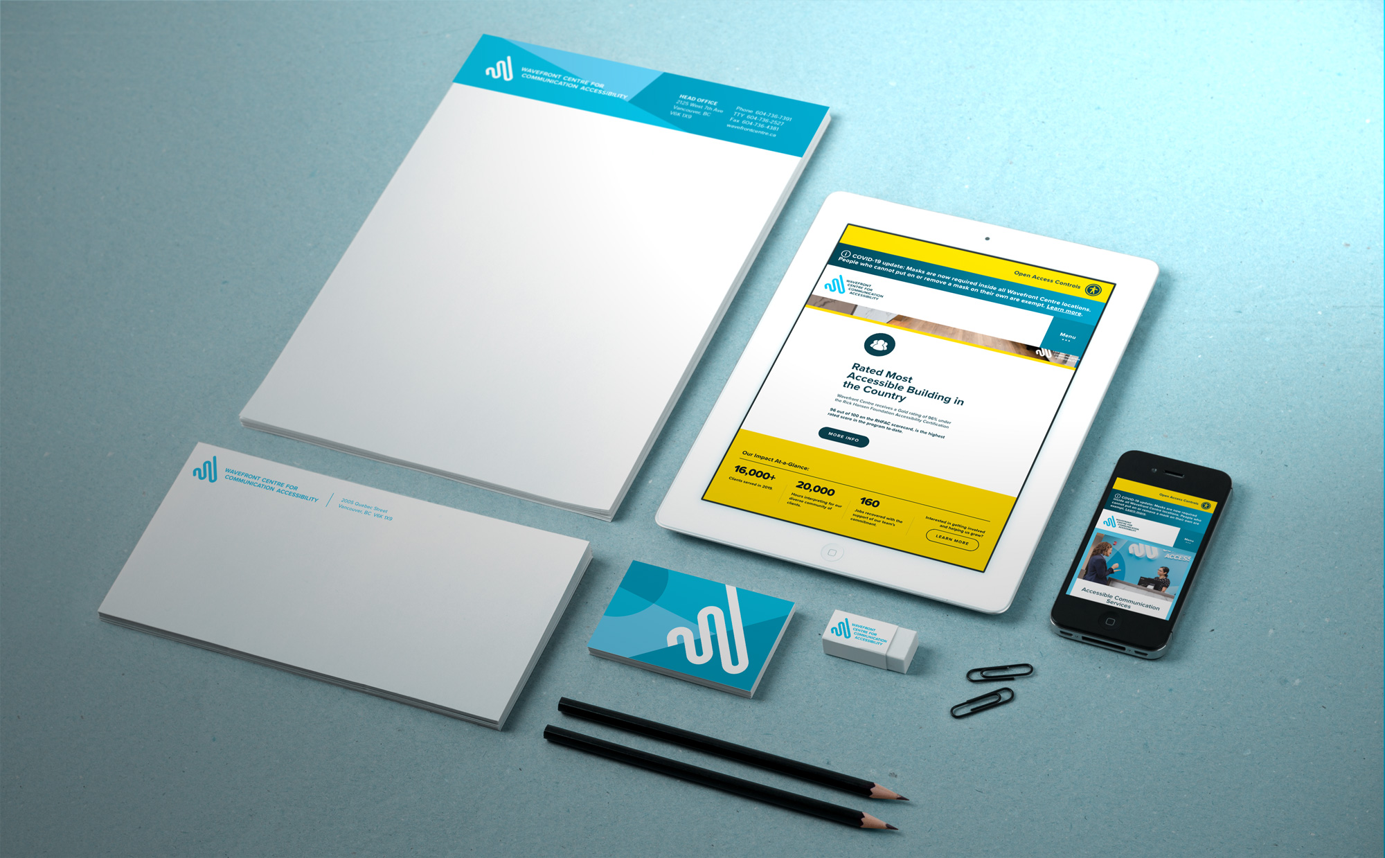
Print and website applications share a visual language, giving the new name continuity across different encounters.
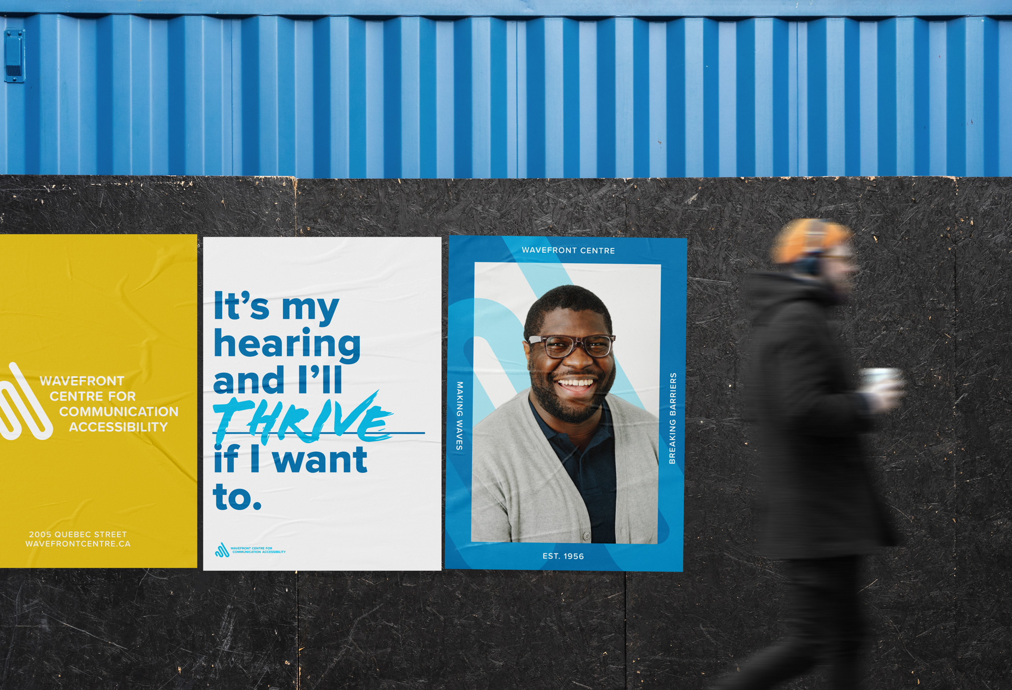
The campaign language brings individual agency into the brand, shown here in a public-poster presentation.
This project stays with us because the community’s participation can be traced into the finished work. It changed the name’s possibilities, broadened how that name could be expressed, and redirected the mark itself. Our responsibility was to keep those contributions present as we developed and implemented the identity.
Wavefront’s new home gave the organization a place to grow. The creative work gave it a connected way to introduce that next chapter, with its community’s experience built into the decisions.

Harc didn’t offer a ‘solution in a box’—they helped us focus and come to our own realizations.


Harc will inspire you to think and dream, and the end result will be better than you imagined.


Harc brought forward beautiful, well-researched ideas, resulting in a brand I’m proud to share with the world.


Harc is a great partner for organizations who not only want to be understood, but also to better understand themselves.


The Harc team is intuitive, creative, and strategic while infusing magic and delight into everything they do.


Parker and Jarren became part of our team, showing up in a meaningful way and bringing our story to life through deep understanding.


Working with Harc was like going on a guided journey into understanding and expressing who we are as a company.


Harc’s coaching has helped me see and design my own methods and practices to be successful with a clearer, more confident approach. As a result, I am engaging both my business and my life at a higher level.

A clear brief is welcome. A gloriously untidy first thought is welcome too. Tell us what you’re making, changing or trying to say. We’ll help work out what happens next.