Case Study
Canucks Autism
Research helped us clarify the decision-making, expand the brief, and bring a more considered identity and digital experience together for Canucks Autism Network.
Research helped us clarify the decision-making, expand the brief, and bring a more considered identity and digital experience together for Canucks Autism Network.
Canucks Autism Network came to us with a website project and a great deal to bring into it. Programs, training, community events, registrations, and the experiences of different audiences were all part of the picture. There were many inputs around the table, and many people with a stake in getting the work right.
The organization’s larger vision helped us find our bearings: people on the autism spectrum being understood, accepted, and supported in community spaces. We wanted the digital experience to connect individual activities with that wider sense of belonging.
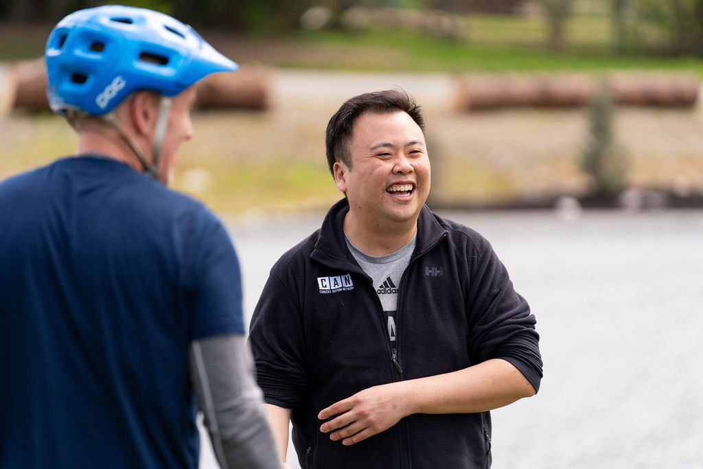
The community’s everyday interactions helped ground a website project with many programs and audiences to consider.
As the project developed, we helped clarify who needed to be involved in decisions and who needed to stay informed. Those are different responsibilities. Making them clearer gave the people carrying the work room to move, while keeping others connected to its direction.
That shift depended on trust, and on making the developing work understandable enough for people to respond. Lindsay Petrie described “thoughtful listening that helped ground the direction of the project.” A more focused working group gave that direction somewhere to land. The research could also show us what the website needed, including things that were not obvious in the original brief.
Through interviews and discovery, accessibility and representation questions surfaced in the visual identity itself. The digital experience would be shaped by those choices everywhere: in the mark, the supporting graphics, and the way the organization appeared to its community.
We opened an identity phase partway through the project. Working closely with the team, we addressed the visual language so it could support the website we were developing and move away from clichéd ideas about autism. We completed that work in time to bring the identity and website together.
The refined identity became part of the website’s foundation, alongside the decisions about structure, language, and access.
We developed the digital strategy around clearer journeys and a more relational way of explaining CAN’s work. Visitors needed to understand what the organization was for, find relevant programs, and know what to do next. Stories and photographs could help communicate the energy people experienced in person.
From there, we carried the direction through user experience design, visual design, and development. The homepage gives the wider vision a prominent place. Program information can become more specific as people move into it. The two levels support each other: a reason to feel connected, and a useful way to act on that connection.
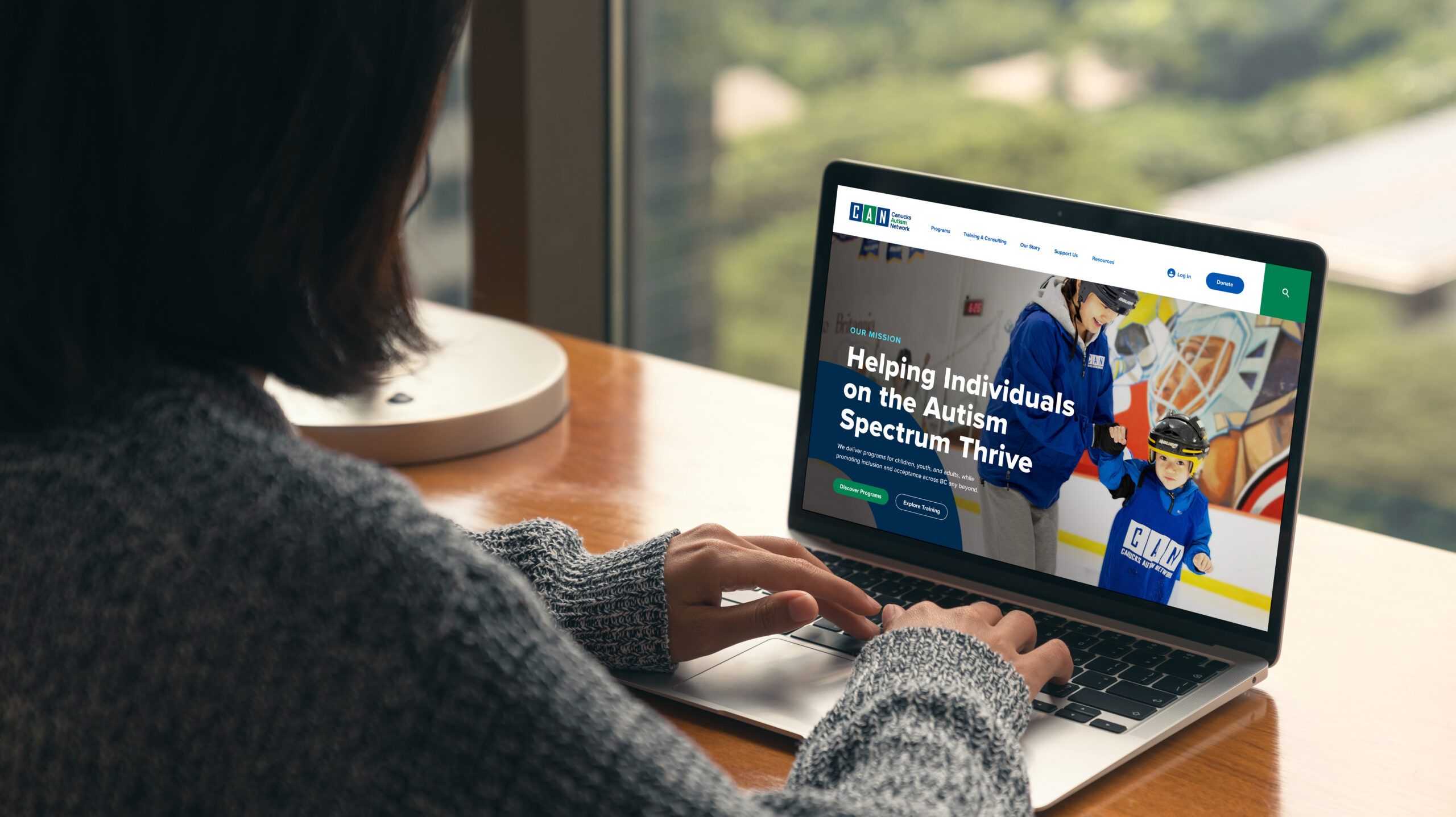
The homepage design brings CAN’s wider vision forward, with community imagery and routes into its work.
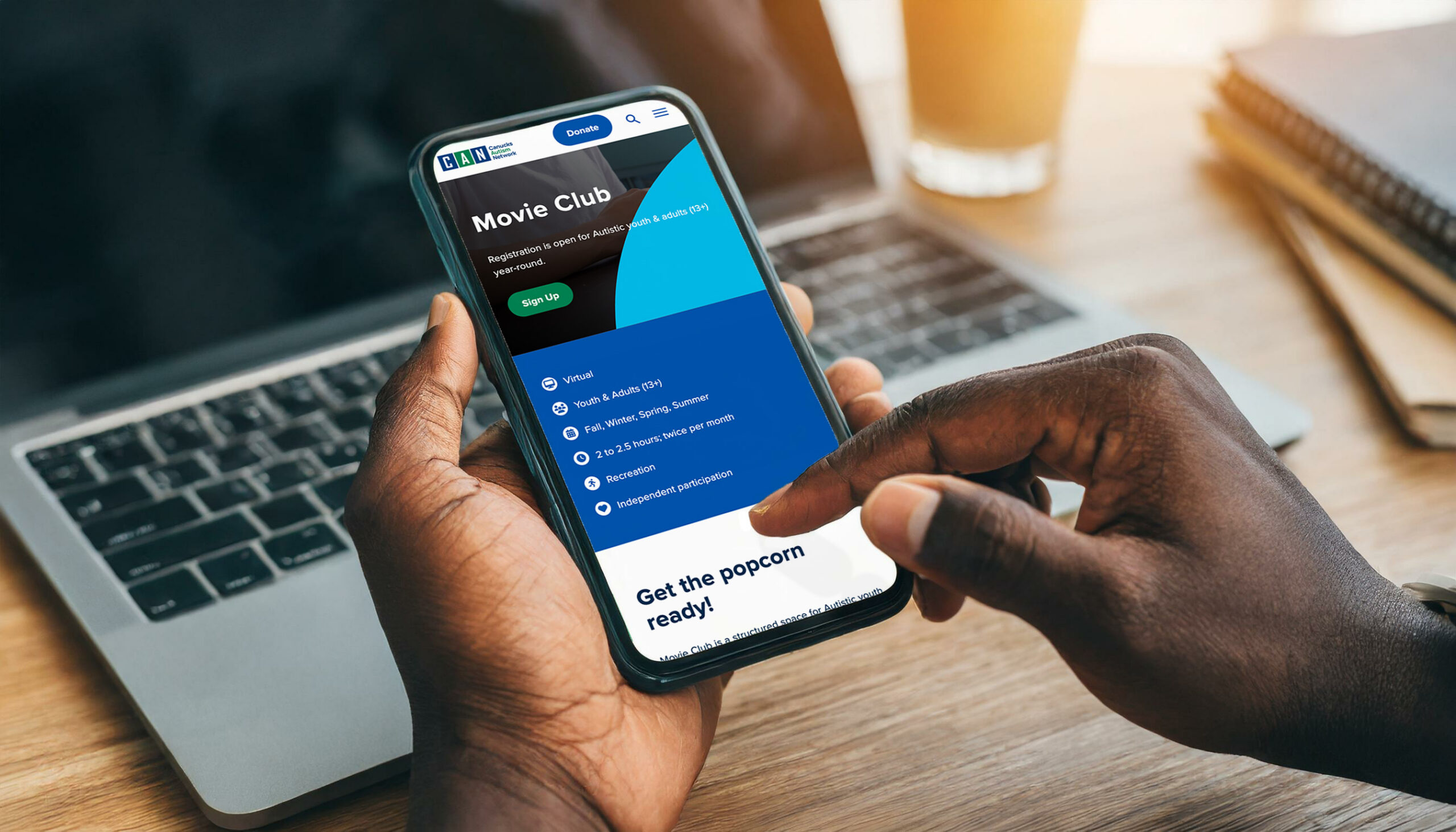
The program-page design brings the experience down to a specific activity, with information and next steps close together.
This work asked us to keep the brief responsive while staying responsible for delivery. We could see something in the research that needed attention, talk it through with the team, and bring the additional creative work into the finished website.
We are proud of how those pieces came together. The clearer working relationships helped the project move. The identity work gave the interface a more considered foundation. The website gave the organization a place to make its breadth and warmth easier to understand. Each part made more sense because we stayed close to the others.

Harc didn’t offer a ‘solution in a box’—they helped us focus and come to our own realizations.


Harc will inspire you to think and dream, and the end result will be better than you imagined.


Harc brought forward beautiful, well-researched ideas, resulting in a brand I’m proud to share with the world.


Harc is a great partner for organizations who not only want to be understood, but also to better understand themselves.


The Harc team is intuitive, creative, and strategic while infusing magic and delight into everything they do.


Parker and Jarren became part of our team, showing up in a meaningful way and bringing our story to life through deep understanding.


Working with Harc was like going on a guided journey into understanding and expressing who we are as a company.


Harc’s coaching has helped me see and design my own methods and practices to be successful with a clearer, more confident approach. As a result, I am engaging both my business and my life at a higher level.

A clear brief is welcome. A gloriously untidy first thought is welcome too. Tell us what you’re making, changing or trying to say. We’ll help work out what happens next.