Case Study
OVMA
Research, shared values, and a circular world of animals helped us give OVMA an identity that reflects the community its members were becoming.
Research, shared values, and a circular world of animals helped us give OVMA an identity that reflects the community its members were becoming.
The Ontario Veterinary Medical Association had a long history of supporting veterinarians through education, advocacy, and the practical demands of the profession. Its community was changing, too. The people entering veterinary medicine, and the kinds of support they needed from one another, were broader than the picture the existing brand conveyed.
When OVMA invited us in, the veterinary sector was also carrying the strain of the pandemic and serious concerns about mental health. There was a lot to understand before drawing anything. We wanted the finished identity to feel connected to the people doing the work, including the parts of their experience that a professional association might not always make visible.
We spoke with leadership, board members, veterinary professionals, supporting staff, and sister organizations. We worked alongside an equity, diversity, and inclusion partner, held focus groups and interviews, and spent time at OVMA’s conference. Clinic visits and informal conversations helped us understand how the organization felt beyond its official descriptions.
There were many inputs, and they did not all say the same thing. Our job was to find the patterns, bring them back clearly, and help the executive team make decisions about where the brand should go. The values that emerged gave us something substantial to draw from, and the team something to steer by.
John Stevens, OVMA’s CEO, described the scale of that discovery:
“A big part of this project was not about our logo or brand, but a deep exploration of who we are as an organization and as human beings who engage with and value the work that we do. Harc explored all aspects of the association and what drives those in our community.”
That understanding could travel back into the organization as well as out into a new identity. As John put it, “with core values of OVMA, we can share who and what we are”. The values gave the team language for something they could recognize in themselves. Our next task was to make that recognition visible.

The values became part of the brand’s everyday expression, shown here on a conference-lanyard design alongside the new identity.
In the research, the idea of One Health helped something click for us: animal health exists within relationships, including relationships with people and the wider environment. We could see a visual direction in that interconnectedness.
We built a circular form from the animals served by Ontario veterinarians. Together, they make an O, but the interest is in how the individual forms fit. Each animal belongs to a larger picture. To reflect the broader context of animal care in the region, a turtle grounds the logo in indigenous ways of knowing, representing the foundation of Turtle Island. Trillium flowers throughout the mark reflect Ontario’s unique symbology, while human hands grasp the logo’s left and right margins, reflecting the care we discovered to be universal among veterinarians. The mark gave us a way to express the breadth of the profession and the sense of connection we had heard throughout the project.
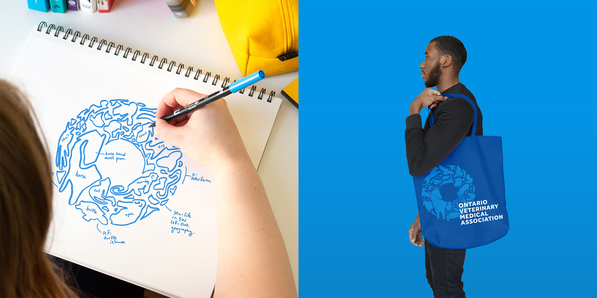
The animal forms resolve into a shared circular mark, then open back out across applications such as the tote shown here.

A clear blue palette and a detailed, interconnected mark give the identity both professional presence and a distinctive point of view.
From there, we developed a system that could move between the association’s formal communications and the places its members encounter it more casually. Conference materials, social graphics, signage, clothing, and objects all needed to feel related. They also needed enough flexibility to carry different stories.
We brought photographs of veterinary professionals into that world, alongside the animal forms and a more human way of speaking about the organization. The people behind the profession could take up more space. The identity could be serious about their work and still have some life to it. We were particularly fond of the water bottles.
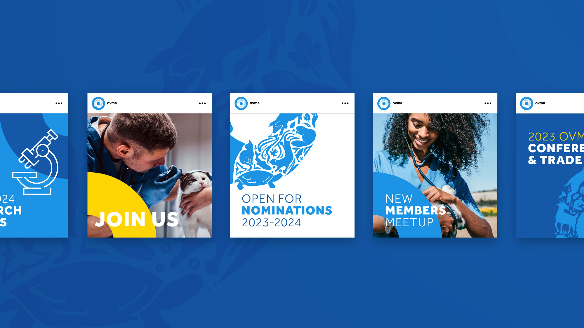
Photography and language bring the people of veterinary medicine into the identity, with the animal forms connecting the series.
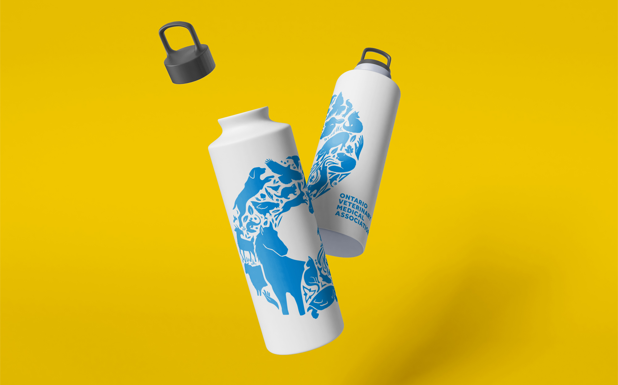
The animal illustration travels beyond the logo, creating an OVMA application with a little personality of its own.
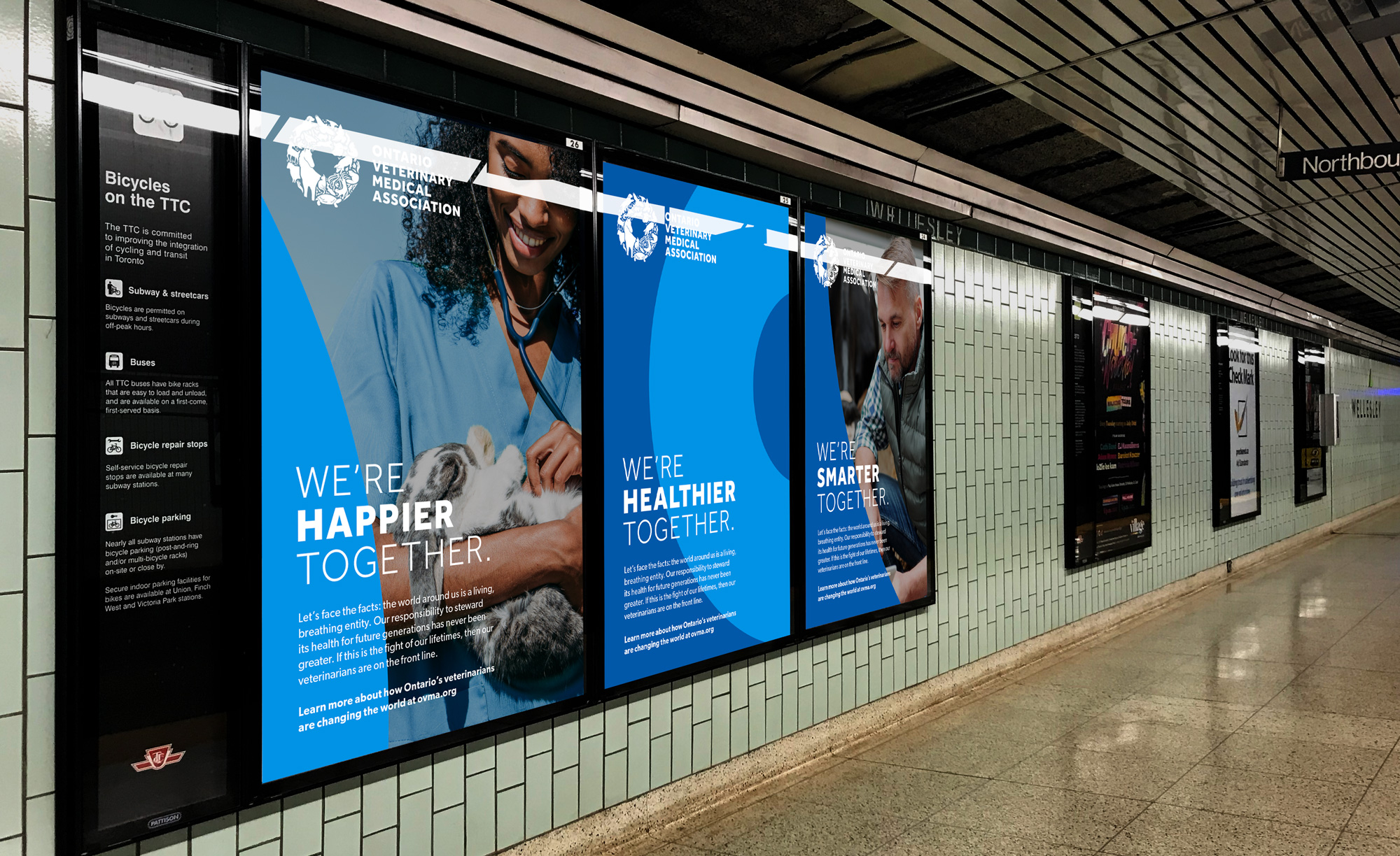
Campaign mockups show how the visual system can connect professional wellbeing, community, and the association’s public presence.
By the time we moved into implementation, the creative direction had been built in conversation with the people it would represent. The animal forms, the photographs, and the language belonged to the same story. Leadership had a clearer basis for decisions, and the people using the identity could explain why it belonged to OVMA.
For John, seeing that understanding become a brand that could tell OVMA’s story “has been invigorating and has brought energy and alignment to our brand storytelling.” That is a lovely thing to hear about a project with so much careful work behind it: the result had brought some energy back to the people doing the telling.
We loved the breadth of this project: the careful research, the conversations that clarified the direction, and the pleasure of making an intricate idea work on a very ordinary object. OVMA gave us the opportunity to connect those things all the way through.
John’s reflection gets to the heart of what became possible: “For organizations who not only want to be understood, but to better understand themselves, Harc has been a great partner in this journey.” We are proud that the identity could carry both: a more recognizable public expression, and a clearer sense of the community behind it.
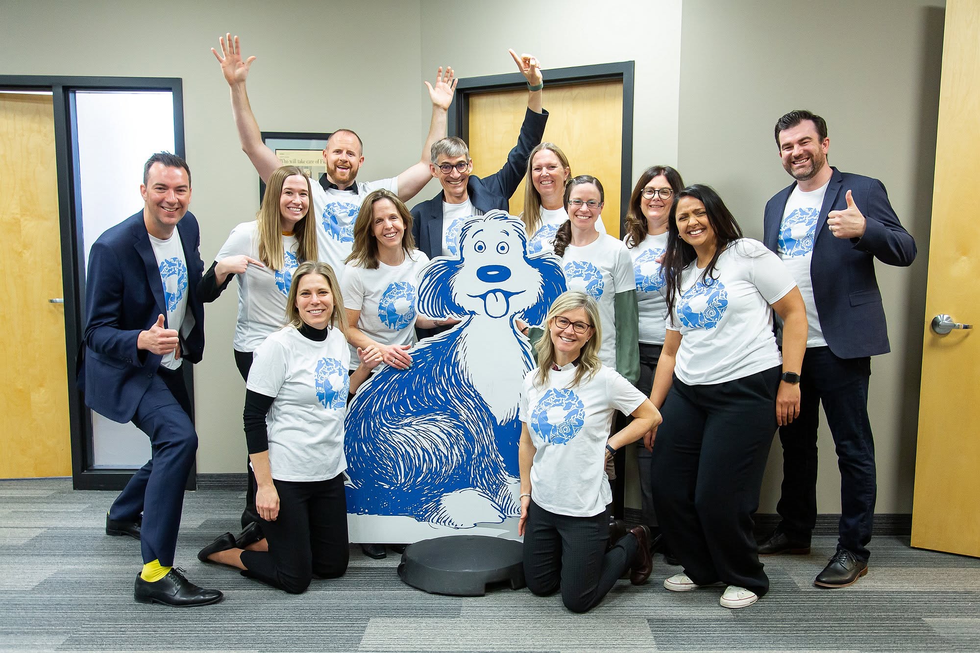
The OVMA team has been united by its new brand and creative leadership– seeing the colour palette carried through to John’s pop-sock is especially gratifying.

Harc didn’t offer a ‘solution in a box’—they helped us focus and come to our own realizations.


Harc will inspire you to think and dream, and the end result will be better than you imagined.


Harc brought forward beautiful, well-researched ideas, resulting in a brand I’m proud to share with the world.


Harc is a great partner for organizations who not only want to be understood, but also to better understand themselves.


The Harc team is intuitive, creative, and strategic while infusing magic and delight into everything they do.


Parker and Jarren became part of our team, showing up in a meaningful way and bringing our story to life through deep understanding.


Working with Harc was like going on a guided journey into understanding and expressing who we are as a company.


Harc’s coaching has helped me see and design my own methods and practices to be successful with a clearer, more confident approach. As a result, I am engaging both my business and my life at a higher level.

A clear brief is welcome. A gloriously untidy first thought is welcome too. Tell us what you’re making, changing or trying to say. We’ll help work out what happens next.