Case Study
Inclusion BC
A solid logotype and a dynamic companion mark gave Inclusion BC an identity that could carry institutional weight while expressing the many ways inclusion takes shape.
A solid logotype and a dynamic companion mark gave Inclusion BC an identity that could carry institutional weight while expressing the many ways inclusion takes shape.
Inclusion BC works across advocacy, partnership, and support, with people, families, organizations, and government all part of its world. Its identity needed the strength to hold its place in serious institutional conversations. It also needed to express something much more personal: inclusion takes a different shape in different lives.
As we worked through the direction with the team, we kept returning to that range. The people asking for help bring their own circumstances and ways of expressing what they need. The support that matters to one person or family can look quite different for another. We wanted the visual system to have room for those differences.
We developed a clear, no-nonsense logotype that could carry the organization’s name with confidence. It provided a steady element within the identity, something that could hold its weight on an official communication or a public-facing piece of advocacy.
Alongside it, we developed a dynamic companion mark. Its forms could change and move through the system, framing people, carrying colour, and giving different stories their own expression. The name could stay steady while the surrounding visual language remained responsive and alive.
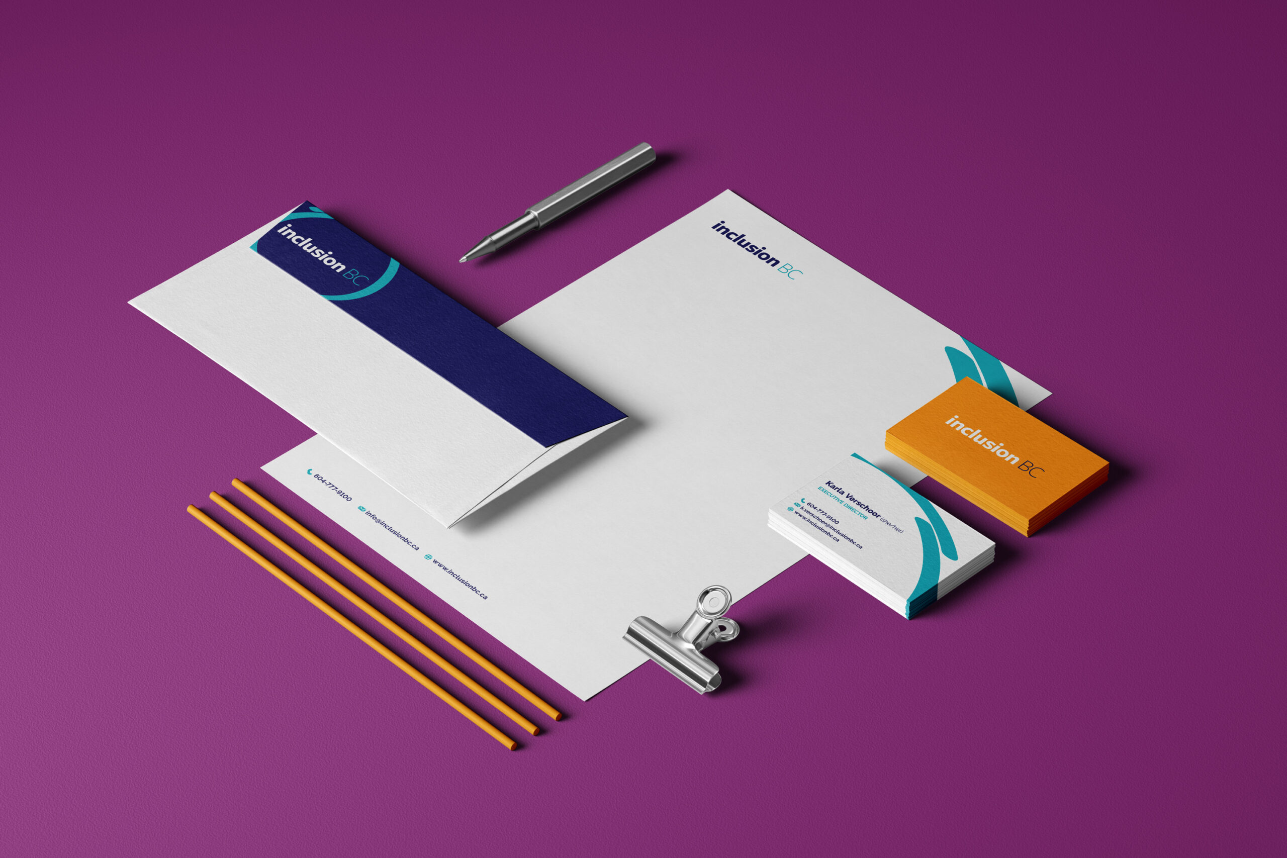
The logotype anchors the identity while the changing graphic forms carry colour and movement across the stationery system.
Our creative strategy explored how inclusion could mean different things in different contexts, with people’s stories making those meanings concrete. That gave the identity a useful job to do: hold those distinct experiences together without making them look or sound interchangeable.
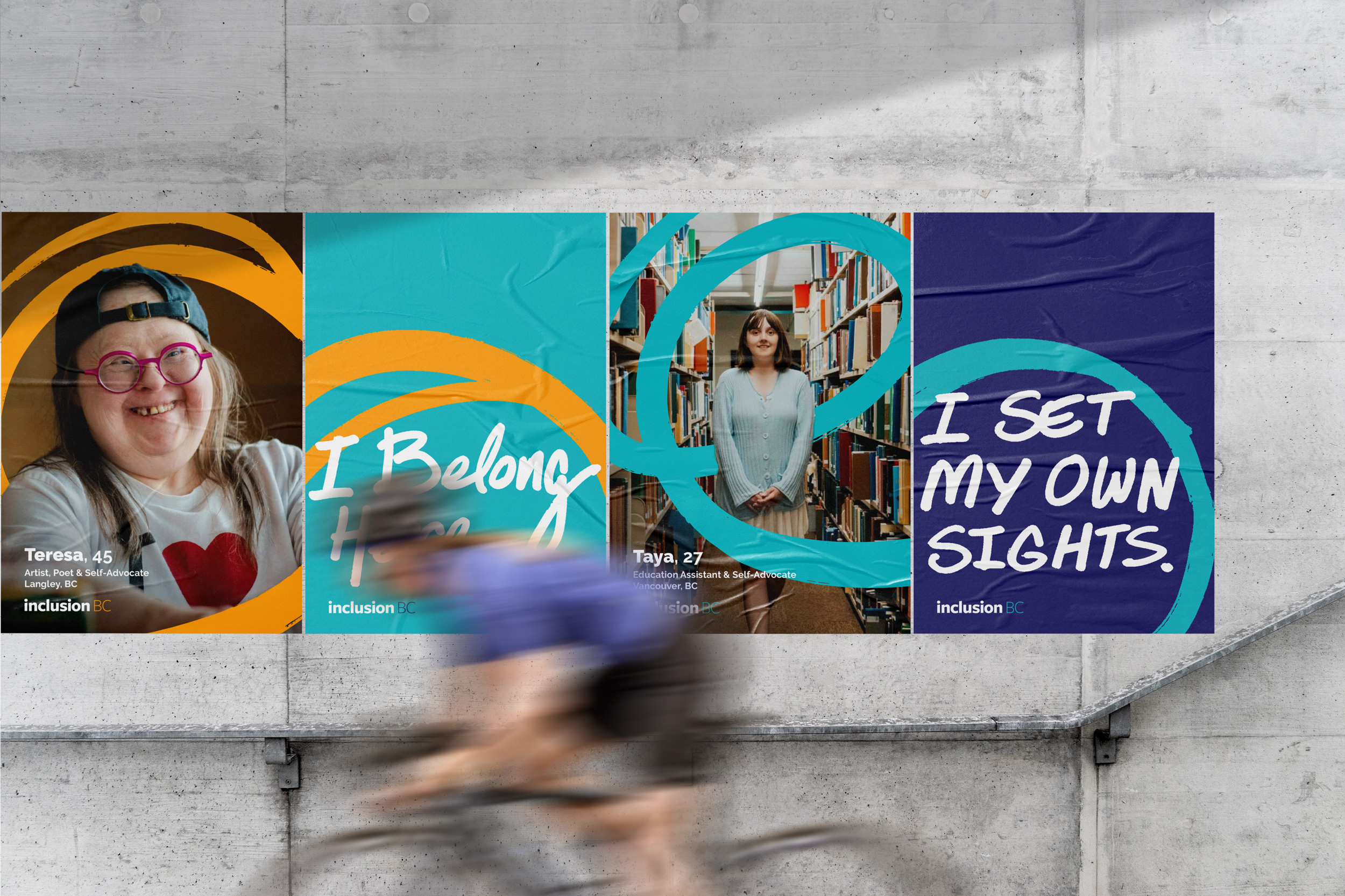
Different portraits and statements take their own place within the same graphic language.
We carried the system across print and digital materials. The companion forms could open around a portrait, make space for a short statement, or bring rhythm to a longer publication. The palette gave the work energy, while the repeated relationship between lettering, people, and shape kept it recognizable.
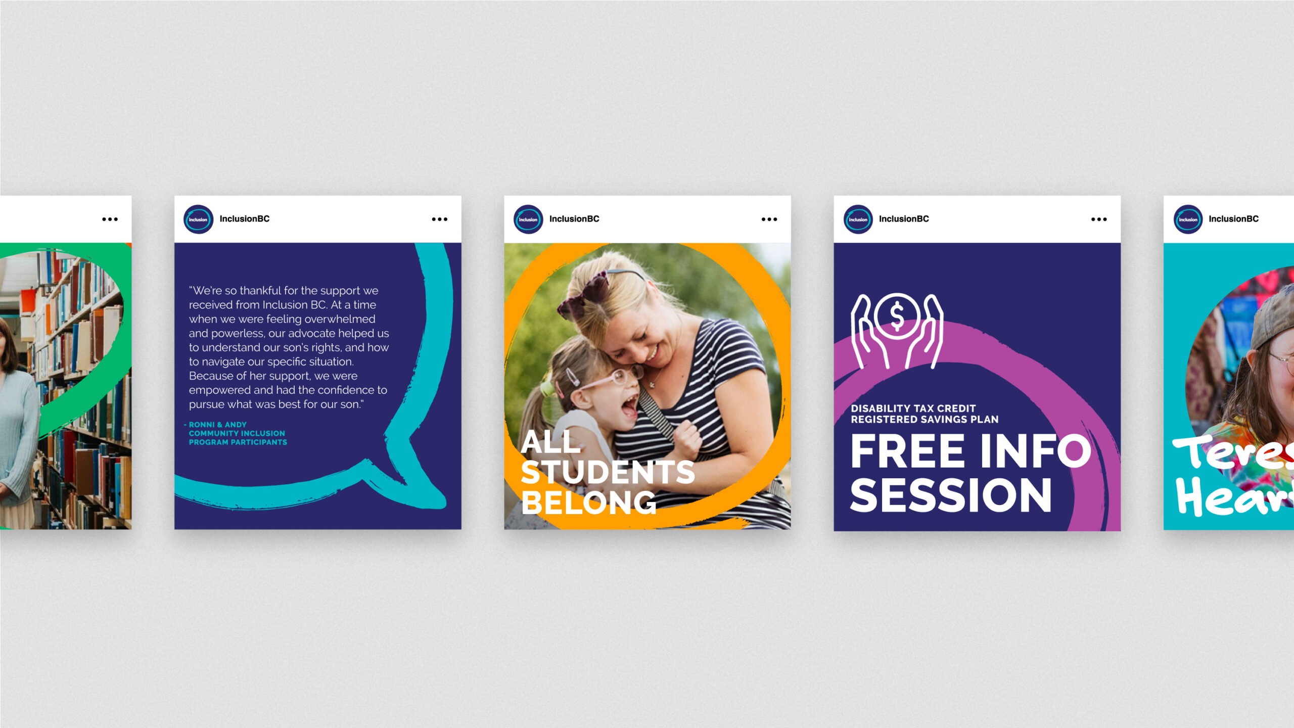
The social system makes room for personal stories, practical information, and event invitations.
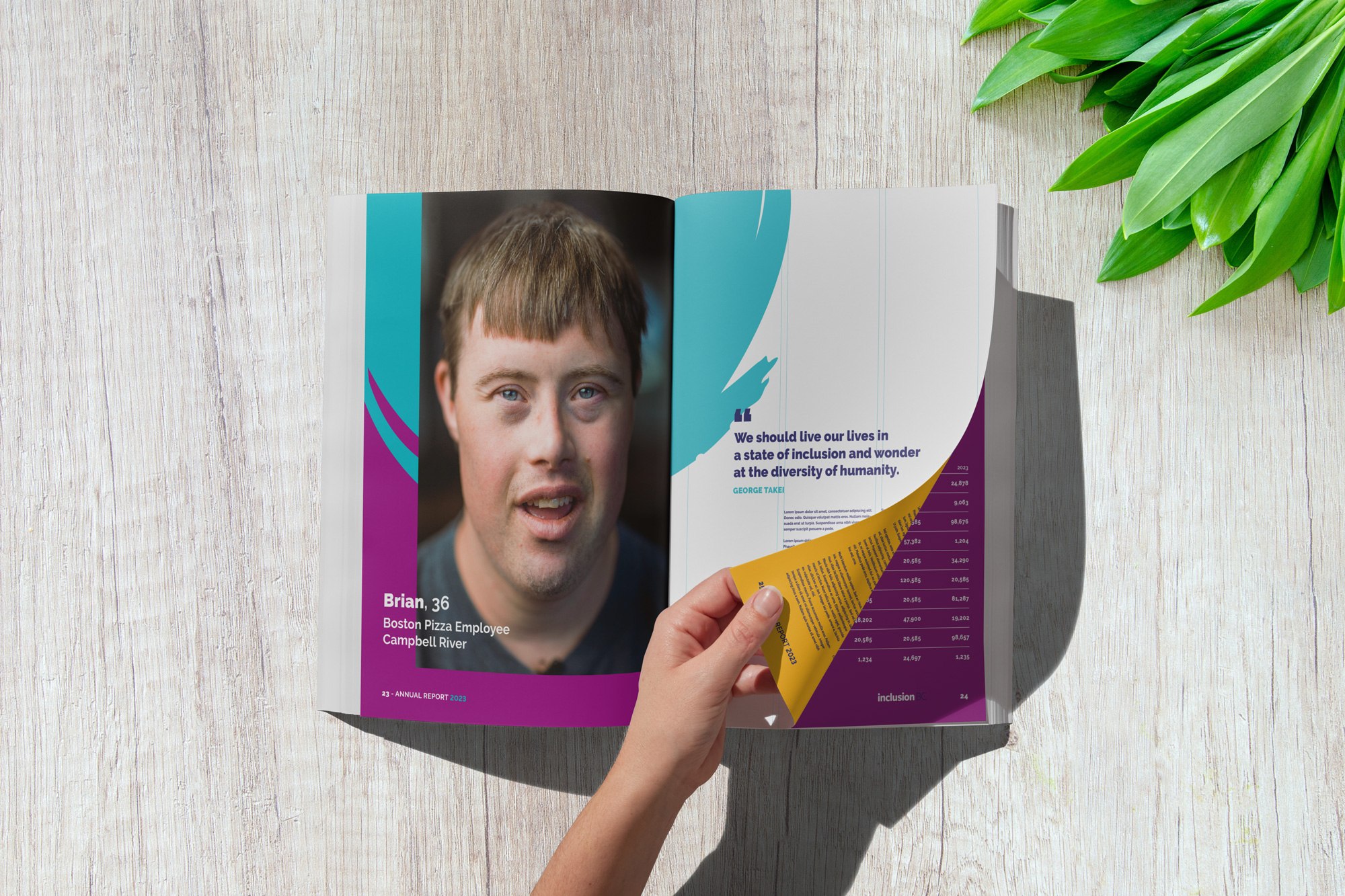
In a longer publication, the graphic language can frame an individual voice while keeping the organization’s presence clear.
The website brought those same relationships into a larger experience, with people prominent and the organization’s information held within a clear visual structure. We wanted the breadth of Inclusion BC’s work to feel connected without losing the individuals who give that work its meaning.
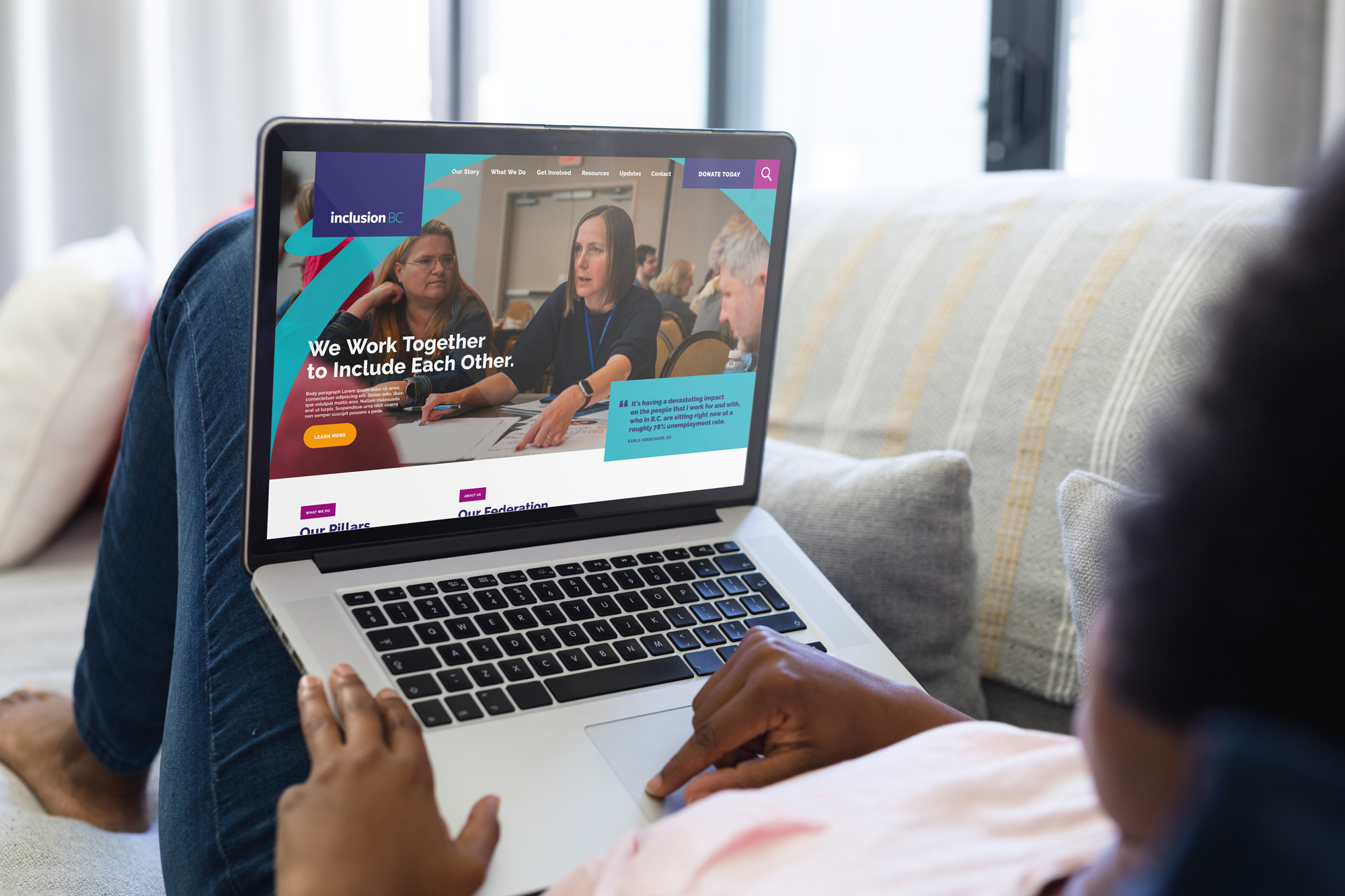
The website presentation brings people, the steady logotype, and the flexible graphic system into the same experience.
We are proud of the balance in the finished identity. It has the solidity to represent an established organization and the flexibility to tell many different stories. That was the point of keeping something steady and letting something else change.

Harc didn’t offer a ‘solution in a box’—they helped us focus and come to our own realizations.


Harc will inspire you to think and dream, and the end result will be better than you imagined.


Harc brought forward beautiful, well-researched ideas, resulting in a brand I’m proud to share with the world.


Harc is a great partner for organizations who not only want to be understood, but also to better understand themselves.


The Harc team is intuitive, creative, and strategic while infusing magic and delight into everything they do.


Parker and Jarren became part of our team, showing up in a meaningful way and bringing our story to life through deep understanding.


Working with Harc was like going on a guided journey into understanding and expressing who we are as a company.


Harc’s coaching has helped me see and design my own methods and practices to be successful with a clearer, more confident approach. As a result, I am engaging both my business and my life at a higher level.

A clear brief is welcome. A gloriously untidy first thought is welcome too. Tell us what you’re making, changing or trying to say. We’ll help work out what happens next.