Case Study
Lumara
We listened across Lumara’s community, shaped a digital strategy around what people needed, and carried that understanding into the design and build of its website.
We listened across Lumara’s community, shaped a digital strategy around what people needed, and carried that understanding into the design and build of its website.
Someone arriving at Lumara’s website may be looking for support while carrying more than they can easily explain. A family member may be trying to understand what is available. A donor may know the work matters but need help seeing how to contribute. The website needed to welcome those different people and help them take a next step.
Lumara’s care extends through counselling, art, music, play, and community. Our work began with understanding how those approaches fit together, and how that understanding could become a useful digital experience. It was a project in two connected parts: a strategy shaped through listening, followed by responsibility for designing and building the website.
We heard from the Lumara team, participants, supporters, and people working in related organizations. A recurring concern was eligibility: people needed to know whether support was for them, especially when they were already under stress. Another was the picture people carried of grief support. There was room to show more of the community, play, and ongoing relationships in Lumara’s work.
Spending several days with the community at Camp Kerry deepened that understanding. We joined conversations, meals, and the drum circle, getting to know a place where grief, music, and connection could share the same space. Reflecting on our visit, co-founder Dr. Heather Mohan said, “And then you reflected all of that back to us in this beautiful website.” What we experienced there helped us decide how the pathways, images, and language of the website should feel.
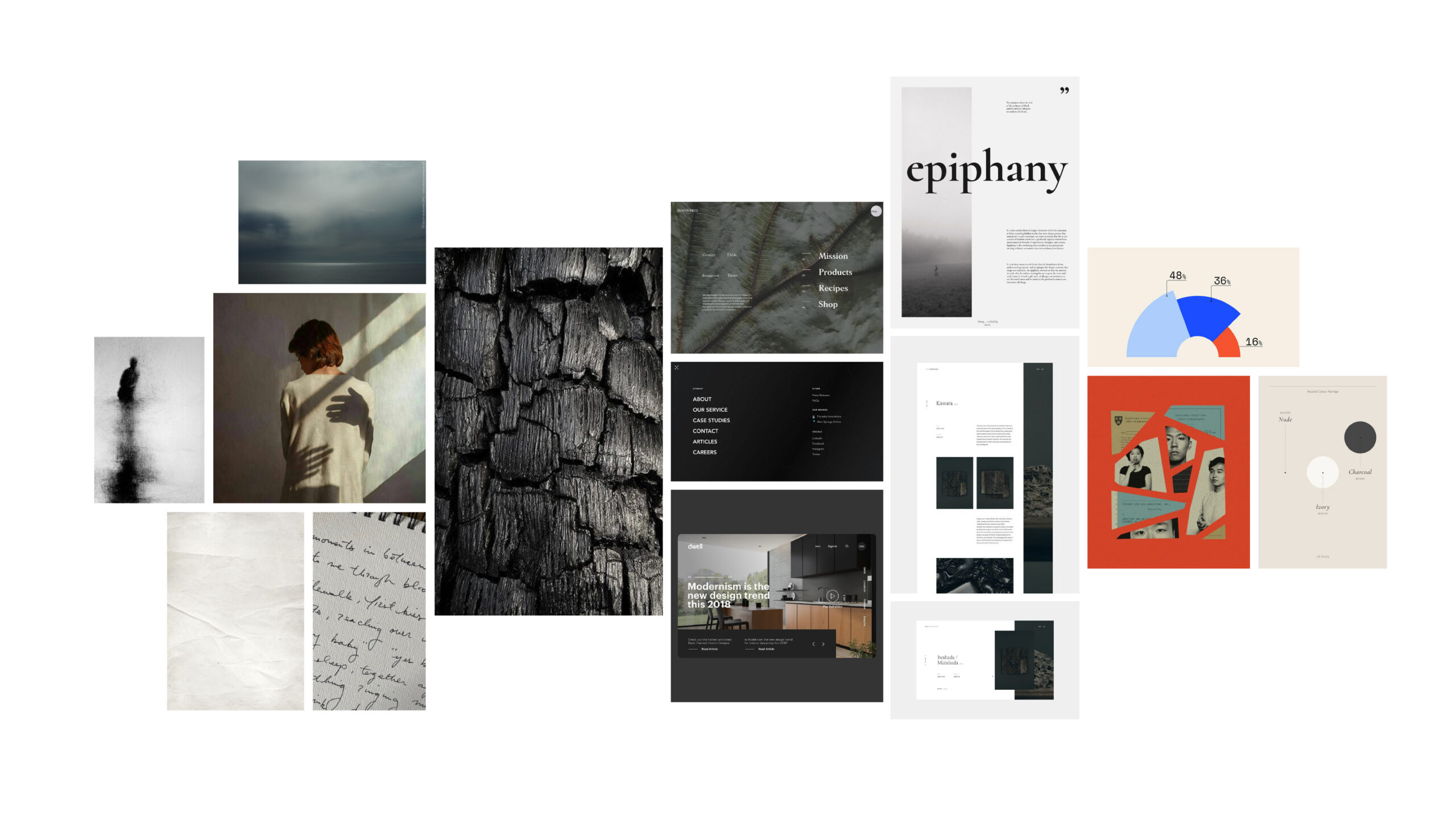
The art-direction board explores a visual tone for the website, bringing together texture, space, photography, and references for the digital design.
The digital strategy connected the tone of the website with its structure. Programs needed clear entry points. The organization’s approach needed space to explain itself. Stories needed to help visitors understand the experience of being part of Lumara, and supporting the work needed to feel connected to the people it serves.
We also worked through priorities with the team. Heather named the relationship between imagination and a workable plan beautifully: “I am a creative person, but I know that in order to move creative ideas forward, you need that structure.” The strategy needed to guide decisions about what to build, how information would relate, and how the site could remain manageable as it grew. It gave us a way to carry the possibilities into the build without losing the plot.

The navigation groups programs, the organization, and its approaches into distinct routes, with a gentle invitation built into the design.
We carried the direction into page layouts, navigation, visual design, and the website build. The homepage brings an introduction to Lumara together with ways into support and the community around it. The approach page gives more room to the ways the organization works, helping people understand the care behind the programs.
The visual design balances calm space with colour and human stories. Clear hierarchy and a considered rhythm help visitors understand what is available without having to take everything in at once. For Heather, an important shift was seeing how Lumara could offer “the same kind of warm, welcoming, caring, compassionate kind of language and invitations online as we can in person.” The welcome people knew at camp could begin before they arrived.
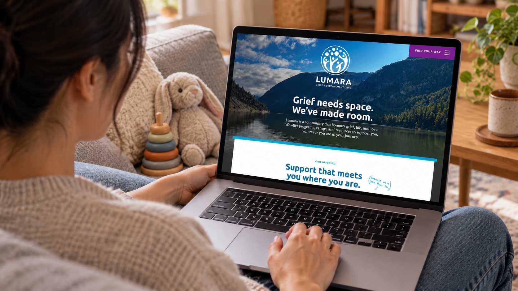
The homepage design connects Lumara’s purpose with routes into support, its approaches, and the people who make the work possible.
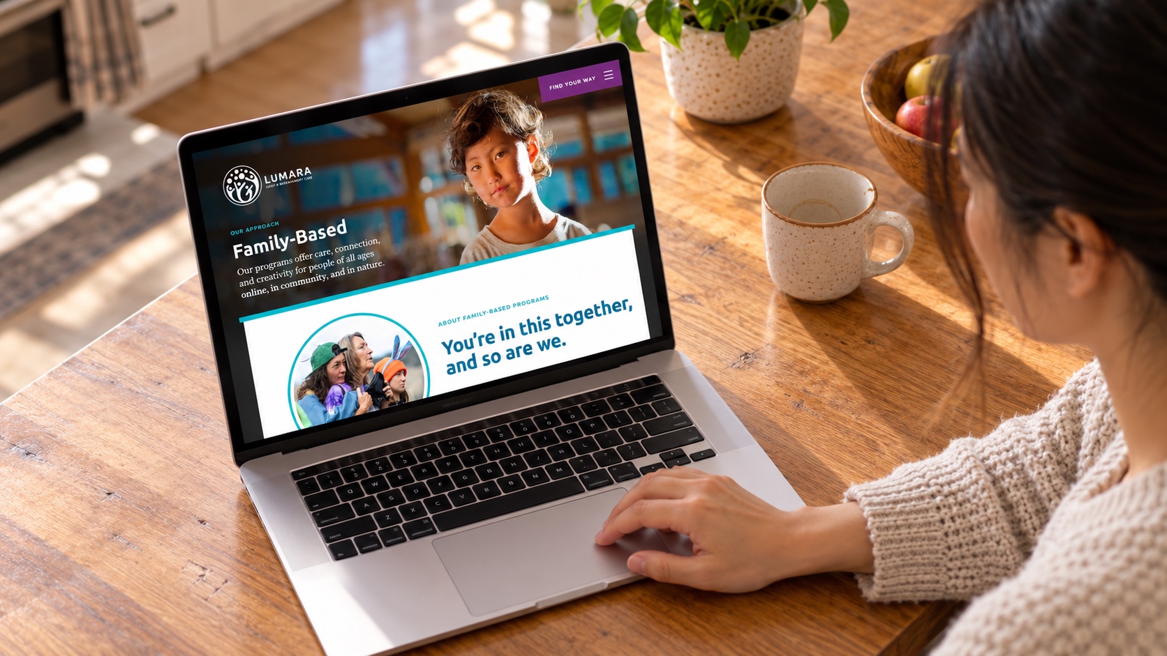
The approach page gives visitors a closer look at the ways Lumara works, carrying the same visual language into more detailed content.
We could follow a thread from something a participant had told us, to a strategic decision, to a place in the finished website. That continuity matters to us. Research becomes more valuable when it keeps influencing the work people actually use.
Lumara invited us close to something tender and substantial. We are proud of the creative work we made with them, and of the attention that connects its parts. The strategy gave us a clear way forward. The design and build gave that direction a home.

Harc didn’t offer a ‘solution in a box’—they helped us focus and come to our own realizations.


Harc will inspire you to think and dream, and the end result will be better than you imagined.


Harc brought forward beautiful, well-researched ideas, resulting in a brand I’m proud to share with the world.


Harc is a great partner for organizations who not only want to be understood, but also to better understand themselves.


The Harc team is intuitive, creative, and strategic while infusing magic and delight into everything they do.


Parker and Jarren became part of our team, showing up in a meaningful way and bringing our story to life through deep understanding.


Working with Harc was like going on a guided journey into understanding and expressing who we are as a company.


Harc’s coaching has helped me see and design my own methods and practices to be successful with a clearer, more confident approach. As a result, I am engaging both my business and my life at a higher level.

A clear brief is welcome. A gloriously untidy first thought is welcome too. Tell us what you’re making, changing or trying to say. We’ll help work out what happens next.