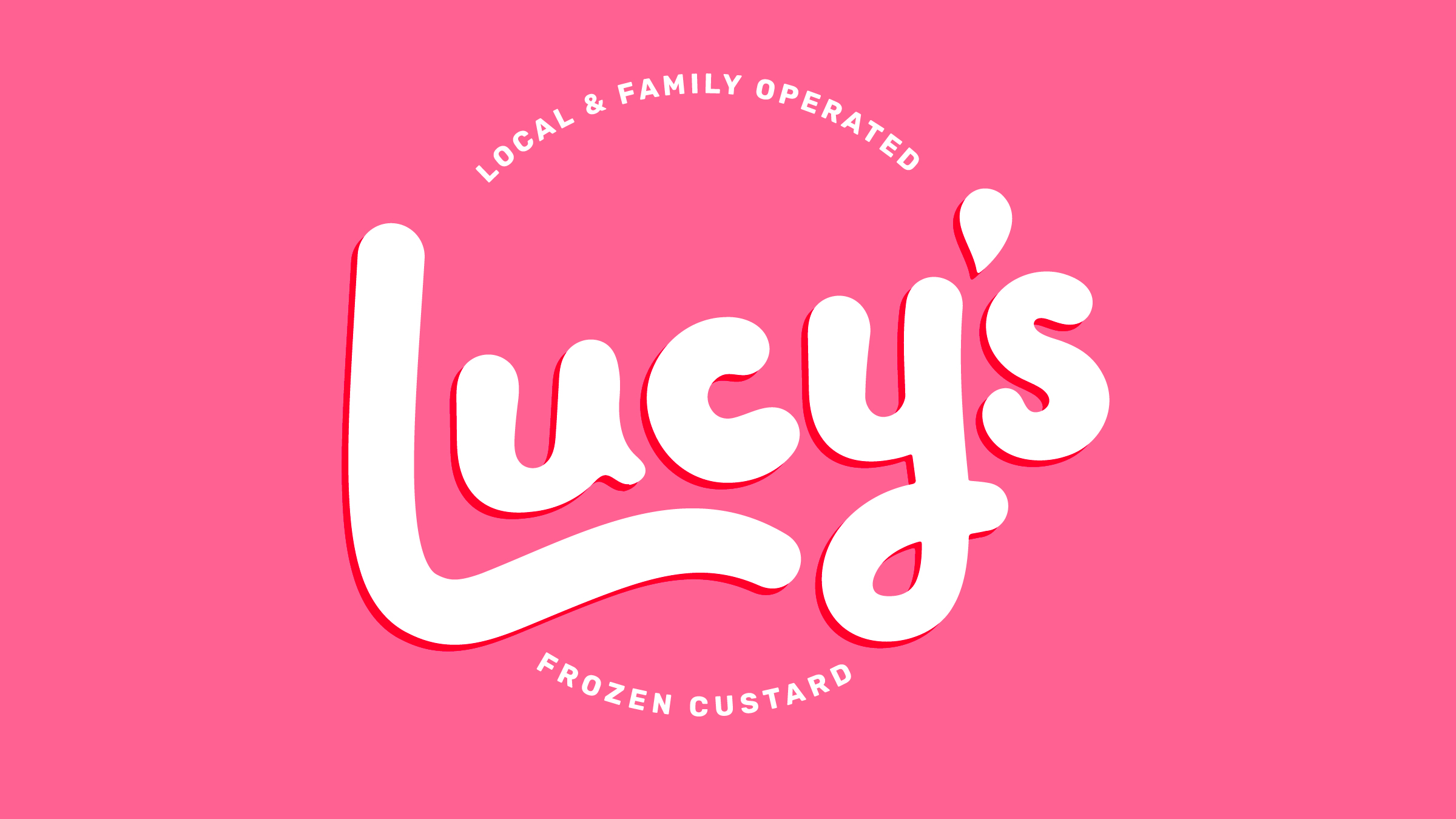
Lucy’s needed a brand for its next chapter.
The pop-up had already proven there was something real there. People came. They lined up. They sold out. Families found them. Frozen custard lovers found them. The idea had moved from “could this work?” into “okay, this is working.”
A very good problem to have.
As Shannon and Brian prepared to open a permanent storefront, the brand needed to become more useful. It had to carry signage, menus, interiors, packaging, customer flow, and all the tiny decisions that come with making a place people can actually walk into.
The identity needed to carry two things at once: the joy and personality of a family business, and the clarity required to help a growing brand find its footing.
But Lucy’s was never just a dessert shop. It was a family-founded business named after their daughter. That mattered. As Shannon later put it, “it was a bit of a bold move” to name the business after Lucy, who was nine. And, as any parent building a business around a real child will understand immediately, there was care required around how much to bring her into the process.
Shannon described the question beautifully: how do you bring Lucy into the decisions “so that she feels a part of it but doesn’t feel responsible”?
That is where our kind of creative facilitation really fit.
Ideas explored during workshops and family conversations eventually became experiences, stories, and moments throughout the space.
We had to make space for joy to lead.
Lots of brand processes move quickly toward the design reveal. We get it. The reveal is fun. But for Lucy’s, the way into the design mattered just as much as the design itself. The engagement was not a preamble. It was the creative work.
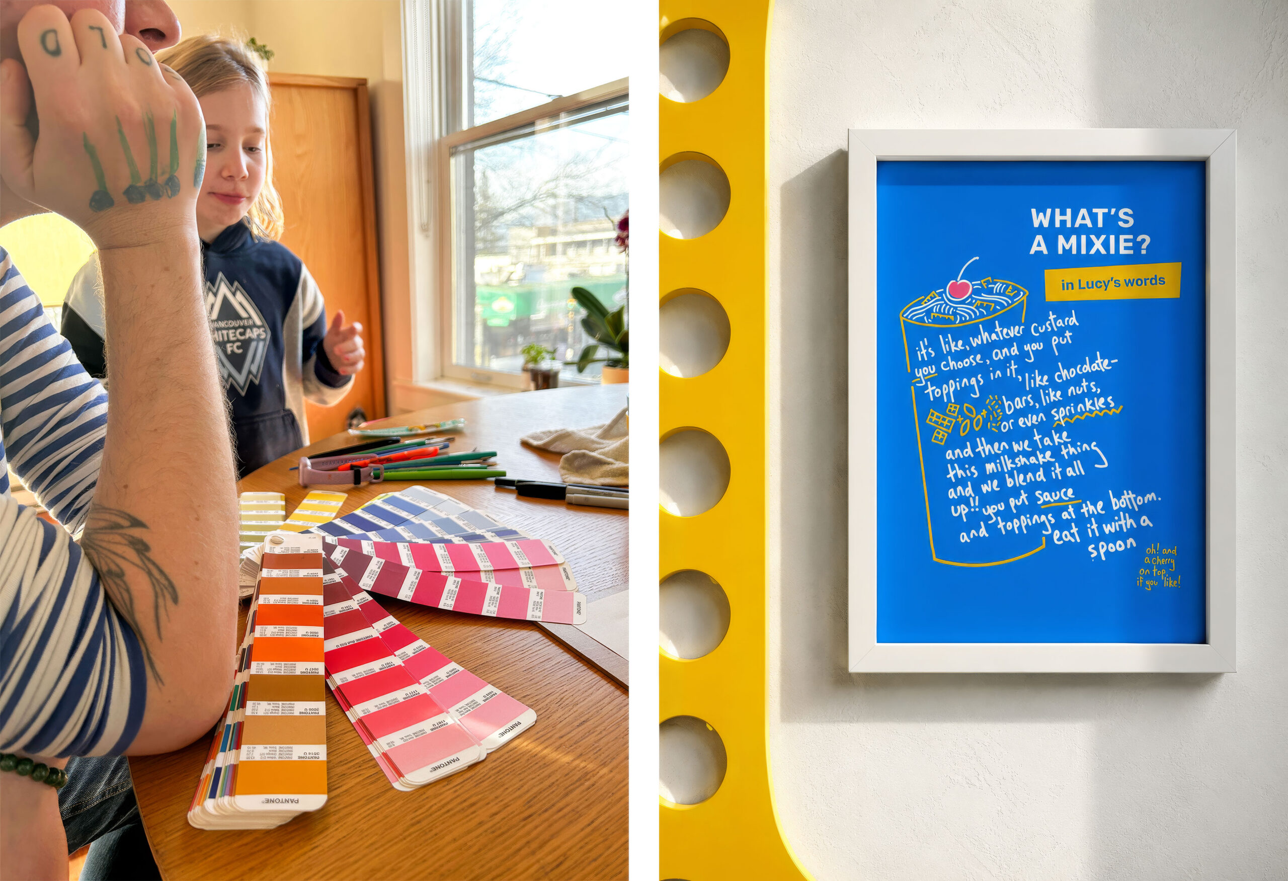
So we built a contained, playful workshop where Lucy could help us understand what Lucy’s felt like from the inside. Paint on the floor. Big paper. Music. Frozen custard nearby, naturally. We asked her what she loved. We watched how she made marks. We let her show us how she imagined the sign, the colours, the feeling of the place.
No pressure. No promises we could not keep. No “congratulations, you are now responsible for this brand.” Just a real invitation into the process, held with care.
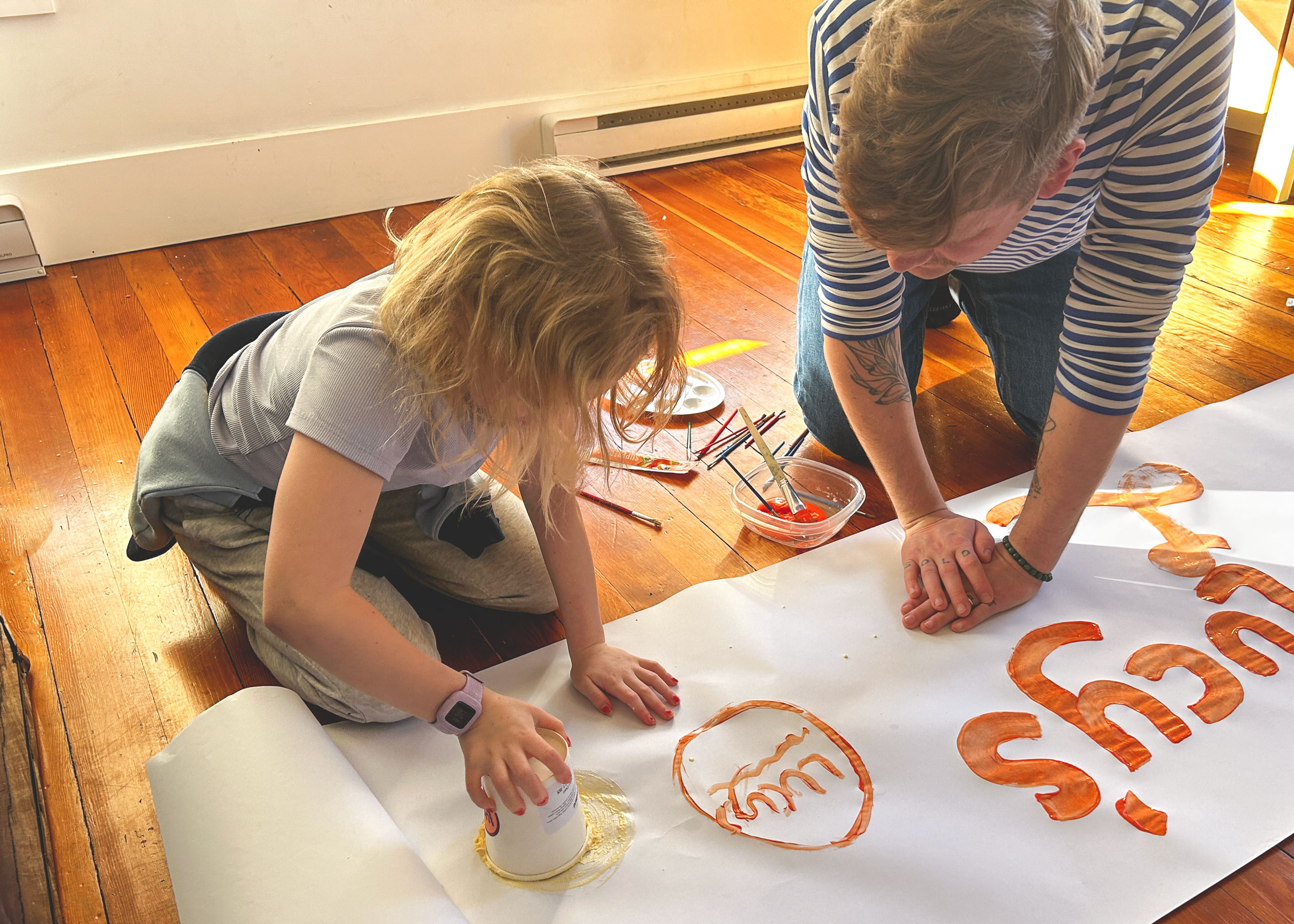
Lucy actually tried painting *with* custard. Participation was the goal, not responsibility. The process was designed to welcome Lucy’s perspective without asking her to carry the weight of the outcome.
And of course, Lucy brought the goods.
She told us she had two favourite colours, and that became part of the brand’s logic. She made bold, gestural marks that helped shape the feeling of the identity. She brought a kind of directness and energy that no adult moodboard could have faked. The whole project came more alive when she entered the room.
That is the sweet spot we were listening for.
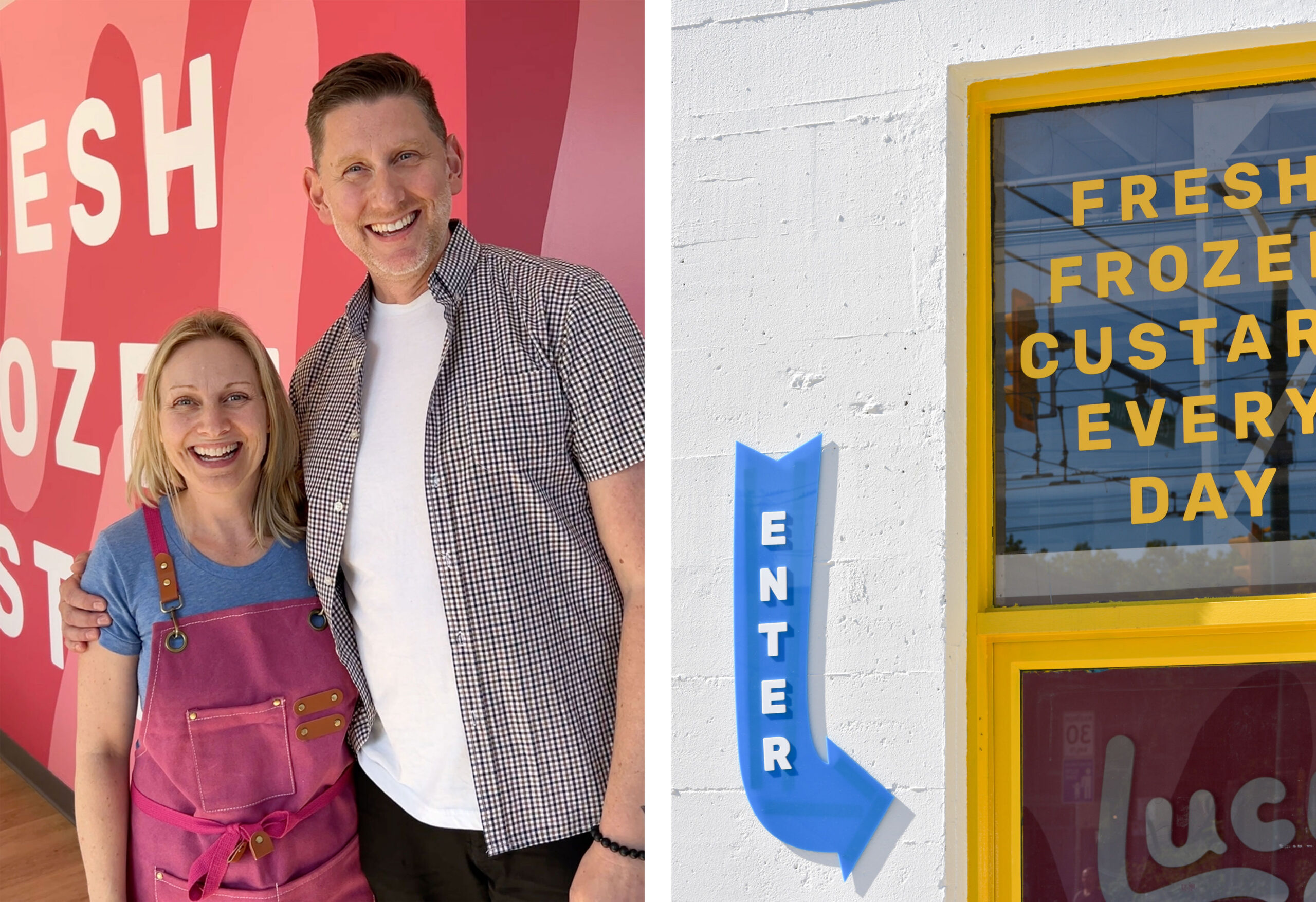
By the time the doors opened, the brand had become more than a collection of design decisions. It had become a clearer expression of what Shannon, Brian, and Lucy had been building all along.
From Listening to Clarity
“We entered our work with Harc with ideas and a nebulous essence of what we wanted to convey to the world with our brand-new business. Parker and Jarren heard us, truly listened, asked insightful questions, and as a result, we emerged with clarity and an amplified version of how we wanted to show up.” –Shannon
That is exactly what the process was for. Not to make the family story tidier. Not to make Lucy’s feel more polished at the expense of its heart. The work was to listen closely enough that the real thing could come forward, then shape it into something Shannon and Brian could actually use.
Parker took the magic Lucy brought into the room, the colour logic, the painted gestures, the sign energy, the bold little sparks of authorship, and translated it into a visual identity with enough polish and structure to work in a real consumer space. Youthful, yes. Curious, absolutely. But not treacly. Not precious. Not so sweet it gives you a headache before you even get to the custard.
Jarren helped hold the container around the work: the pace, the practical realities, the decisions, the “how does this actually live in the shop?” part of the process. Because a brand does not only need to feel good in a workshop. It needs to work on a sign. It needs to help people move through a space. It needs to make launch decisions easier, not harder.
Together, the work became both personal and usable.
Which is really the point.
Lucy’s got a brand that could carry Lucy’s input without making Lucy carry the brand. Shannon and Brian got a clearer, more grounded expression of what they were building. And the storefront got a visual world that felt connected to the family story from the start.
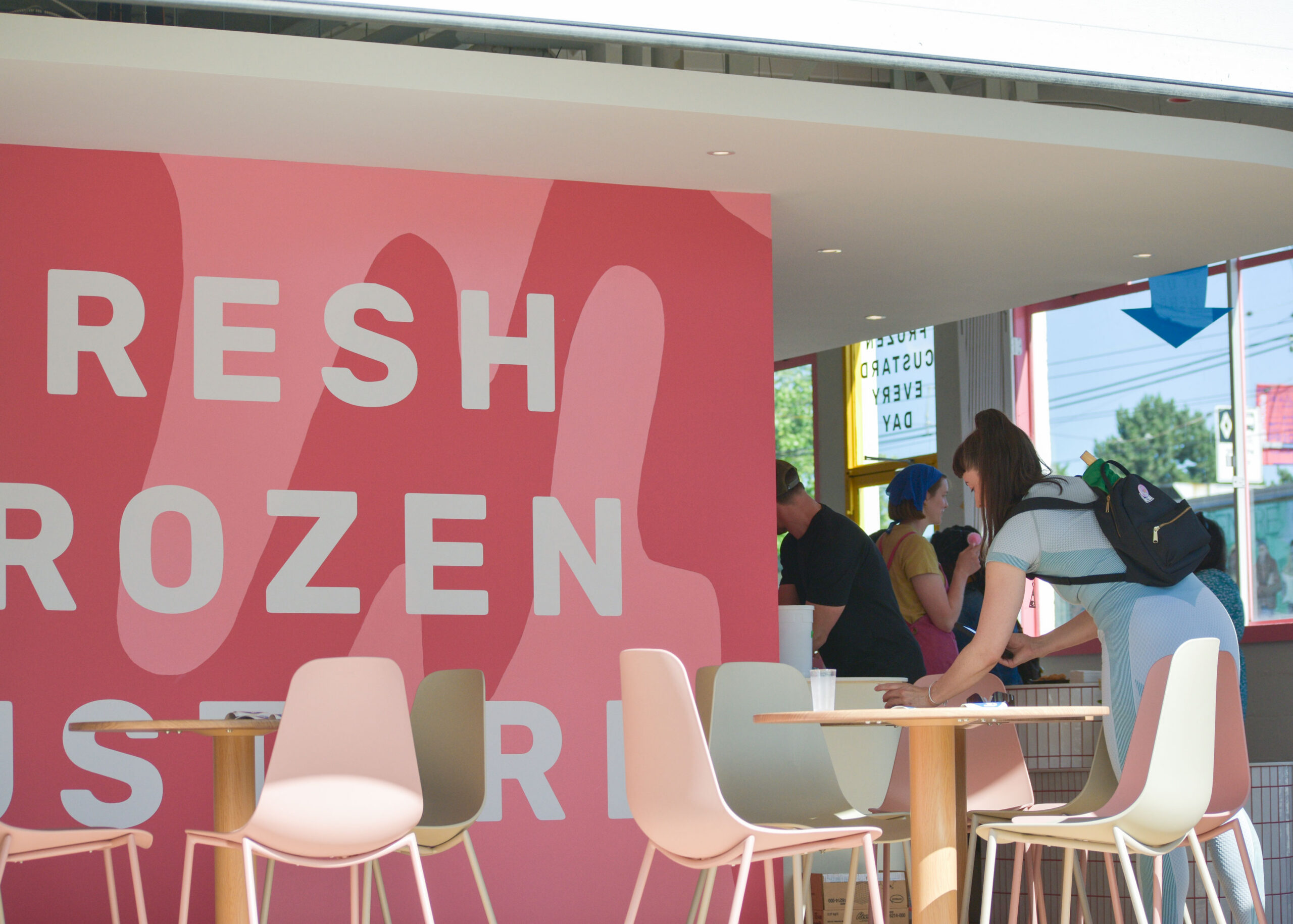
By opening weekend, months of conversations, decisions, sketches, and experiments had become a place people could gather, celebrate, and enjoy together.
What We Made
- Brand foundations
A clearer strategic and emotional foundation for Lucy’s as it moved from pop-up momentum into a permanent storefront. - Family brand workshop
A playful, carefully held creative session where Lucy could contribute to the brand’s source material without being made responsible for the outcome. - Visual identity refinement
A refreshed logo, letterforms, and colour system rooted in Lucy’s input and shaped for real-world use. - Signage and retail expression
Brand applications for the storefront, interiors, menus, environmental graphics, and launch-ready customer touchpoints. - Practical creative tactics
Usable ways for Shannon and Brian to bring the brand into everyday decisions quickly, with more clarity and less circling.
What Shifted
- From pop-up momentum to permanent place
Lucy’s moved from a proven idea into a brand ready to live in a real storefront. - From nebulous essence to clarity
Shannon and Brian had a clearer, amplified version of how they wanted Lucy’s to show up. - From family inspiration to family authorship
Lucy’s presence in the brand became real, specific, and carefully held. - From brand as another launch task to brand as momentum
The work gave Shannon and Brian practical creative tools they could use right away. - From feeling to form
The warmth, memory, and energy behind Lucy’s became visible in the identity, signage, space, and customer experience.
Lucy’s reminds us why the process matters.
Not because every brand needs a big dramatic workshop. It does not. But because when a story is this close to real people’s lives, the way you invite people in matters. The questions matter. The container matters. The care matters.
This is the kind of brand work we love: listening for what is already alive, making enough room for it to show itself, and then shaping it into something clear, useful, and ready for the world.
With sprinkles, when appropriate.