Case Study
Crisis Centre of BC
A clear first question and a purposeful colour system helped us design a website around the very different needs of people arriving at the Crisis Centre.
A clear first question and a purposeful colour system helped us design a website around the very different needs of people arriving at the Crisis Centre.
The Crisis Centre of BC has several kinds of work to explain: immediate support, education and training, community programs, and the fundraising that helps sustain it. Each matters. But a person arriving in crisis needs a very different experience from someone looking for a course or deciding how to donate.
As the organization’s work and partnerships grew, its website needed to make those differences clearer. We began with program staff and the people answering calls. They helped us see what needed to be easy to find, what needed more explanation, and what could wait. Mark Sheehan later described the trust that came from feeling we “understood our purpose and mission and would take the appropriate care when creating our new website”. That care had to become a very practical decision about what a visitor would encounter first.
We developed an entry screen that asks whether the visitor needs help now. That first decision leads toward immediate support or into the wider website. It gives people arriving with an urgent need a direct route, while making space for other visitors to explore the organization’s work.
This became the organizing decision for the digital strategy. We could build different paths around different needs rather than asking every visitor to understand the whole organization before finding a useful next step. In a project with many audiences, that gave the design a clear priority.

The yellow entry screen puts immediate support first, while providing a separate route into the full website.
The visual brand had useful ingredients. We refined their application so that colour could help people understand where they were and what an action was for. Yellow became the signal for front-line help and reaching out. The blues and greens carried more of the developmental, training, fundraising, and program-delivery content.
That choice gave the palette a practical role across the interface. A help route could remain recognizable as visitors moved through different pages. The broader organization could have its own depth and character without competing with the need for support.
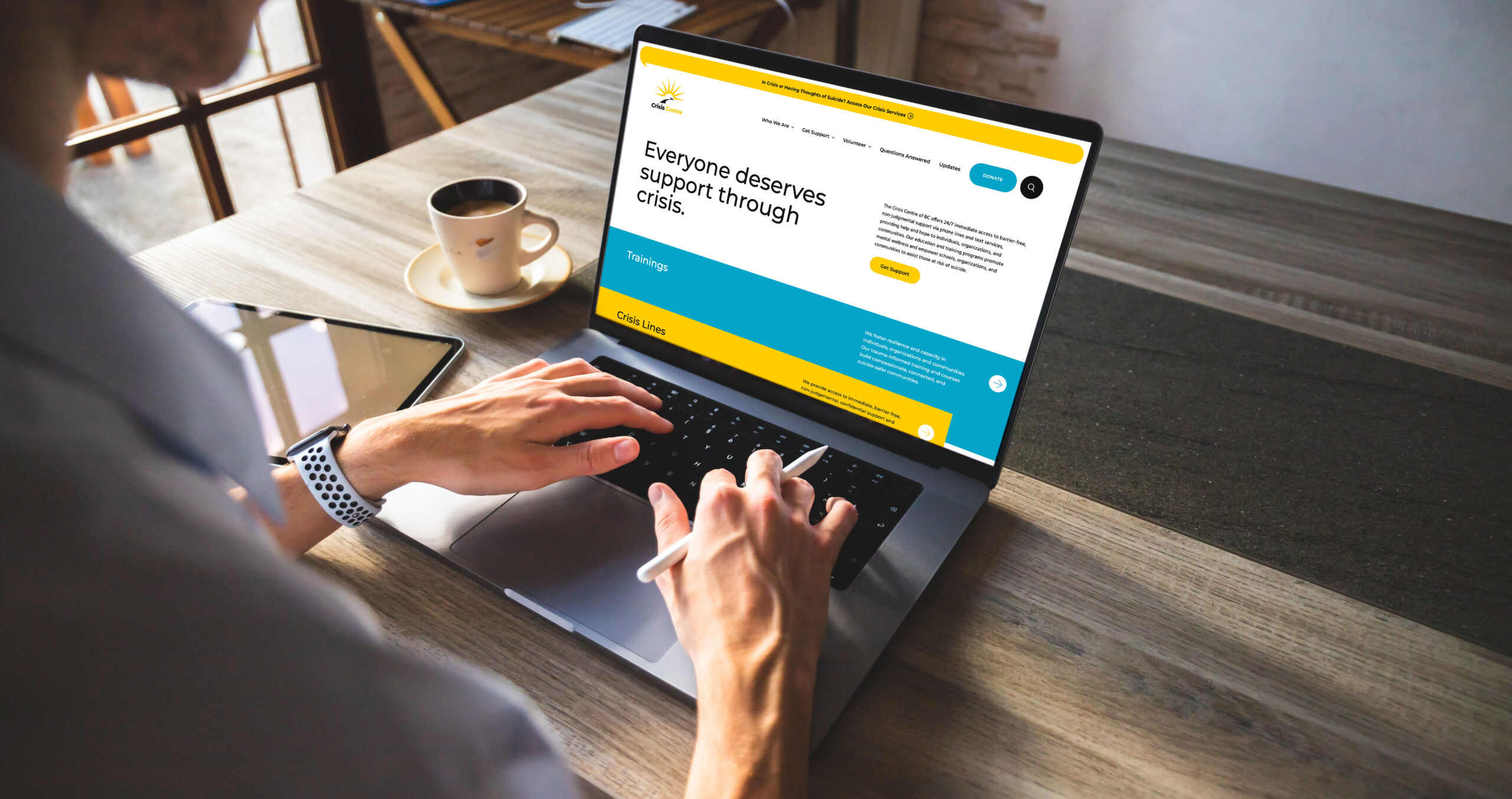
The full-site design uses the wider palette to explain the organization, with yellow continuing to identify routes toward help.
We translated the research into the site structure, worked through the prototype, and carried the direction into visual design and development. The entry screen was central, but the surrounding experience mattered too. The organization still needed to explain its training, make its work understandable, and give supporters a way to get involved.
The project asked us to pay attention to both the emotional and practical demands of arriving at a website. What can someone take in? What do they need first? How clearly can the design offer it? Those questions shaped the finished work, from the first screen to the supporting pages.
We cared about making something the team could stand behind because its priorities reflected their purpose. The website gives their different audiences room, and keeps the path toward immediate help in view. That is a very concrete kind of care to build into a design.

Harc didn’t offer a ‘solution in a box’—they helped us focus and come to our own realizations.


Harc will inspire you to think and dream, and the end result will be better than you imagined.


Harc brought forward beautiful, well-researched ideas, resulting in a brand I’m proud to share with the world.


Harc is a great partner for organizations who not only want to be understood, but also to better understand themselves.


The Harc team is intuitive, creative, and strategic while infusing magic and delight into everything they do.


Parker and Jarren became part of our team, showing up in a meaningful way and bringing our story to life through deep understanding.


Working with Harc was like going on a guided journey into understanding and expressing who we are as a company.


Harc’s coaching has helped me see and design my own methods and practices to be successful with a clearer, more confident approach. As a result, I am engaging both my business and my life at a higher level.

A clear brief is welcome. A gloriously untidy first thought is welcome too. Tell us what you’re making, changing or trying to say. We’ll help work out what happens next.